Last Revision: November 20, 2022
Asset Class Performance: Introduction
Understanding asset class performance is an important part of assembling the proper investment portfolio mix.
This post analyzes the historical performance of various assets using ETF and Mutual Fund proxies.
Its purpose is to show
- the historical ranked returns of several asset classes.
- the volatility (risk) of the returns.
- how the asset returns correlate against one another.
Learning more about these key asset class characteristics (Return, Risk, CoRrelation or the Three Rs), should help the investor in developing a sound investment strategy and asset allocation plan.
Menu
Aswath Damodaran (NYU Stern) Data Summary
Credit Suisse (Global Investment Returns Yearbook 2022 Summary Edition) Data Summary
Asset Class Returns Analysis Based on Various ETFs and Mutual Fund Performance Data provided by www.lazyportfolioetf.com and themeasureofaplan.com
- Asset Classes Annualized Real Returns 1992 – Oct. 2022
- Asset Class Periodic Return Table Concept
- Asset Class Yearly Return Ranking Periodic Table
- Asset Class Correlations
- Asset Returns vs Standard Deviation
- Asset Returns vs Sharpe Ratio
- US Stock Performance for Various Size and Style Categories
- US vs International Stock Performance
- Bond Performance
- US vs International Bond Performance
Conclusions and Appendices
Study Basis and Sourcing
Investment asset classes can be conveniently categorized as Cash, Equity, Bonds, and Alternatives, where Alternatives include real estate, commodities, derivatives, hedge funds, private equity, crowdfunding, etc.
See more details on asset types in my post on Asset Classes.
I searched the web for asset class performance histories and I landed on 4 references:
1. Aswath Damodaran historical return data for US stocks and bonds.
- I downloaded his historical returns spreadsheet ( Damodaran Historical Return Data) and then modified it to include nominal and real returns for all assets listed.
- I created two bar graphs showing nominal and real historical returns for US stocks, bonds, and Residential Real Estate.
2. Credit Suisse (Global Investment Returns Yearbook 2022 Summary Edition) Data Summary
- I downloaded the “Credit Suisse Global Investment Returns Yearbook 2022 Summary Edition” pdf [Source: Elroy Dimson, Paul Marsh and Mike Staunton, DMS Database 2022, Morningstar]
- From this document, I have used the return data for US stocks and bonds (Fig 3, page 38) and International stocks and bonds (Fig 4, page 39).
- I created an excel bar graph showing the returns.
3. Returns Analysis for 46 ETFs (mostly) and Mutual Funds
- I found historical return data on 46 different ETFs and Mutual Funds (See Appendix 1 and Appendix 4) that represent several different asset classes.
- The asset classes represented are various stock types (size, style, location, technology, momentum, preferred, indices), cash, bonds (US, International), REITs, commodities, gold, and hedge funds. You can read my Asset Classes post for more information on these.
- The majority of the raw data was downloaded from Lazyportfolioetf.com/
- I used some mutual fund data from Themeasureofaplan.com. I did my own excel calculations but some of the formats and computations are based on the great excel download from this site.
- I used this data to compute statistics (including correlation coefficients) as well as CAGRs (annualized growth rates) over different time periods.
4. Other References
- https://www.hfr.com/family-indices/hfri#tab-HFRI (hedge fund performance)
Performance is defined as price performance plus re-invested dividends but not including fees or taxes. Note: Hedge Fund returns are “net of all fees” according to HFRI .
US Stocks, US Bonds, US Residential Real Estate Historical Returns (Damodaran Data)
Stocks have historically outperformed all other investment over the long term.
If you are going to invest, you should consider having stocks in your portfolio.
See my previous posts on Historical S&P 500 U.S. Stock Performance and Historical Performance of Stock and Bond Allocations.
Graph 1 and 2 Discussion
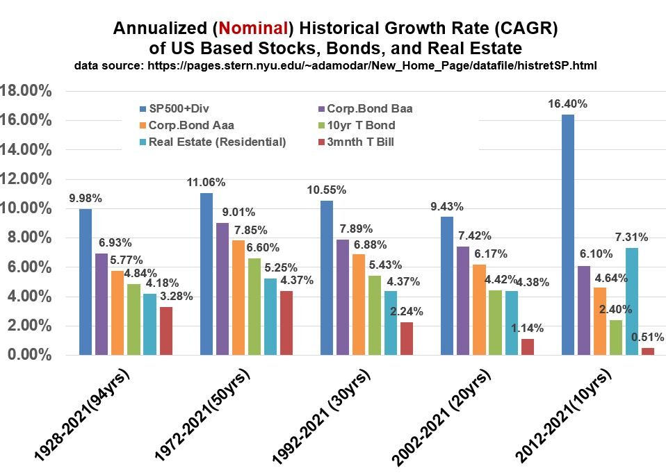
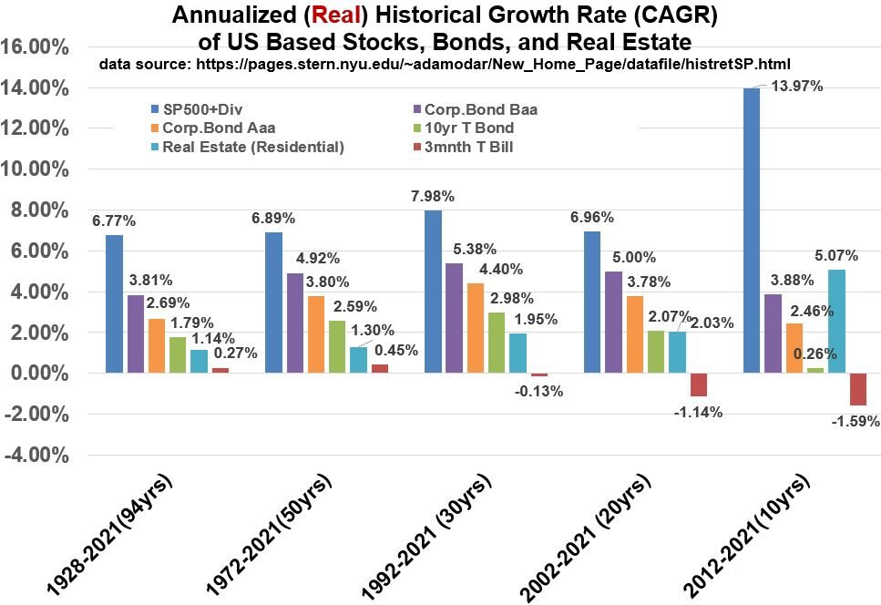
Graphs 1 and 2 below , using the data collected and computed (mostly) by Aswath Damodaran , show the historical nominal and real returns of US Stocks, US Bonds, and US Residential Real Estate.
Note that Real Estate returns are for residential homes (data is from Robert Shiller’s on line data).
You can download the excel spreadsheet I used via this link: Spreadsheet using Damodaran Data
Graphs 1 and 2 show that stocks have outperformed the other standard investments over time (Last 94, 50 and 10 years).
There is evidence that Real Estate Investment Trusts (representing a wider swath of different types of real estate including equity and mortgage REITs) have produced higher historical returns than Residential Real Estate.
I used NAREIT REIT Index data to compute the following historical returns for REITs (the inflation rate used was a singular composite estimate).
- Last 50 years to Oct. 2022: Nominal Return (9.97%), Real Return(5.85%)
- Last 20 years to Oct. 2022: Nominal Return (10.77%), Real Return(6.62%)
- Last 10 years to Oct. 2022: Nominal Return (12.03%), Real Return(7.83%)
You can download the excel spreadsheet I used via this link: Spreadsheet using REIT returns from NAREIT
As you look at Graphs 1 and 2, remember that Real Returns are Nominal Returns (Actual Returns) that have been adjusted for inflation.
See my blog “Inflation Rates, Real Returns, and Nominal Returns” for more details or see Appendix 3 for a summary of the mathematical relationship.
Graph_1: Annualized Nominal Historical Returns for US based Stocks, Bonds, and Residential Real Estate.
Graph_2: Annualized Real Historical Returns for US based Stocks, Bonds, and Residential Real Estate.
Graph 1 and 2 and NAREIT data Observations
- Stocks perform the best over 10,20,30,50, and 94 year periods
- Corporate bonds outperform government bonds
- Residential Housing returns have been comparable or worse than bonds except in the last 10 years where they have outperformed all bonds
- According to NAREIT data, their composite REIT index performance has been competitive with stocks in the last 10,20, and 50 year periods.
International Stock/Bonds Historical Returns (Credit Suisse Data)
Recall from my Investment Asset Classes post (See the SIFMA data), that International stocks and fixed income make up about 58% and 61.4% (respectively) of total world market capitalization!
These are massive and liquid markets (In 2021: 126.9 Trillion USD for fixed income and 124.4 Trillion USD for stocks) , so we should understand how US and International stocks and bonds have performed relative to each other through the years.
Note that fixed income also includes instruments like mortgage backed securities but the majority of the capitalization is in government and corporate bonds.
In the previous section we summarized the historical return data for US stocks and bonds.
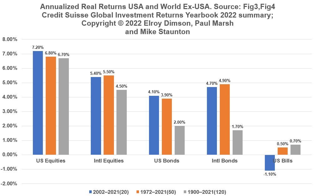
We will use data from the Credit Suisse Global Investment Returns Yearbook 2022 Summary .pdf document to describe the historical returns of international stocks and bonds.
See Graph 3 below.
Graph 3: Historical Annualized Real Returns Stocks and Bonds (from Credit Suisse Global Investment Returns Yearbook 2022)
Highly Recommended Video by Credit Suisse on Historical Stock Returns
General Observations of Credit Suisse Performance Data Through 2021
- Stocks outperform bonds
- US equities beat out international equities (by a range of about 1.3 to 2.2 % absolute)
- International Bonds beat out (by .6 to 1% abs.) US Bonds over 20 and 50 year periods and US Bonds beat International bonds by .3% abs. over the full 120 year period. Credit Suisse points out that these bonds are long term treasury type bonds.
Asset Classes: Annualized Real Returns
Stocks perform better than other investments over time.
The remainder of this blog will mostly be dedicated to analyzing the returns of 46 ETFs and Mutual Funds that represent various asset classes (a few represent the same asset as well).
The raw return data was obtained from Lazyportfolioetf.com/ (most) and Themeasureofaplan.com.
In this section we’ll compare annual stock returns to other core and alternative assets.
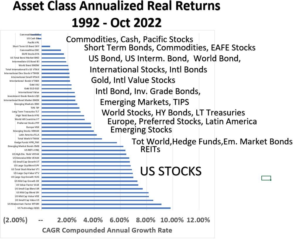
Graph 4 below shows annualized Real (adjusted for inflation) Returns for 46 funds (mostly ETFs and Mutual Funds) which represent various asset classes.
For completeness I included a few funds that had the same investment theme (although their performance wasn’t exactly the same).
I’ve annotated in larger font the general asset class categories.
For example, the bottom 15 in the graph are all different types of US stocks. You can access the spreadsheet I used if you want to see all the details:
Download Asset Class Performance Spreadsheet here
Although some of the funds have data going back to 1972, my calculations are based on the period starting from 1992, as several of the funds did not have information before this year.
So, to do my comparative analysis I stuck with this 30 year period (including year 2022 through end of October).
Take a look at the general trends you might see and then continue below to read my observations.
Graph 4: Annualized Real (Inflation Adjusted) Returns of Various Asset Classes (1992 to Oct. 2022)
Graph_4 Observations
- Lets look at the graph in broad sections: US stocks out perform the other investments shown
- REITs and Non US stocks represent a second tranche of assets that follow US stocks in performance
- Bonds and Cash are the third tranche and follow international stocks in performance
- Gold and Commodities lie in that third tranche as well
- Hedge funds are close to REITs in performance
Historical Performance Caveat
Remember that this is just a snapshot of historical performance.
If you pick longer periods, the numbers will probably shift but perhaps we would expect the same general shape.
Also, this is past performance, so future performance might not be the same.
Economic and political events always muddy the water so future performance of various assets will be affected by these things as well
For example, inflation is now at near historical highs, so certain investments that benefit from increased pricing [e.g. commodities] or that are defensive [non cyclical stocks] might do better than others in the near term.
Asset Class Periodic Return Table Concept
Investment returns of asset classes are often shown in a periodic table format (see the Callan Periodic Table of Investment Returns as an example) .
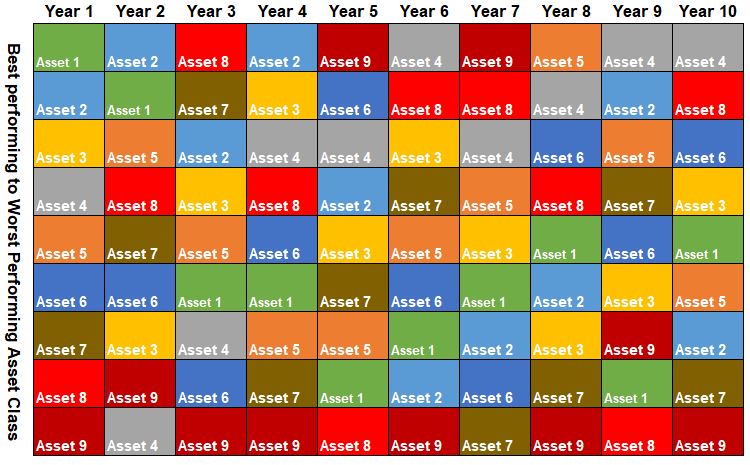
The basic look of this performance chart is shown in Graph 5 below.
Each column represents a certain year (year 10 being the most recent typically).
Each year (column) is sorted by annual returns for that year with the highest returning asset being placed at the top.
The main observation from these graphics is that asset class rankings vary from year to year and appear almost random.
For example, follow Asset 8 from left to right through the years.
Graph 5: Generic Periodic Table of Investment Returns
We should expect the same behavior if we generate a periodic returns graph for the 46 funds mentioned in the previous section.
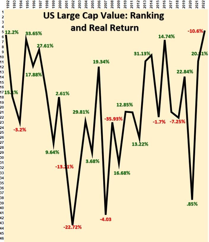
Graph 6 below shows the ranked returns of the US Large Cap Value Stocks asset class. Sure enough, it bounces around quite a bit from year to year with a pretty wide spread of rankings/returns.
Graph 6: Periodic Table of Investment Returns for US Large Cap Value Stocks (1992 – Oct 2022)
Asset Class Ranked Returns Periodic Table
If we remove the yellow cover in Graph 6 above, we get Graph 7 below where we can see the full periodic investment return table for the 46 funds that represent various asset classes (we’ve kept the black performance line for the Large Cap Value Stocks asset class).
Graph 7: Periodic Return Table for 46 Asset Class Funds (1992 to October 2022)
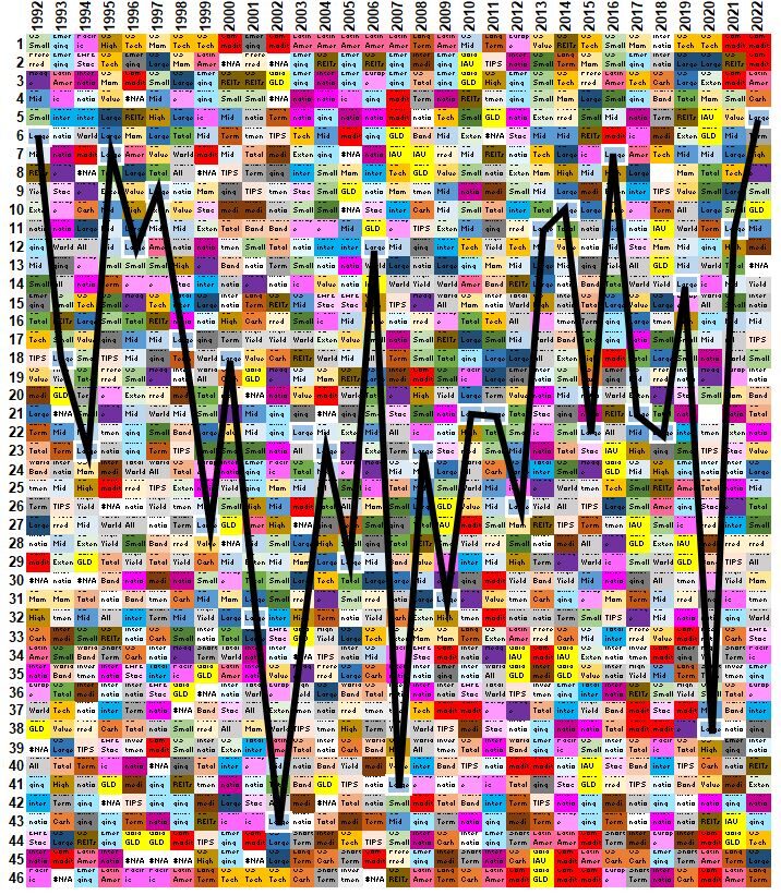
So, yes, same result.
What you see is ,essentially, a randomly colored quilt-like graphic that tells you, from year to year, individual select asset classes rank randomly.
The variation in performance between the best and worst performing asset each year is pretty big.
The average ‘max – min’ value if I use all the data is about 62% (absolute)!
If I take out a few very large difference years, the number drops to about 55%.
If I look at the last 10 years (ending in 2021) the average ‘max – min’ performance is about 44%!
The number is big no matter how you look at it.
Refer to the following links for some additional information on Periodic return charts:
Diversify!
Because of this potential extreme price/performance volatility, and our inability to tell which investment class will do well in any year, it is wise to have a properly diversified investment portfolio.
Diversification means that our portfolios should contain more than one investment type, but that’s not sufficient.
A properly diversified portfolio also needs to have constituents that are not strongly correlated;
- that is , when one constituent goes up or down, the other doesn’t change as much (not strongly positively correlated) or even changes in the opposite direction (negatively correlated).
The next section explores performance correlations among our 46 funds.
Asset Class Correlation Table
I used the Correl and Pearson excel worksheet functions to calculate correlation coefficients for the returns of all 46 funds from 1992 to October 2022.
The calculation takes all pairs of funds and determines a value between -1 to + 1 indicating the degree of correlation.
A high value, lets say .8 to 1 means high correlation (i.e. they move together).
A number close to zero indicates no correlation, and negative values indicate negative correlation (i.e. as one increases, the other decreases).
Graph 8 below is the correlation matrix output from excel. All 46 funds are listed on both the x and y axes. Each column and row intersection indicates the correlation coefficient for that pair.
- The hypotenuse (the long side) of the triangle shape represents a perfect correlation of 1 since the pairs consist of the identical asset.
- I’ve grouped the asset classes into general categories (US Stocks, International Stocks, Bonds, Alternatives)
- Each intersection (cell) is color coded.
- Color ranges from Green to Yellow to Red where Green is the least correlated or negatively correlated and red indicates the highest correlation.
- The sections inside the big triangle shape that have blue line boundaries, represent the kinds of pairs:
- S+S = Stocks vs Stocks,
- S+B = Stocks vs Bonds,
- S+A = Stocks vs Alternatives,
- B+B = Bonds vs Bonds,
- B + A = Bonds vs Alternatives, and
- A + A = Alternatives vs Alternatives.
Notice the lighter, least correlated or negatively correlated areas.
We would like to have a diversified portfolio with investments that are not very correlated or even negatively correlated, so we can get off-setting movements in performance that in total will hopefully mitigate or reduce the severity of any individual investment downturn (and upturn, unfortunately).
Graph 8: Correlation Coefficients Among 46 Different Funds 1992 to Oct 2022
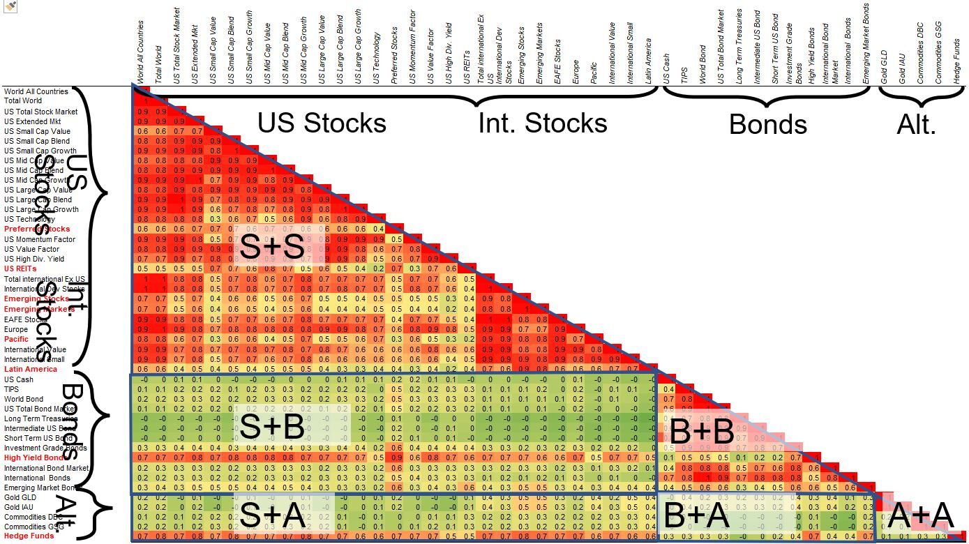
Some Graph 8 Observations
- In the Stock fund universe (S+S), you can see pockets of low correlation. For example, Preferred Stocks and US REITs seem to have lower correlations with other stock types.
- Some International Stocks have lower correlations with US stocks.
- Notice the low and even negative correlations various Bonds have with Stocks. Same goes for Alternative Funds.
- Commodities and Gold have very low correlations to Stocks.
- Bonds and Alternatives also show low to negative correlations
Since stocks and bonds have low and even negative correlations, they typically make up some portion of an ideal investment portfolio mix.
Yes, you give up some returns with bonds, but you also reduce your overall portfolio price/performance risk. Lets back up this statement with Graphs 9 and 10 below.
Effects of Bonds on a Bond/Stock Portfolio Mix
Recall my post on estimated returns for different mixes of stocks and bonds (here).
One of the graphs from this post is shown below.
Notice in Graph 9 how the min and max lines widen and the CAGR and Standard Deviation increase with increasing Stock allocation.
By adding Bonds to the mix (going right to left), the Standard Deviation (volatility or price risk) is dampened but so are returns.
Graph 9: Expected Returns Graph for Various Mixes of Stocks and Bonds.
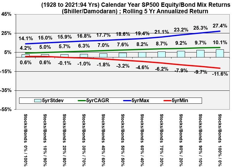
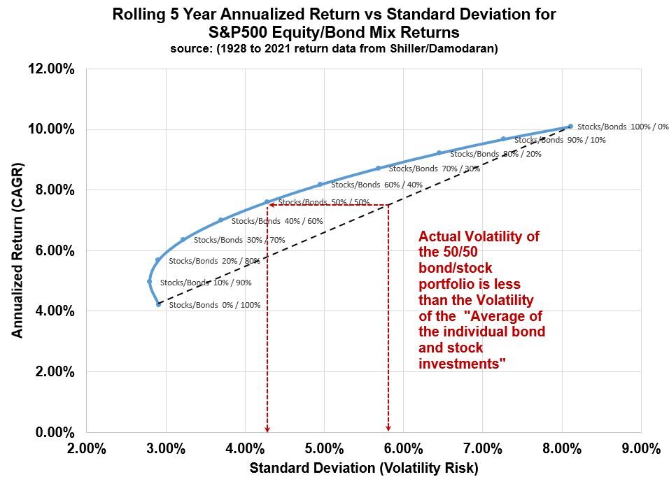
We can use the CAGR and Standard Deviation values shown in Graph 9 and plot them in a scatter diagram as shown in Graph 10 below.
Notice in Graph 10 how:
- the Standard Deviation (price/performance volatility) drops as the Bond component of the mixture increases (but returns drop as well).
- how a 20/80 mix of Stocks/Bonds has the same risk but has a better return than a 100% percent bond portfolio.
- the average volatility of the individual investments (shown on the black dotted line) is greater than the volatility of the actual bond/stock portfolio (see example with 50/50 portfolio shown in red dotted lines)
Graph 10: CAGR vs Standard Deviation Scatter Chart for Different Mixes of Stocks and Bonds
Assets Returns vs Standard Deviation
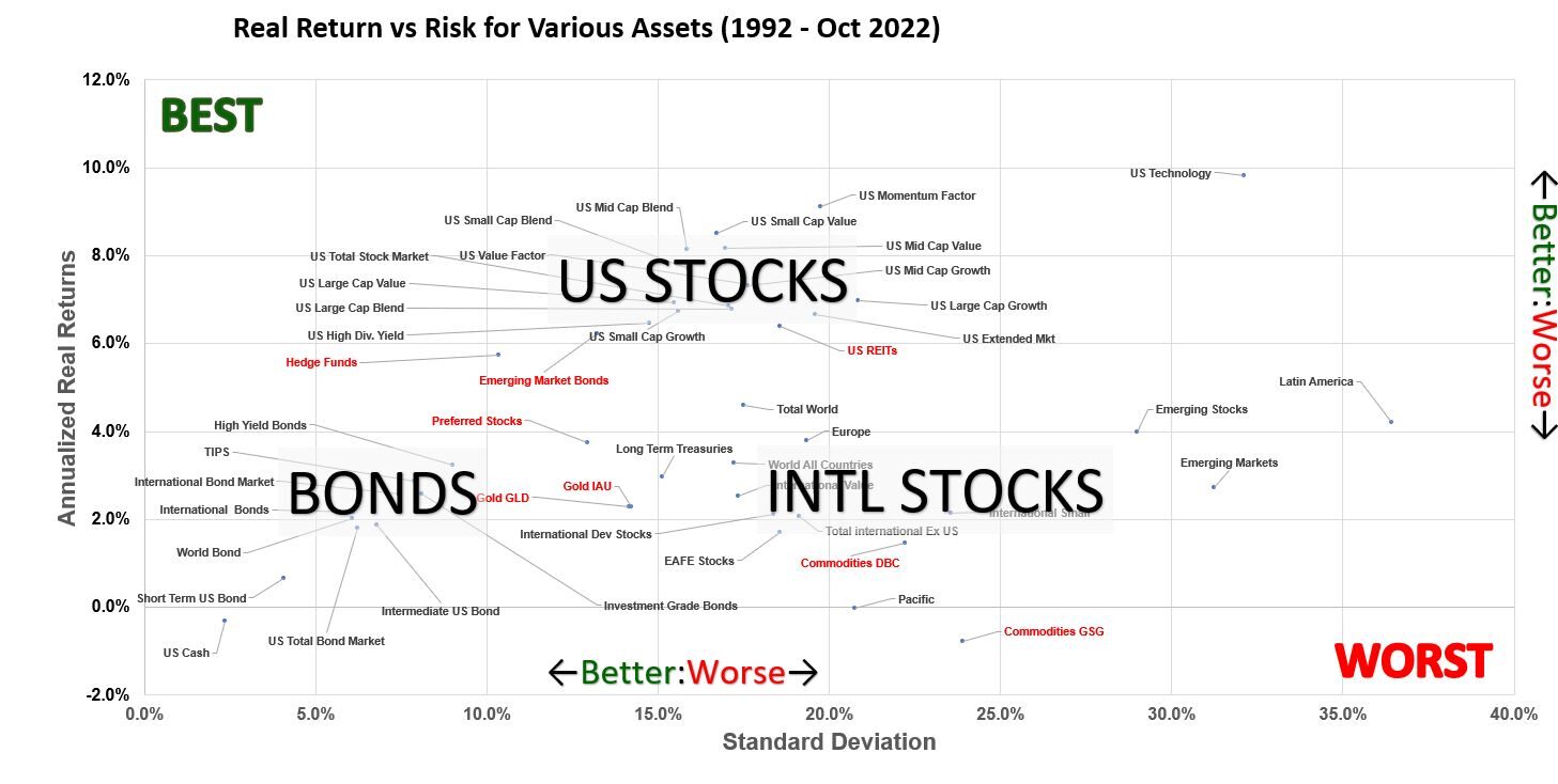
In Graph 11, I’ve plotted the Annualized Real Return vs the Risk (Volatility or Standard Deviation) for the 46 funds representing various asset classes.
This graph gives you a flavor , over the last 30 years, how the returns have been for each of the funds compared to the volatility.
- Ideally, the closer to the top left corner of the graph, the better.
- Conversely, you want to stay as far away from the lower right corner as you can.
- For any vertical line, the higher the better (higher return for the same risk)
- For any horizontal line, the more left , the better (lower risk for same return)
Graph 11: CAGR vs Volatility for Various Asset Classes (1992-Oct 2022)
Graph 11 “Broad Brush” Observations (1992 to Oct 2022 period):
- US Stocks (and REITs) returns are highest, with higher volatility as expected
- Bond returns are lower and have less volatility. Recall from Graph 8 that Bonds are not very correlated to stocks. The benefit of mixing bonds with stocks is that overall volatility is reduced.
- Gold and Commodities have not performed as well as stocks. From Graph 8 we see they are less correlated to stocks as well.
- International Stocks return less than US stocks with the same volatility (with some exceptions)
Beware as usual that this data represents the last 30 years. Other periods or subperiods might look a little different. Also, this historical data does not guarantee the same performance going forward.
Asset Returns vs Sharpe Ratio
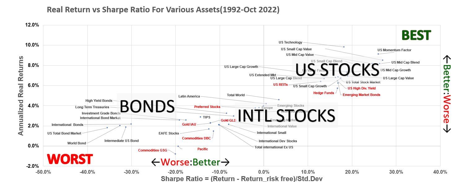
Graph 12 below is a variation of Graph 11 where we plot Returns against the Sharpe Ratio which is a measure of return efficiency = (Actual Return – Risk Free Return)/(Standard Deviation).
The higher the Sharpe ratio, the more efficient the investment.
The top right corner of the graph is the ideal best, and the bottom left is the ideal worst.
Graph 12: Annualized Real Returns vs Sharpe Ratio for Various Assets (1992-OCt 2022)
Graph 12 “Broad Brush” Observations for 1990 to October 2021 Period
- US stocks have been the most efficient investment
US Stock Performance for Various Capitalizations and Style
Lets switch gears a little and take a look at how different types of US stock categories have performed relative to each other.
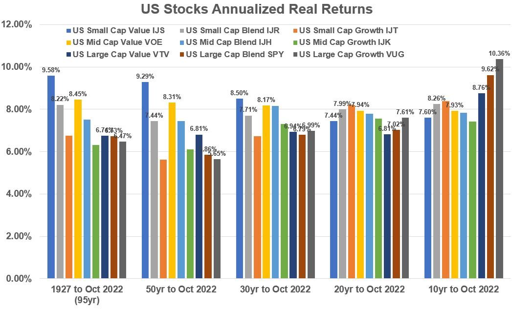
Graph 13 below shows annualized historical returns for various US stock categories of market capitalization (size) and style (growth vs value). See my blog on Investment Asset Classes or my Financial Glossary for definitions of size and style.
Go to Appendix 5 for a review of the definitions for Market Capitalizations and growth/value style first.
Historical Performance of US Stock category combinations of Size and Style
Graph 13 shows historical returns for 9 different categories of US stock sizes (Market Capitalization) and style (Growth vs Value).
They are represented by various ETFs. We see that:
- For 30 years and longer periods, US Small Cap Value stocks have performed the best: 95yr(9.58%), 50yr(9.29%), 30yr(8.5%)
- For the last 20 years, US Small Cap Growth stocks have performed the best: 20yr(7.99%)
- For the last 10 years, US Large Caps have performed the best: Value(8.76%), Blend(9.62%), Growth(10.36%)
Graph 13: Historical Annualized Real Returns: US Stock Size/Style Combinations
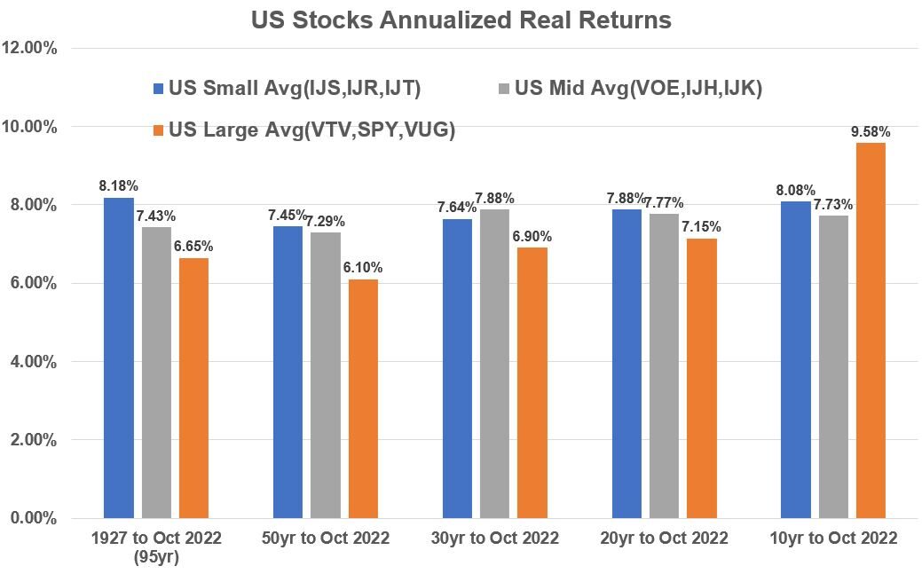
If we average the 9 categories into three categories based on size we get Graph 14.
- In the long term, Small Cap stocks have outperformed.
- For 20 to 50 years periods, Small Caps and Mid Caps outperformed.
- For the last 10 years, Large Cap Stocks have outperformed.
Graph 14: Historical Annualized Real Returns: US Stock Size/Style Combination Averages
General Observations on US Stock Performance
- Past performance cant tell you what future performance will be.
- All US stock categories have performed pretty well over time relative to alternative investments.
- Small and Mid Cap stocks have performed more “consistently” over time
US vs International Stock Performance
Recall from my Investment Asset Classes post (See the SIFMA data), that International stocks make up about 58% of total world market capitalization (~72 Trillion USD)!
Let’s see how they have performed relative to US stocks.
Correlation of US Stocks to International Stocks
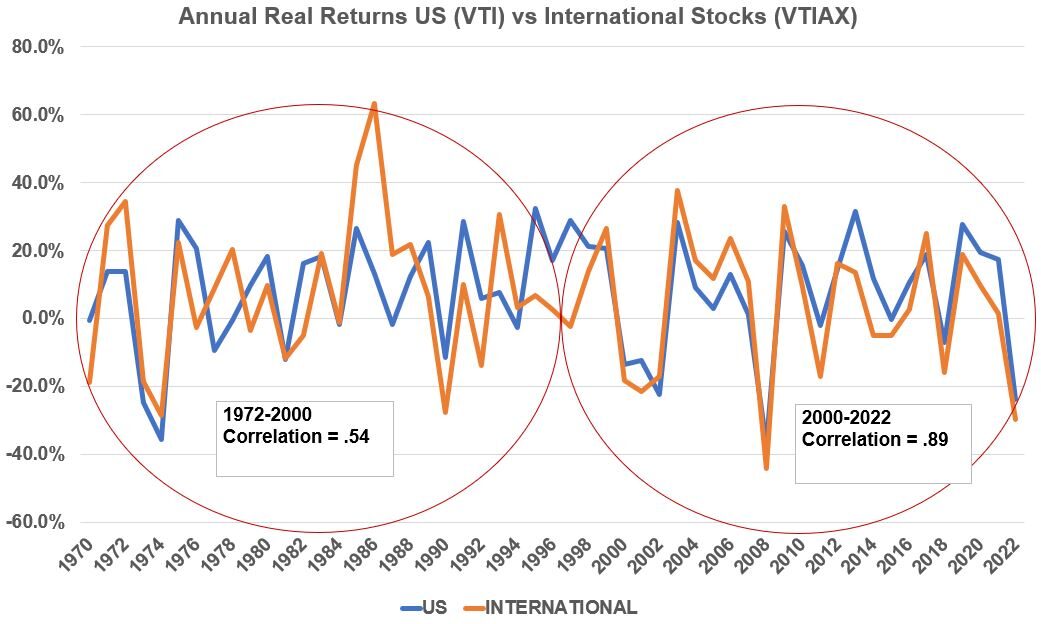
Graph 15 compares the annual real returns between US (using ETF VTI) and International Stocks (using Mutual Fund VTIAX).
Just looking at the line graph it seems that the lines move more in “sync” with each other in more recent years.
If we compute a correlation coefficient for an early period and more recent period as shown in Graph 15, notice that the correlation has improved from .54 to .89 in more recent years (a 65% increase in correlation).
Recall that the closer the correlation coefficient is to one, the more exactly correlated two variables are.
Perhaps the fact that our world has become increasingly connected with respect to market information and pricing is one explanation for this.
Graph 15: Annual Real Returns US (VTI) vs International (VTIAX) Stocks
Smoothed Out Performance Comparison between VTI and VTIAX
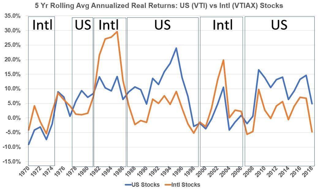
Graph 16 shows annualized rolling 5 year returns for US stocks versus International stocks using VTI and VTIAX as proxies.
There are long periods where one asset outperforms the other asset.
It’s a bit subtle but it seems , visually, that US stocks beat international stocks over the long term, but let’s look at what different annualized period returns show in Graph 17.
Graph 16: Annualized 5 year Rolling Real Returns US (VTI) vs International (VTIAX) Stocks
Annualized Historical Performance Comparison between VTI and VTIAX
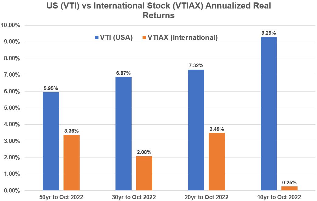
Graph 17 shows that over 10 , 20, 30, and 50 year periods, US Stocks beat International Stocks (if we use VTI and VTIAX as the proxies).
We saw in previous graphs (Graphs 3,4, 11,12) that this was the case.
Please note that the Credit Suisse Data is based on returns through 2021 whereas the data set I am using extends through October 2022.
Year 2022 has been a Bear Market and the large negative returns will cause a mismatch when trying to compare the exact numbers.
We can still accept the general conclusion that US stocks have (in general) outperformed International stocks.
Graph 17: Historical Annualized Real Stock Returns: US(VTI) vs International(VTIAX)
General Observations
- US Stocks have outperformed International Stocks.
- Correlations between US Stocks and International Stocks have increased closer to one (more correlated) in recent years.
Bond Performance
Recall from my Investment Asset Classes post (See the SIFMA data), that fixed income investments make up about 61.4% of total world market capitalization (~79 Trillion USD!).
Note that fixed income also includes instruments like mortgage backed securities but the majority of the capitalization is in government and corporate bonds.
So, let’s take a look at bond performance.
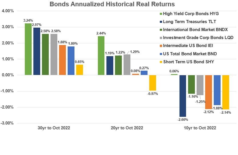
Graph 18 shows various bond historical real returns.
Graph 18: Bonds Historical Annualized Real Returns
General Observations on Bond Performance
- In the last 20 and 30 year periods, bond returns have ranged between -1% and 3.2%. All yields are negative or essentially zero in the last 10 years.
- The main advantage of bonds is they are not correlated strongly to stocks and therefore reduce the volatility of the overall investment when mixed with stocks.
- US High Corporate Bond yields have done the best in the last 20 and 30 year periods (followed by US Long Term Treasuries).
- International bond yields (using composite BNDX) have outperformed US bond yields (using composite BND).
US vs International Bond Performance
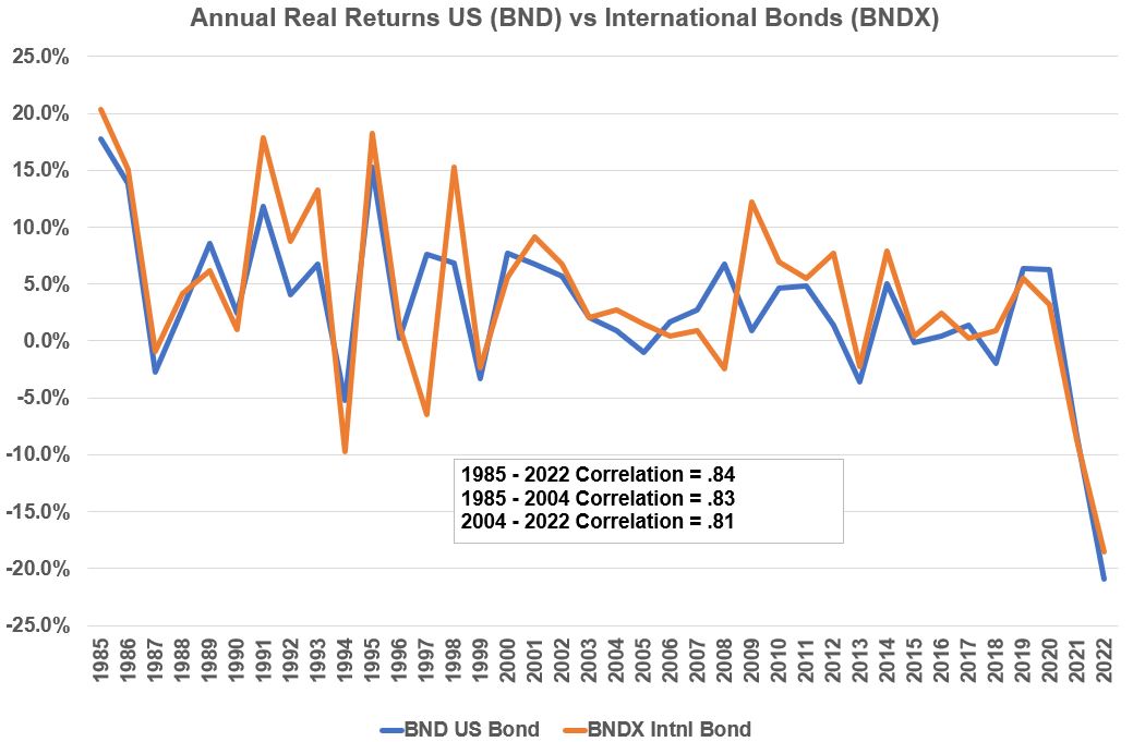
Let’s take a closer look at US vs International Bond Performance using ETFs BND and BNDX as proxies .
Graph 19 shows a line graph of US vs International Bond real annual returns. They are pretty closely correlated (Correlation of 1 is perfect correlation).
Graph_19: Annual Real Bond Returns: US(BND) vs International(BNDX)
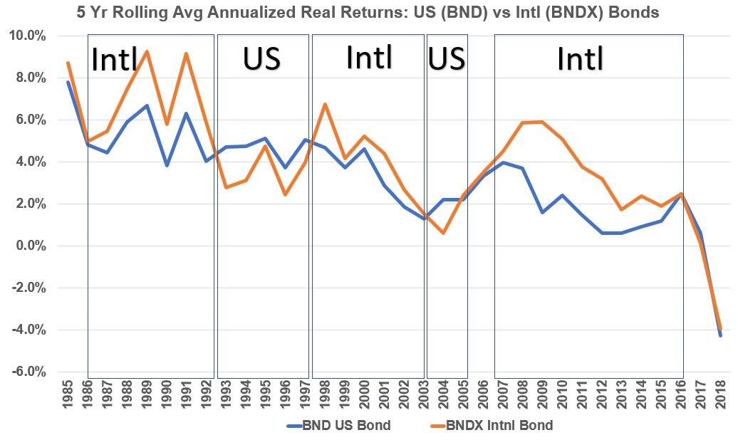
Graph 20 plots rolling 5 year real returns for US vs International Bonds (using ETFs BND and BNTX as proxies). Just like for stocks, we see long periods where one investment beats the other.
Graph 20: Annualized 5 Yr Rolling Real Bond Returns: US(BND) vs International(BNDX)
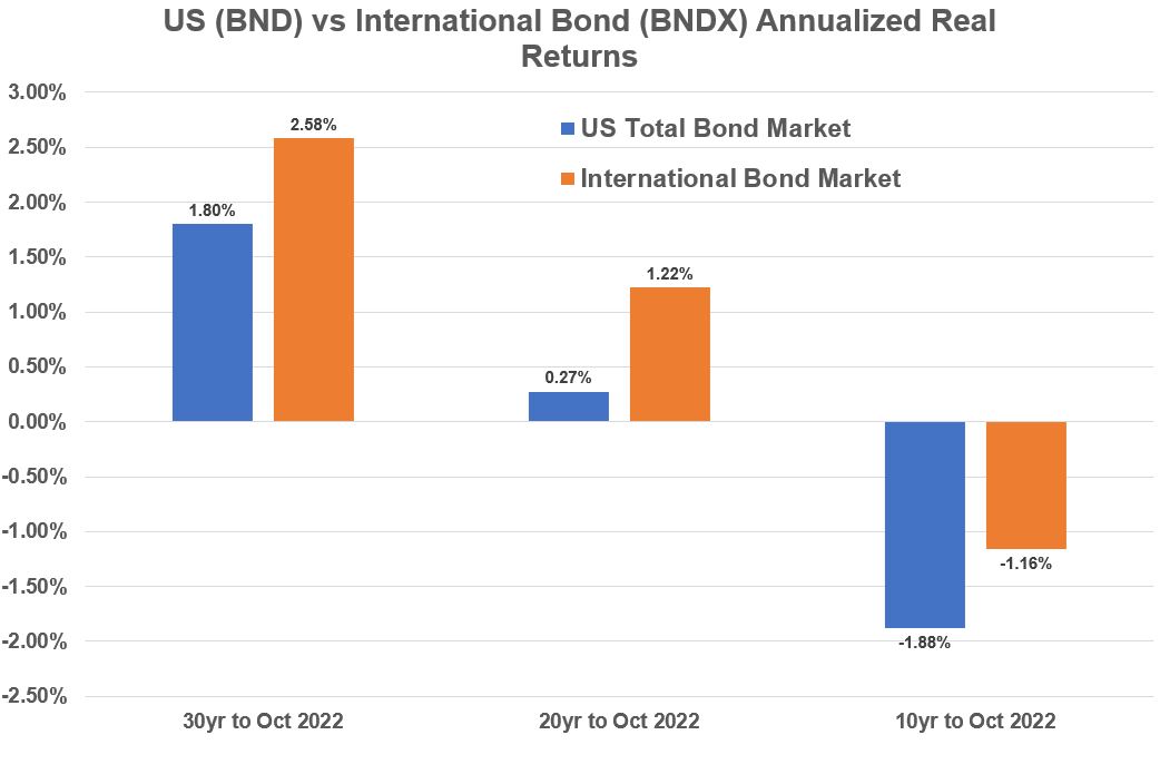
Graph_21 plots 10, 20, and 30 year annualized real returns for US and International stocks (BND vs BNDX). The international bond fund does better in each time frame. We plotted these in Graph 18 as well.
Graph 21: Historical Annualized Real Bond Returns: US(BND) vs International(BNDX)
General Observations on US vs International Bond Performance
- International Bonds as represented by BNDX outperform US Bonds as represented by BND for 10,20, and 30 year periods.
- This is consistent (but not equivalent to) with the Credit Suisse (CS) data in Graph 3.
Note 1 : The CS International Bond returns represent international long term bonds which is not the same as BNDX so their returns wont match.
Note 2: BNDX and BND are composite investments (invest in a mix of different bond types).
Conclusions – Asset Class Performance
- Through various time periods, stocks outperform bonds and other asset classes.
- US stocks outperform international stocks. In recent years they have become more correlated.
- US Corporate bonds and US and International Long Term Treasuries have produced the best long term bond returns.
- US and International Bonds show high correlation (above .8)
- Bonds (and commodities) have low correlations to stocks. Mixing low correlation assets together reduces the overall volatility of the investment
- In the US stock world, Small Cap Value stocks have outperformed over the long term. In the last 10 years, large cap stocks have been the best performers. Tilting an investment portfolio towards a specific stock cap/style category has been used as an investment strategy.
- Past performance does not predict future performance. Don’t get too fixated on past performance numbers and expect them to be the same in the future. Quote: “It has been said that history repeats itself. This is perhaps not quite correct; it merely rhymes.” – 1965 by Theodor Reik.
Appendix 1 – Listing and Sources of Asset Class Proxies
source_1: http://www.lazyportfolioetf.com/
source_2: https://themeasureofaplan.com/investment-returns-by-asset-class/
source_3: https://www.hfr.com/family-indices/hfri#tab-HFRI
| Source | # | ETF or Mutual Fund | Ticker |
| source 1 | 1 | World All Countries | VT |
| source 2 | 2 | Total World | VTWAX |
| source 1 | 3 | US Total Stock Market | VTI |
| source 2 | 4 | US Extended Mkt | VEXAX |
| source 1 | 5 | US Small Cap Value | IJS |
| source 1 | 6 | US Small Cap Blend | IJR |
| source 1 | 7 | US Small Cap Growth | IJT |
| source 1 | 8 | US Mid Cap Value | VOE |
| source 1 | 9 | US Mid Cap Blend | IJH |
| source 1 | 10 | US Mid Cap Growth | IJK |
| source 1 | 11 | US Large Cap Value | VTV |
| source 1 | 12 | US Large Cap Blend | SPY |
| source 1 | 13 | US Large Cap Growth | VUG |
| source 1 | 14 | US Technology | QQQ |
| source 1 | 15 | Preferred Stocks | PFF |
| source 2 | 16 | US Momentum Factor | MTUM |
| source 2 | 17 | US Value Factor | VLUE |
| source 2 | 18 | US High Div. Yield | VHYAX |
| source 1 | 19 | US REITs | VNQ |
| source 2 | 20 | Total international Ex US | VTIAX |
| source 2 | 21 | International Dev Stocks | VTMGX |
| source 2 | 22 | Emerging Stocks | VEMAX |
| source 1 | 23 | Emerging Markets | EEM |
| source 1 | 24 | EAFE Stocks | EFA |
| source 1 | 25 | Europe | VGK |
| source 1 | 26 | Pacific | VPL |
| source 2 | 27 | International Value | EFV |
| source 2 | 28 | International Small | VFSAX |
| source 1 | 29 | Latin America | FLLA |
| source 1 | 30 | US Cash | BIL |
| source 1 | 31 | TIPS | TIP |
| source 2 | 32 | World Bond | BNDW |
| source 1 | 33 | US Total Bond Market | BND |
| source 1 | 34 | Long Term Treasuries | TLT |
| source 2 | 35 | Intermediate US Bond | IEI |
| source 2 | 36 | Short Term US Bond | SHY |
| source 1 | 37 | Investment Grade Bonds | LQD |
| source 1 | 38 | High Yield Bonds | HYG |
| source 1 | 39 | International Bond Market | BNDX |
| source 2 | 40 | International Bonds | VTABX |
| source 1 | 41 | Emerging Market Bonds | EMB |
| source 1 | 42 | Gold GLD | GLD |
| source 1 | 43 | Gold IAU | IAU |
| source 1 | 44 | Commodities DBC | DBC |
| source 1 | 45 | Commodities GSG | GSG |
| source 3 | 46 | Hedge Funds | HFRI_FWI |
| source 2 | Inflation US CPI Data |
Appendix 2: Asset Class Annualized Real Returns: 1992 to October 2022
| US Technology QQQ | 9.83% |
| US Momentum Factor MTUM | 9.12% |
| US Small Cap Value IJS | 8.50% |
| US Mid Cap Value VOE | 8.17% |
| US Mid Cap Blend IJH | 8.16% |
| US Small Cap Blend IJR | 7.71% |
| US Value Factor VLUE | 7.38% |
| US Mid Cap Growth IJK | 7.31% |
| US Large Cap Growth VUG | 6.99% |
| US Large Cap Value VTV | 6.94% |
| US Total Stock Market VTI | 6.87% |
| US Large Cap Blend SPY | 6.79% |
| US Small Cap Growth IJT | 6.73% |
| US Extended Mkt VEXAX | 6.67% |
| US High Div. Yield VHYAX | 6.46% |
| US REITs VNQ | 6.39% |
| Emerging Market Bonds EMB | 6.23% |
| Hedge Funds HFRI_FWI | 5.73% |
| Total World VTWAX | 4.61% |
| Latin America FLLA | 4.20% |
| Emerging Stocks VEMAX | 3.98% |
| Europe VGK | 3.80% |
| Preferred Stocks PFF | 3.75% |
| World All Countries VT | 3.29% |
| High Yield Bonds HYG | 3.24% |
| Long Term Treasuries TLT | 2.97% |
| TIPS TIP | 2.87% |
| Emerging Markets EEM | 2.72% |
| International Bond Market BNDX | 2.58% |
| Investment Grade Bonds LQD | 2.58% |
| International Value | 2.54% |
| Gold GLD GLD | 2.29% |
| Gold IAU | 2.28% |
| International Bonds VTABX | 2.17% |
| International Small VFSAX | 2.14% |
| International Dev Stocks VTMGX | 2.12% |
| Total international Ex US VTIAX | 2.08% |
| World Bond BNDW | 2.03% |
| Intermediate US Bond IEI | 1.88% |
| US Total Bond Market BND | 1.80% |
| EAFE Stocks EFA | 1.70% |
| Commodities DBC | 1.47% |
| Short Term US Bond SHY | 0.65% |
| Pacific VPL | -0.02% |
| US Cash BIL | -0.31% |
| Commodities GSG | -0.79% |
Appendix 3: Real Return and Nominal Return Relationship
Primary Relationships between Inflation, Real, and Nominal Rates
Ri = [(1+RN)/(1+RR)] – 1
RR = [(1+RN)/(1+Ri)] – 1 = (RN–Ri)/(1+Ri)
RN = [(1+Ri)(1+RR)] – 1
Where:
- FV = Future Value
- PV = Present Value
- n = number of years
- RR = Real Return (does not include inflation)
- Ri = Inflation rate
- RN = Nominal Return (the actual return, which includes inflation)
See my blog “Inflation Rates, Real Returns, and Nominal Returns” for more details.
Appendix 4: Investment Fund Assumptions and Descriptions
Aswath Damodaran Stock and Bond Data
- Stocks as S&P 500 with Dividends Reinvested
- 3 month Treasury Bill
- 10 year Treasury Bond
- Corporate US Bonds Baa
- Residential Real Estate Index (Case-Shiller)
Credit Suisse Global Investment Returns Yearbook Data (all assets assume reinvested income)
- Equities
- Long-term government bonds
- Treasury Bills.
Note: I was unable to access the full credit Suisse report (only a summary).
The summary does not exactly describe what proxies or methods were used to compute stock and bond returns (except for T bills which are ,well, T Bills).
Vanguard ETFs: VTI, VTIAX,BND,BNDX,VOE, VTV,VUG
VTI Vanguard Total Stock Market ETF
- Seeks to track the performance of the CRSP US Total Market Index.
- Large-, mid-, and small-cap equity diversified across growth and value styles.
- Employs a passively managed, index-sampling strategy.
VTIAX Vanguard Total International Stock Index Fund
This fund offers investors a low cost way to gain equity exposure to both developed and emerging international economies.
The fund tracks stock markets all over the globe, with the exception of the United States.
Because it invests in non-U.S. stocks, including those in developed and emerging markets, the fund can be more volatile than a domestic fund. Long-term investors who want to add a diversified international equity position to their portfolio might want to consider this fund as an option.
BND Vanguard Total Bond Market ETF
The fund’s investment objective is to seek to track the performance of a broad, market-weighted bond index. The fund generally:
- Provides broad exposure to the taxable investment-grade U.S. dollar-denominated bond market, excluding inflation-protected and tax-exempt bonds.
- Offers relatively high potential for investment income; share value tends to rise and fall modestly.
- May be more appropriate for medium- or long-term goals where you’re looking for a reliable income stream.
- Is appropriate for diversifying the risks of stocks in a portfolio.
BNDX Vanguard Total International Bond ETF
- Seeks to track the performance of the Bloomberg Global Aggregate ex-USD Float Adjusted RIC Capped Index (USD Hedged).
- Employs hedging strategies that seek to mitigate uncertainty in exchange rates.
- Passively managed, using index sampling.
- Fund remains fully invested.
- Broad exposure across major bond markets outside of the United States.
- Low expenses minimize net tracking error.
VOE Vanguard Mid-Cap Value ETF
- Seeks to track the performance of the CRSP US Mid Cap Value Index, which measures the investment return of mid-capitalization value stocks.
- Provides a convenient way to match the performance of a diversified group of midsize value companies.
- Follows a passively managed, full-replication approach.
VTV Vanguard Value ETF
- Seeks to track the performance of the CRSP US Large Cap Value Index, which measures the investment return of large-capitalization value stocks.
- Provides a convenient way to match the performance of many of the nation’s largest value stocks.
- Follows a passively managed, full-replication approach.
VUG Vanguard Growth ETF
- Seeks to track the performance of the CRSP US Large Cap Growth Index.
- Provides a convenient way to match the performance of many of the nation’s largest growth stocks.
- Follows a passively managed, full-replication approach.
Ishares ETFs: IJS,IJR,IJT,IJH,IJK
IJS iShares S&P Small-Cap 600 Value ETF
The iShares S&P Small-Cap 600 Value ETF seeks to track the investment results of an index composed of small-capitalization U.S. equities that exhibit value characteristics.
IJR iShares Core S&P Small-Cap ETF
The iShares Core S&P Small-Cap ETF seeks to track the investment results of an index composed of small-capitalization U.S. equities.
IJT iShares S&P Small-Cap 600 Growth ETF
The iShares S&P Small-Cap 600 Growth ETF seeks to track the investment results of an index composed of small-capitalization U.S. equities that exhibit growth characteristics.
IJH iShares Core S&P Mid-Cap ETF
The iShares Core S&P Mid-Cap ETF seeks to track the investment results of an index composed of mid-capitalization U.S. equities.
IJK iShares S&P Mid-Cap 400 Growth ETF
The iShares S&P Mid-Cap 400 Growth ETF seeks to track the investment results of an index composed of mid-capitalization U.S. equities that exhibit growth characteristics.
State Street Global Advisors ETFs: SPY
SPY SPDR® S&P 500® ETF Trust
The SPDR® S&P 500® ETF Trust seeks to provide investment results that, before expenses, correspond generally to the price and yield performance of the S&P 500® Index (the “Index”).
The S&P 500 Index is a diversified large cap U.S. index that holds companies across all eleven GICS sectors
Appendix 5: US Stock Size and Style Definitions
Market Capitalization Definitions
The Morningstar definitions for stock size are based on a cumulative capitalization scale of all stocks in a particular country or geographic area (style zone).
- Giant-Cap Stocks (Top 40% of the cumulative market capitalization)
- Large-Cap Stocks (Top 70% of the cumulative market capitalization).
- Mid-Cap (70%-90% of the cumulative market capitalization).
- Small-Cap (90%-97% of the cumulative market capitalization)
- Micro-Cap (97%-100% of the cumulative market capitalization)
- Nano Cap Stock (less than $50 Million Market Cap)
The following value ranges wont match exactly with the categories defined above but they are good for giving you a sense of the order of magnitude
- Micro Cap Stock ($50 to $250 Million Market Cap)
- Small Cap Stock ($250 Million to $2 Billion Market Cap)
- Mid Cap Stock ($2 Billion to $10 Billion Market Cap)
- Large Cap Stock ($10 Billion to $200 Billion Market Cap)
- Meg Cap Stock ( Greater than $200 Billion Market Cap)
Stock Style Definitions Definitions
We can define a continuum (a range) of stocks spanning from slower growing “Value” stocks to faster growing “Growth” stocks.
By growth, we generally mean earnings per share growth.
In general (not always), new companies tend to start out as growth stocks where revenue and earnings growth rates are higher than average and where the company will tend to reinvest its revenue/earnings back into the company (no dividends).
As the company matures and becomes more established (and perhaps with fewer above average growth opportunities), the company’s price trajectory might “stabilize” and it might consider distributing parts of its earnings back to investors in the form of dividends.
Read the following for some good general information on Growth vs Value stocks.
Financial sheet (Income, Cash, Balance) data points are usually used to differentiate between Value stocks and Growth stocks.
Use my Accounting Primer to remember what the financial sheets look like.
Morningstar uses the following financial metrics to define Value stocks:
- dividend yield (Higher = Higher Value Characteristic)
- price relative to: revenue, earnings, book value, and cash flow (Lower = Higher Value Characteristic)
Morningstar uses the growth rates of earnings, sales, cash, and book value to define Growth stocks (Higher = Higher Growth Characteristic).
Return to stock size and style performance section
Disclaimer: The content of this article is intended for general informational and recreational purposes only and is not a substitute for professional “advice”. We are not responsible for your decisions and actions. Refer to our Disclaimer Page.
