Historical S&P 500 U.S. Stock Performance

Last Revision: October 17, 2022

Introduction

This article describes the historical performance of the U.S. Stock Market as represented by the S&P 500 index. It also provides some useful learnings that can be applied to our investment decisions.

As you read through the material, please refer to the Financial Glossary which will open as a separate tab. This allows for convenient access when you need to learn a little more about a particular term or concept.

Stocks Over the Long Run Beat Other Investments 

Over the long run, U.S. Stock Market returns beat bonds, gold, and cash. You can explore the web (e.g. The Motley Fool , Get Rich Slowly, etc.) or read a reputable book (e.g. “Stocks for the Long Run” by Jeremy Siegel) or listen to people like Warren Buffet (2012 Shareholder Letter) to convince yourself of that. But, be aware that this does not always hold true for shorter periods of time like in 2022 (as of July 2022) where  commodities (oil, wheat, etc.) have been outperforming stocks. We shouldn’t be too surprised to know that a majority of Americans own stocks. According to a May 12, 2022 Gallup article, 58% of Americans own stock and this goes up to 89% for households earning > $100,000. 

Return to Menu

Reasons to Own Stocks

We should consider owning stocks because

  • over the long run, they beat all alternatives as noted above.
  • cash loses value over time because of inflation (loss of purchasing power). Stocks are designed to beat inflation since corporations adjust pricing as needed.
  • stocks are easy to buy and sell (stock markets are liquid).
  • capital gains from stocks are taxed at a lower rate than regular income.
  • the IRS allows you to save stocks tax free via IRAs and via company retirement benefit plans.
  • some stocks produce dividends (income payments which can be reinvested or paid to you).
  • stocks come in different styles and sizes that allow for diversification.
  • etc.

Return to Menu

Stock Allocation Decisions  

Ok, so we should own stocks but, how do we go about doing it? There is a bewildering amount of information available today (magazines, books, internet, advisors etc.) to help you decide how much (and what type of) stock you should own relative to other investments in your portfolio. The process can be overwhelming, as you will need to determine the

  • types of stocks to own, where “type” could mean size (small to large capitalization) or style (growth, blend, value) or location (international or USA i.e. domestic).
  • stock sectors or industries to own.
  • number of stocks to own (individual stocks or a “basket” of stocks representing an index or a sector or an industry, etc.).
  • amount of cash or fixed income investments (bonds) to have in the portfolio.
  • other (if any) alternative investments you want to add to the portfolio (real estate, commodities, cryptocurrencies etc.).

Our particular circumstances (old or young, level of expertise, condition of our budgets, how much money we make, how much money we owe, etc.) dictate what the answers will be. But, a first fundamental step should be to understand how stocks have performed over the long term.

Return to Menu

Understand How Stocks Have Performed

You’ll be making (or have made) investment decisions about stocks and allocation of stocks relative to other investments. You need confidence and conviction in your decisions. Therefore, before assessing an existing investment plan or formulating a new one,  you should develop a basic understanding of how stocks have performed over time.

In this post, I share my analysis of historical U.S. Stock Market performance using the S&P 500 Index as a benchmark (and a few other indices used before the S&P 500 Index was created in 1957).  The S&P 500 Index represents a market-capitalization weighted collection of the 500 biggest stocks of American based corporations. This ‘basket’ of the largest U.S. growth and value stocks in America is a good proxy for the overall US Stock Market. Warren Buffet has suggested (see his 2013 Annual Shareholder letter) that ‘non-professionals’ would do well to just invest in the S&P 500 Index.

The focus of this post will be on U.S. large capitalization stocks, but I hope you can take some of the methods/observations/learnings and apply them to other investment assets (other stock types/styles or non-stock assets). Ultimately, this should help you determine the optimal asset allocation for you.

Return to Menu

Historical Stock Performance Data Source

I used historical monthly U.S. Stock performance data assembled by Robert Shiller to compute 3 month, 6 month, 1 year, and annualized 3, 5, 10, 20 and 25 year returns. If you are a data junky, you can dig into the details by downloading the Excel spreadsheet I created. [ Download Spreadsheet  note: This is a large excel file. I suggest you download to your desktop or laptop only.]

Shiller uses the S&P 500 Index (combined with pre 1957 indices) as a proxy for the U.S. Stock Market. According to S&P Global, as of July 10, 2022, the S&P 500 Index represents about 80% of the total U.S. Stock Market capitalization. To learn more about the Shiller data, go to the second section of the Appendix in this post.   

I’ve configured my spreadsheet to allow the user to view the data on either a Nominal (actual) or Real basis (inflation adjusted). The performance data presented in the following sections are expressed in Nominal terms.

Return to Menu

Historical Stock Prices (Nominal Total Return Basis) 

Lesson 1:  U.S. Stocks go up over the long term

Take a look at Graph 1 below. U.S. Stocks grow in value over time. They do better over the long term than other investments. As long as we are able to innovate and develop new technologies and methods to improve our lives, I’d expect the long term trend to continue upwards.   

Graph 1 

Historical S&P 500 Nominal Total Return Price 1871 to 2022

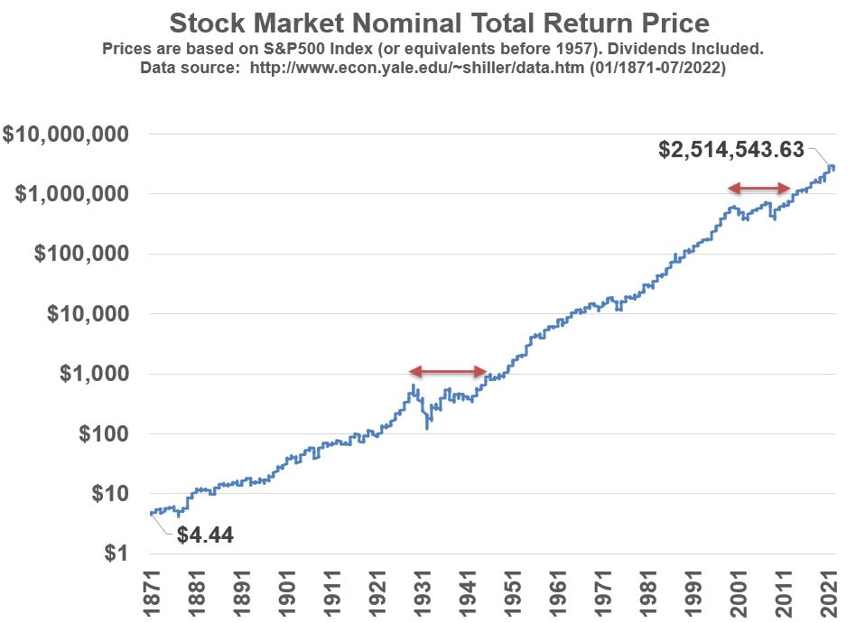
From 1871 to 2022, stocks (as represented by the S&P 500 Index and pre-1957 indices used by Shiller) have returned an annual compounded growth rate of about 9% (Nominal) . If we adjust the values for the effects of inflation , we get a rate of return of about 6.9% (Real). The graphs in this post show values on a Nominal basis,  but be aware that inflation is a destroyer of purchasing power (i.e. money buys less over time) .  

Knowing that stocks have a nice growth rate over a 151 year period might not make us feel that comfortable because, as you can see from the graph, there are long periods where the market does not grow (for example, see sections below the red arrows in Graph 1). The following section explores historical price drops in the market and how long it took to recover from those price drops. 

Return to Menu

Historical Stock Price Drawdowns (Nominal Basis)

Lesson 2: U.S. Stock Market Prices can take a very long time to recover from losses. 

In Graph 2 below, I’ve plotted the raw Nominal price (actual price; not adjusted for inflation or dividends) history in terms of drawdowns from price maximums (peaks).  Drawdowns help us view the magnitude and duration of price drops relative to historical peaks. Each zero on the chart represents a price peak, and the gaps between the peaks show how long it took for the price to recover to its previous peak.  Note that the pricing is based on monthly averages.  Wow!  Take a look at how deep and wide some of these stock declines have been!

 Graph 2

Historical S&P 500 Nominal Price Drawdowns 1871 to 2022. Dividends not included in the price.

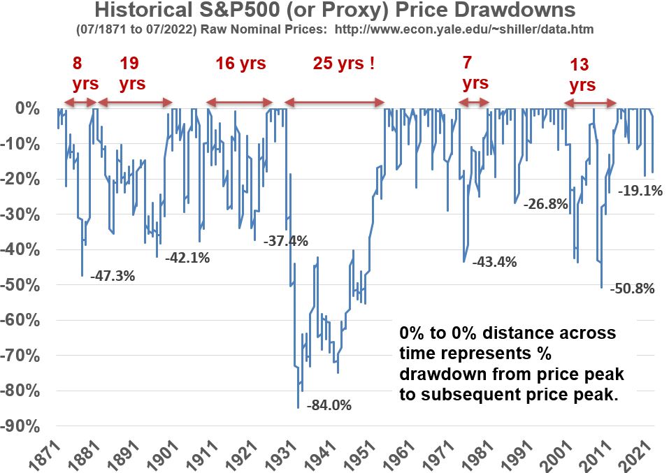
Lets look at the big drawdown periods from Graph 2 above:

  • The 2020 -19.1% drawdown represents the Covid Crash of 2020 but the market actually dropped about 34%  from Feb 19, 2020 to March 23, 2020. It recovered quickly though; in about a month.
  • Between the Dotcom (2000) crash and the Housing Bubble Crash (2008), the market took about 13 years to recover and experienced a price peak drawdown of -50.8%.
  • It took 7 years to recover from the recession caused partly by the 1973 Oil Crisis.
  • But, look at what happened after the 1929 U.S. Stock Market crash.  The market lost about -84% from its peak and took 25 years to recover!
  • Looking back to earlier periods you can see we have a few more long recovery period events.

Return to Menu

Historical Stock Price Returns

The remaining sections of this post are dedicated to showing evidence for lesson 3.

Lesson 3: U.S. Stock Market Annualized Returns Over Longer Durations Show Less Volatility and a Tilt Toward More Positive Values. 

In the following sections we will look at rolling 1 year returns of the stock market based on monthly data provided by Shiller. We will compare these to annualized returns based on longer durations to simulate holding stocks for longer than 1 year periods. The goal is to observe what longer holding periods do to volatility (the range or scatter of returns) and overall return.

Return to Menu

Historical Stock Price Returns (Nominal Rolling 1 Year Basis)

Graph 3 below shows how scattered (volatile) yearly returns are on a 1 year basis. I’ve fixed the Y axis range to +/- 40% but just be aware that about 5.2% of the data points are > 40% and about .6% of the data points are less than -40%.

Graph 3‘s statistical summary notes that the standard deviation is 19.1%. This means that, if the data is normally distributed, we can expect about 68% of the returns to be within +/- 19% of the average. However, be aware that this only holds true if the data is normally distributed. More on this later when we discuss Graph 5 and the other histogram style distribution charts. The standard deviation is larger than the average, so I would say that the movements are quite volatile. 

In Graph 3 and later graphs, the term “rolling” means that the calculations are being done month by month where the data set is the same size but the oldest number drops off as the newest number is added.     

Graph 3

U.S. Stock S&P 500 yearly rolling Nominal Total Returns (01/1871 - 07/2022) based on monthly data from Shiller.

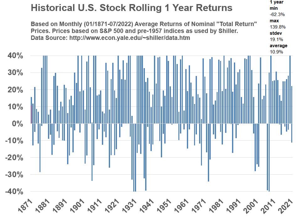
Yearly returns are very volatile! During the 1929 crash recession the minimum and maximum values were -62.3% and 139.8% respectively. The values in Graph 3 represent rolling yearly averages (Jan to Jan, Feb to Feb, etc.). Often you will see yearly return data expressed on a calendar year basis (approximately Jan to Jan on our graphs). Does the yearly data look different if we look at non-calendar year periods? Check out Graph 4 to see the answer.

Return to Menu

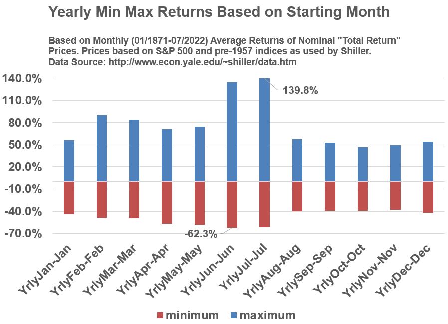
Various 12 Month Periods Compared

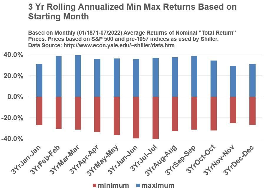
Graph 4 below plots the minimum and maximum values for all the potential 12 month periods. Interesting.  Clearly, there are other non-calendar year 12 month periods that are more volatile (sometimes much more volatile) than the Jan-Jan yearly periods. So, just be aware of this the next time someone gives you a calendar year based statistic. It might not be representative of some of the other 12 month periods.

Graph 4

U.S. S&P 500 Stock Yearly Min Max Returns Based on Starting Month (Based on Monthly Nominal Total Returns 01/1871 to 07/2022)

Return to Menu

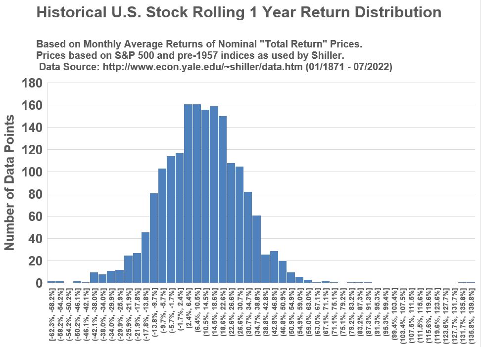
Histogram (Distribution Frequency) of Yearly Returns

Graph 5 below is a histogram that shows the frequency of the various yearly returns. The shape is roughly “bell” shaped, meaning we can apply some general rules of thumb about the average and the spread from the average (the standard deviation).  Namely, we can apply the 68%/95%/99.7% rule : the average +/-  1 or 2 or 3  standard deviations will represent 68% or 95% or 99.7% of all the data points.

Graph 5

U.S. Stock S&P 500 yearly rolling Nominal Total Returns Frequency Distribution (01/1871 - 07/2022) based on monthly data from Shiller.

Return to Menu

Historical Stock Price Returns (Nominal Annualized Rolling 3 Year Basis)

What happens to the data if we look at rolling 3 year periods and annualize the returns? Graphs 6, 7 and 8 below are structured the same as Graphs 3, 4 and 5 above except that the annualization is computed across every three year period. Be aware that the annualization is being computed using the CAGR (Compound Annual Growth Rate) formula. The CAGR = (End Price/Start Price)^(1/#of years) – 1.  (the caret symbol “^” represent a power (exponent) function).

When you compare the shapes of Graphs 6,7,8 with Graphs 3,4,5, you’ll see that the data becomes less scattered and the distribution ranges lessen.

Graph 6

U.S. Stock S&P 500 3 year rolling annualized Nominal Total Returns (01/1871 - 07/2022) based on monthly data from Shiller.

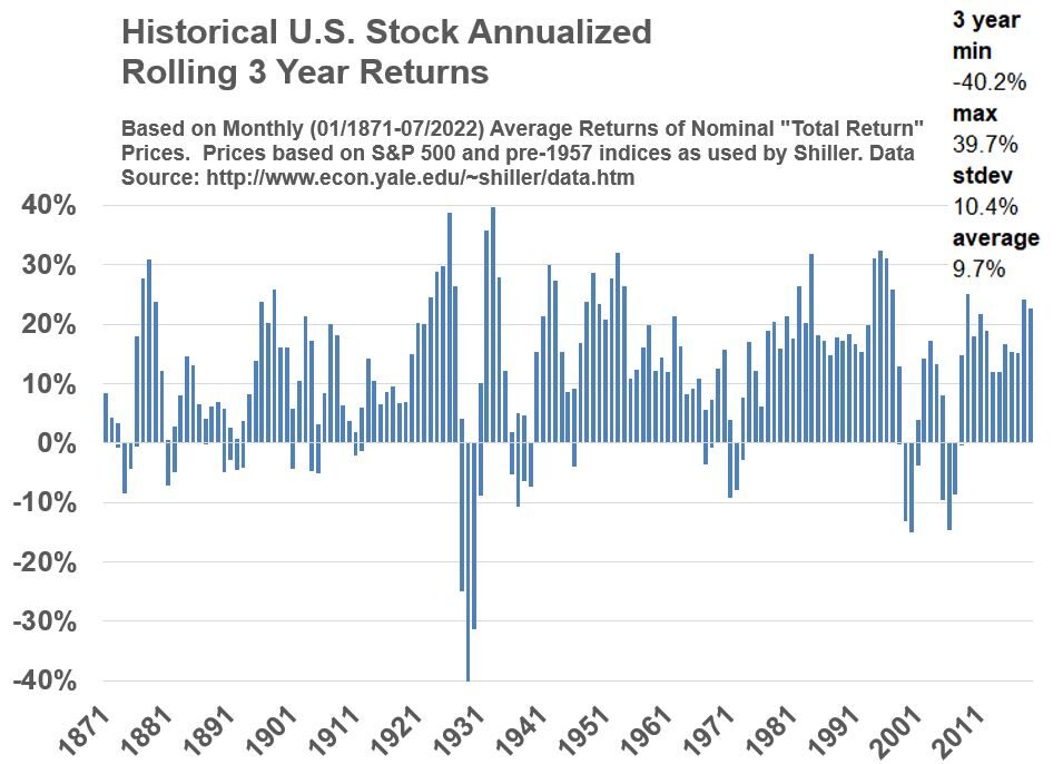
You can see that Graph 6 has been smoothed out quite a bit compared to Graph 3. The three year period shows less volatility (standard deviation of 10.4% versus 19.1%).  Graph 7 below  shows that the calendar and non-calendar years are looking more alike compared to Graph 4.

Graph 7

U.S. S&P 500 Stock 3 Year Rolling Annualized Min Max Returns Based on Starting Month (Based on Monthly Nominal Total Returns 01/1871 to 07/2022)

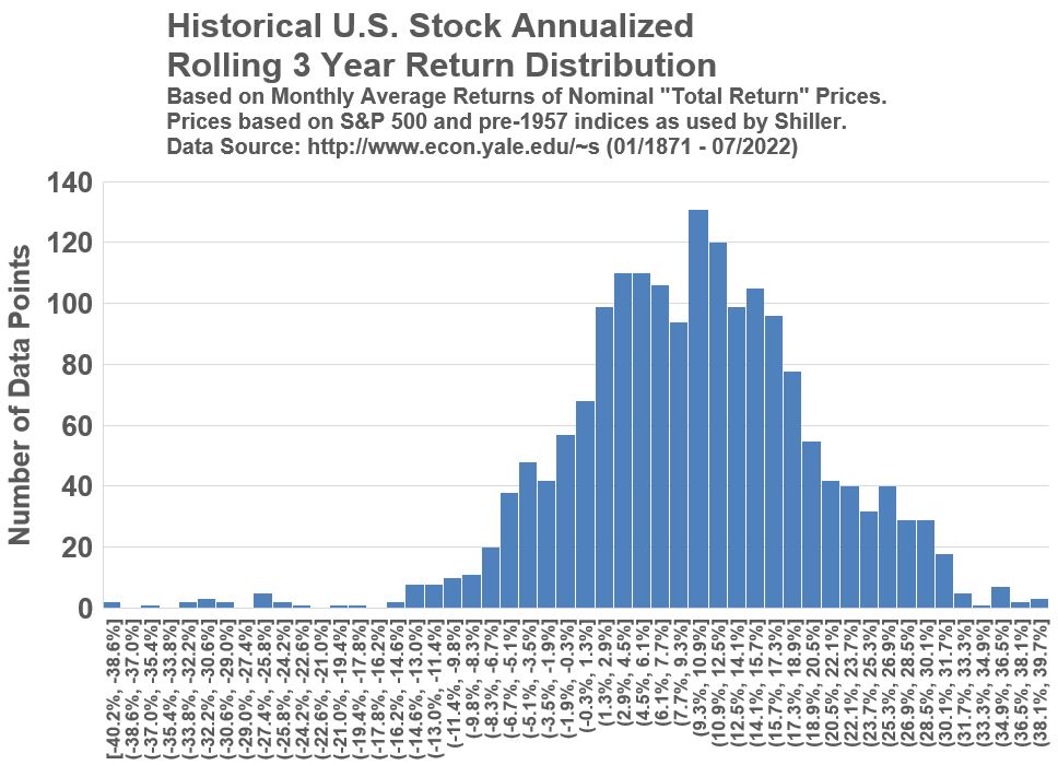
Both Graph 8 below and Graph 5 show a roughly Normal Distribution although Graph 8 looks like it has two peak areas developing. Notice the range in Graph 8 is about -40.2% to 39.7% whereas the range in Graph 5 is -62.3% to 139.8%.

Graph 8

U.S. Stock S&P 500 3 year rolling annualized Nominal Total Returns Frequency Distribution (01/1871 - 07/2022) based on monthly data from Shiller.

Return to Menu

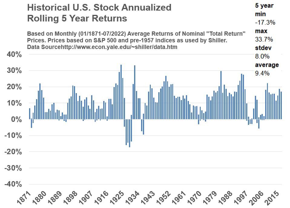
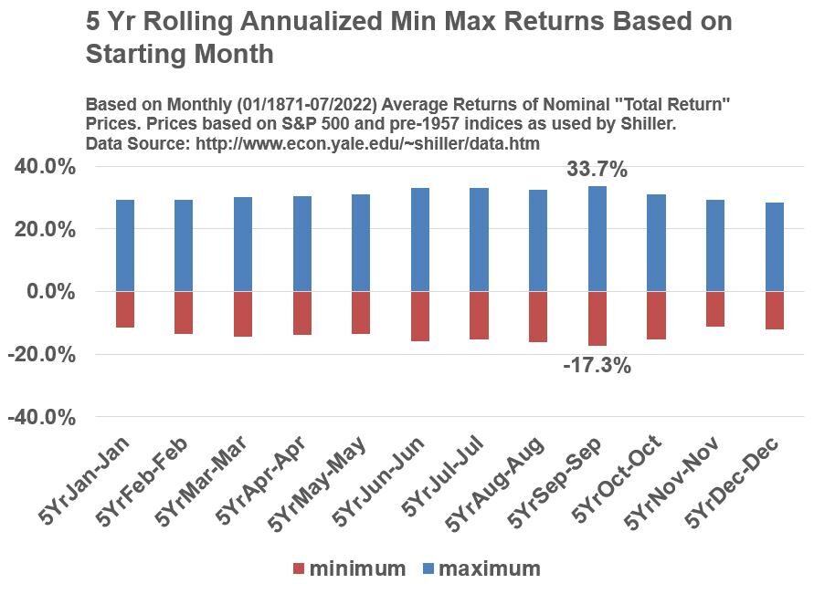
Historical Stock Price Returns (Nominal Annualized Rolling 5 Year Basis)

What do you think happens if we extend the rolling period to 5 years?  Scroll down through Graphs 9,10, and 11 to confirm what you are probably guessing.

Graph 9

U.S. Stock S&P 500 5 year rolling annualized Nominal Total Returns (01/1871 - 07/2022) based on monthly data from Shiller.

Graph 10

U.S. S&P 500 Stock 5 Year Rolling Annualized Min Max Returns Based on Starting Month (Based on Monthly Nominal Total Returns 01/1871 to 07/2022)

Graph 11

U.S. Stock S&P 500 5 year rolling annualized Nominal Total Returns Frequency Distribution (01/1871 - 07/2022) based on monthly data from Shiller.

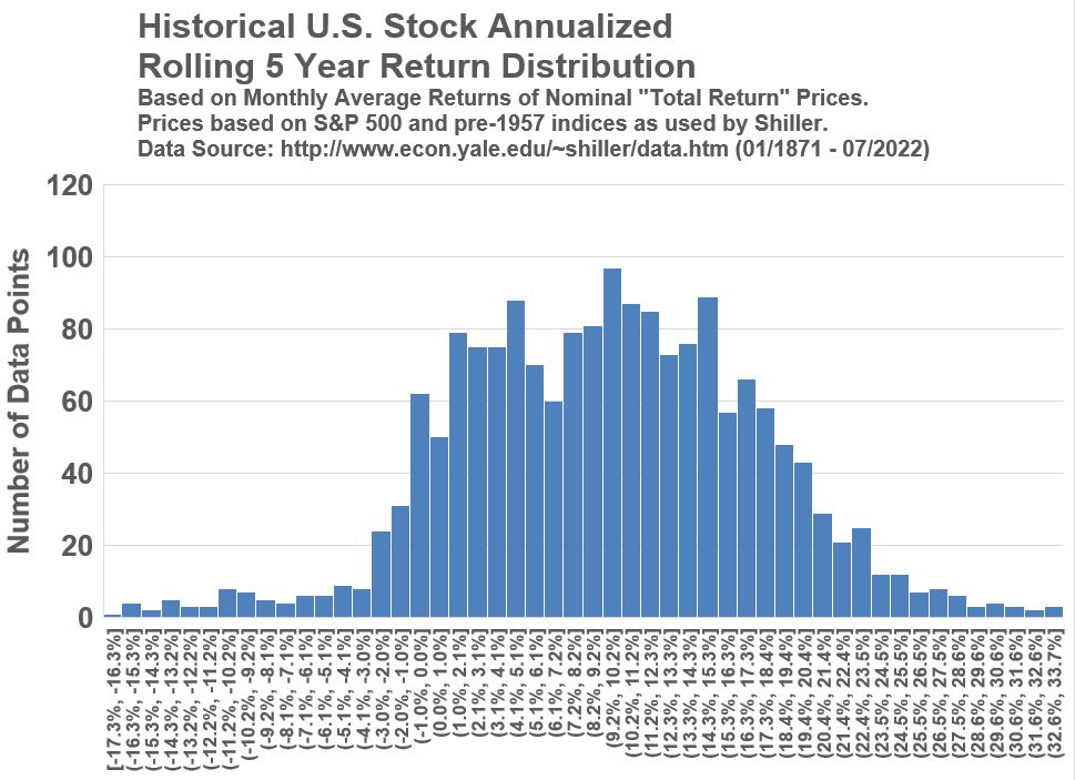
Comparing the 5 year period Graphs 9,10,11 against the 3 year period Graphs 6,7,8 shows that scatter of the data continues to narrow. The average returns drop a little but the standard deviations (the volatility) drop a lot. Through 1 to 3 to 5  year annualized return periods, the average return has dropped from 10.9% to 9.7% to 9.4% but the standard deviation has dropped from 19.1% to 10.4% to 8%.

Return to Menu

Table 1 below lists the S&P 500 annualized return statistics for 1,3,5,10,15 and 20 year rolling periods. You’ll see the volatility continue to drop, the min/max ranges reduce and become more uniform, and the negative losses become less and less (-.4% for the 15 year period charts and actually no losses for the 20 year period charts).

Table 1 

S&P 500 Annualized Nominal Return Statistics For Rolling 1,3,5,10,15,20 Year Periods [ (*)= data not normally distributed]

GraphsPeriodAverageMedianMinMaxStandard
Deviation
3,4,51 year10.9%11%-62.3%139.8%19.1%
6,7,83 year9.7% 9.9%-40.2%39.7%10.4%
9,10,115 year9.4%9.5%-17.3%33.7%8%
14,15,1610 year(*)9.3%8.6%-4%21.2%5%
17,18,1915 year(*)9.2%8.4%-.4%19.3%4%
20,21,2220 year(*)9.2% 8.1%2%17.9%3.2%

Return to Menu

Refer to the Appendix for the 10+ Periods Charts

  • Go to Appendix 3 to see Graphs 13,14,15 (10 year period charts).
  • Go to Appendix 4 to see Graphs 16,17,18 (15 year period charts).
  • Go to Appendix 5 to see  Graphs 19,20,21 (20 year period charts).

Notice how the distributions become more and more non-normal (Graphs 15,18,21). Graph 15 (10 year) exhibits a Bimodal Distribution and similarly, Graph 18 (15 year) exhibits Bimodal behavior with more skewness (degree of asymmetry) to the right. Graph 21 (20 year) is multimodal with plenty of skew.

Be aware that interpreting the average and standard deviation becomes a bit more complicated when distributions become more non-normal. For the purpose of this post, we are not going to go down the rabbit hole of how to interpret average and standard deviation for a non-normal distribution. The thing to take away from the histogram distribution graphs is that the range of return values (x axis range) progressively narrows with longer durations.

Return to Menu

Key Observations/Learnings

  • In the long run, stocks provide the most competitive returns against other assets. I didn’t prove it in this post since you’re better off  studying this in the works of Jeremy J. Siegel, John C. Bogle , Charles D. Ellis, and Warren Buffet (among others).
  • In the long run (using the 150+ year Shiller data set), there can be very long periods before stocks recover from losses.
  • Stock returns are very volatile (to the positive and negative side) in the short term. Also very few days (which are probably impossible to always predict) contribute disproportionately to the market upside movements. See this post for more on this.  
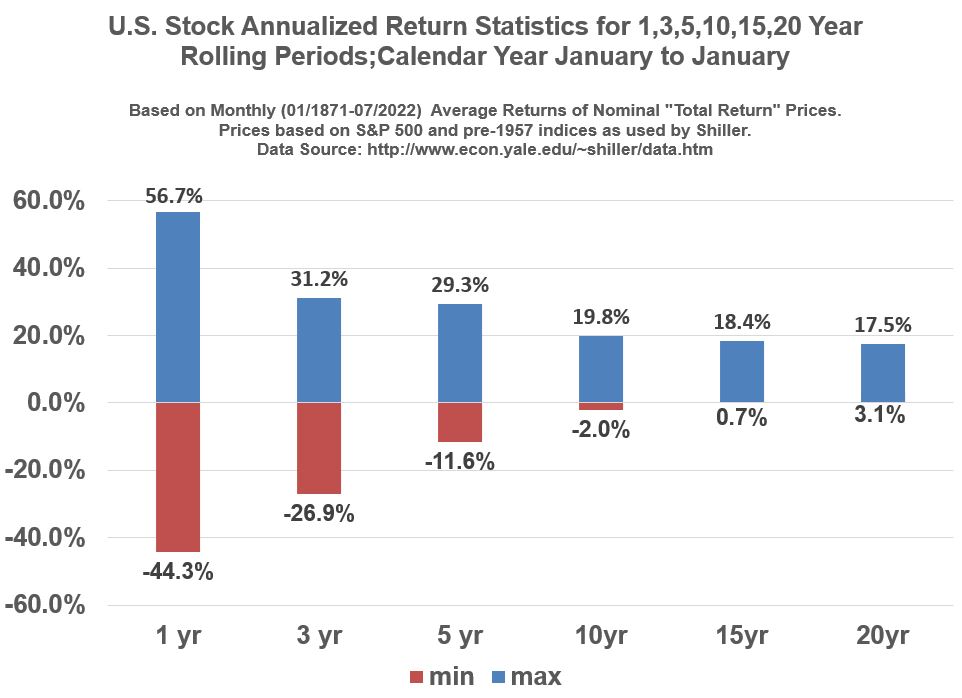
  • See Graph 12 below. Over longer durations, the range of annualized returns narrow, with a tilt towards fewer negative returns. For example, from Graph 12, annualized calendar year returns over rolling 10 year periods show a maximum loss of about -2%. For 15 and 20 year rolling periods, there are no negative annualized returns.
  • Maybe I tricked you a little bit with the previous bullet. Graph 12 is only true for the Jan to Jan periods. 
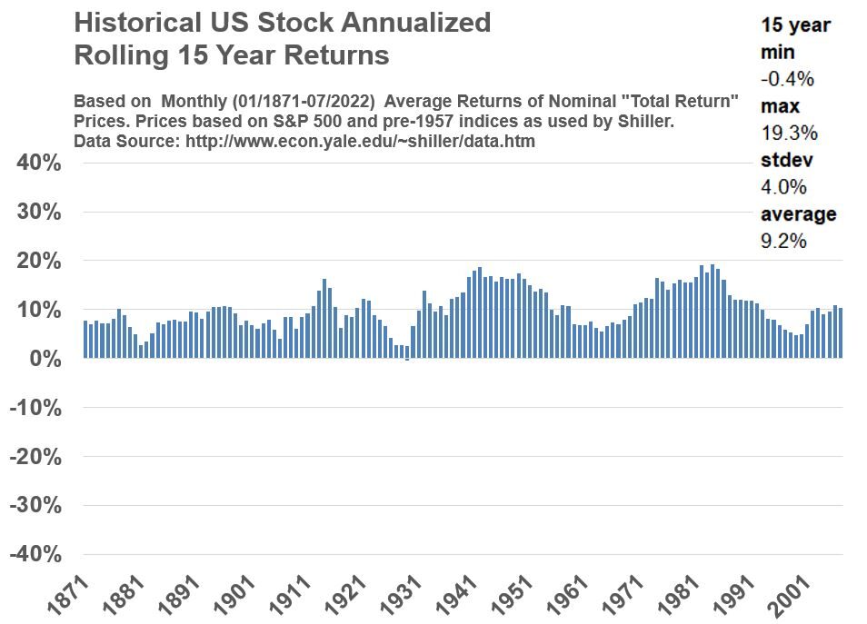
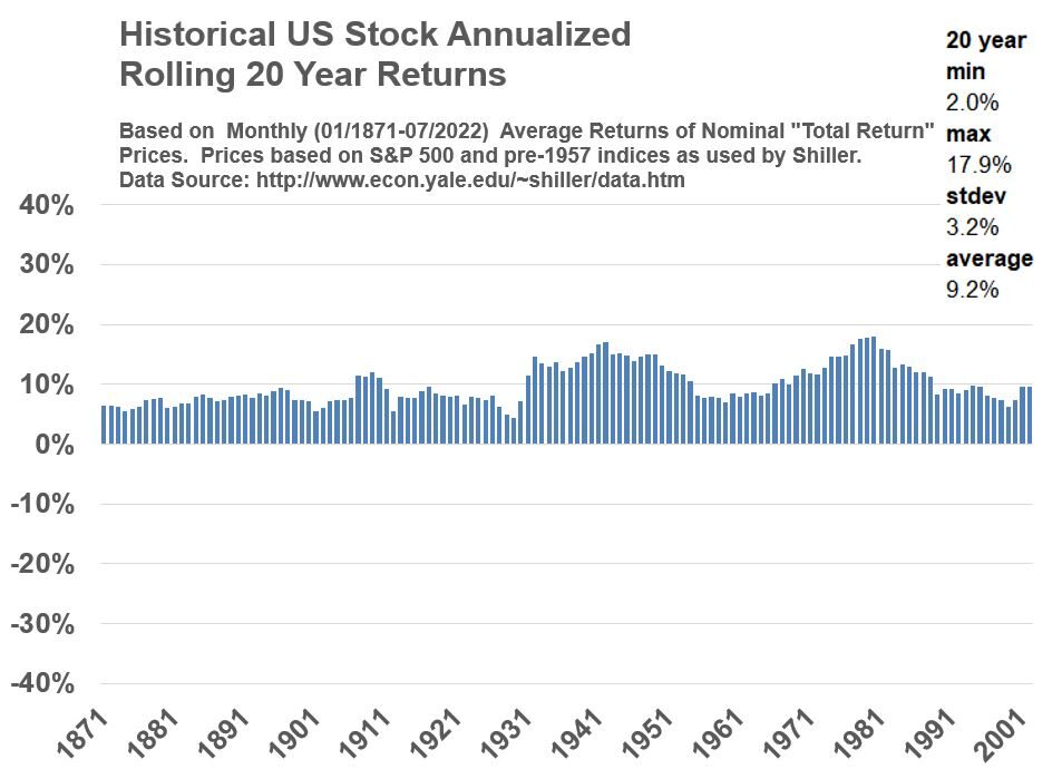
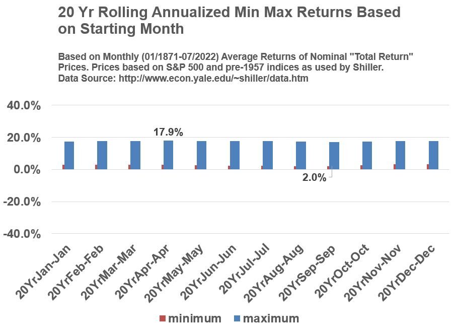
If we look at all rolling periods in Graphs 13,16, and 19 we see that the max losses are actually -4%, -.4%, and +2% for all rolling 10,15, and 20 year periods.
  • My advice to you is, if someone states performance numbers, you should ask as many context related questions as you can think of (e.g. How was the data calculated? What is the source date? Are the performance values based on calendar year ? Are there worse performing non-calendar year periods? Is the data expressed in Nominal terms or Real terms? etc.

Graph 12

Historical S&P 500 Nominal Total Return Statistics Approximated by Jan to Jan calendar year 01/1871 to 01/2022

Return to Menu

Conclusion

History says holding stocks for longer periods reduces the odds of losing money. How much time you have to invest (and stay invested) is very important. Aged based stock/bond asset allocations are very common for this reason. For example, John Bogle in his book “Bogle on Mutual Funds; Irwin, 1994” suggests that a simple rule of thumb for asset allocation (stocks vs bonds) is to have your age roughly equal your bond allocation. (e.g. if you are 25 years old, you ought to have a bond/stock mix of about 25%/75%). You should take this as a rough rule of thumb. Your chosen portfolio allocation will depend on a lot of other factors including your tolerance for loss.

Return to Menu

Appendix 1

Some of My Favorite Publications

Note that the publication details of the following books are based on my personal copies.

  • “Stocks for the Long Run” by Jeremy J. Siegel, 2nd Edition, McGraw-Hill; New York; 1998
  • “Winning the Loser’s Game” by Charles D. Ellis, 3rd Edition, McGraw-Hill; New York; 1998
  • “Bogle on Mutual Funds” by John C. Bogle, Richard D. Erwin Inc., 1994
  •  Berkshire Hathaway Inc. Shareholder Letters (Warren Buffett’s Annual Letters to Shareholders)

Return to Menu

Appendix 2

Description of Shiller Data (See Shiller Data Site)

Refer to the link provided above to access and review the source data yourself.  In Shiller’s data set,

  • U.S. Stock price indices come from three sources:
    1. 1871 – 1926:  Stock Indices based on data by Cowles and Associates
    2. 1926 – 1957:  “Standard Statistics 90” Stock Index
    3. 3/4/1957 – Present: S&P 500 Index
  • U.S. Stock price data are monthly averages of daily closing prices
  • Dividends (interpolated into monthly values from quarterly data) are incorporated into the U.S. Stock price values (Shiller calls this the Total Return Price) 
  • The Shiller actual historical prices and returns (“Nominal”)  are expressed in “Real” terms. This can be explained with a simple example:  What is $ 1 in 1950 worth using today’s dollars (July 2020)?  The answer is $ 12.3.  Shiller is adjusting the historical prices and dividends in the same way. He is inflating historical values to today’s dollars to reflect constant purchasing power across time.
  • When returns are computed in “Real” terms, we call it the Real return (it will be less than the Nominal return as it has accounted for the effects of inflation on price).  Nominal values are converted to Real values using the Consumer Price Index or CPI (an inflation indicator).  The Nominal Value to Real Value formula is: Real Value = (Nominal Value in Month M of Year Y)  x  CPI (most recent)  / CPI (in Month M of Year Y).  The CPI is published by the U.S. Bureau of Labor Statistics.  In essence, the historical actual values are being expressed in today’s dollars by inflating the old values using a CPI ratio factor. 

Return to Menu

Appendix 3

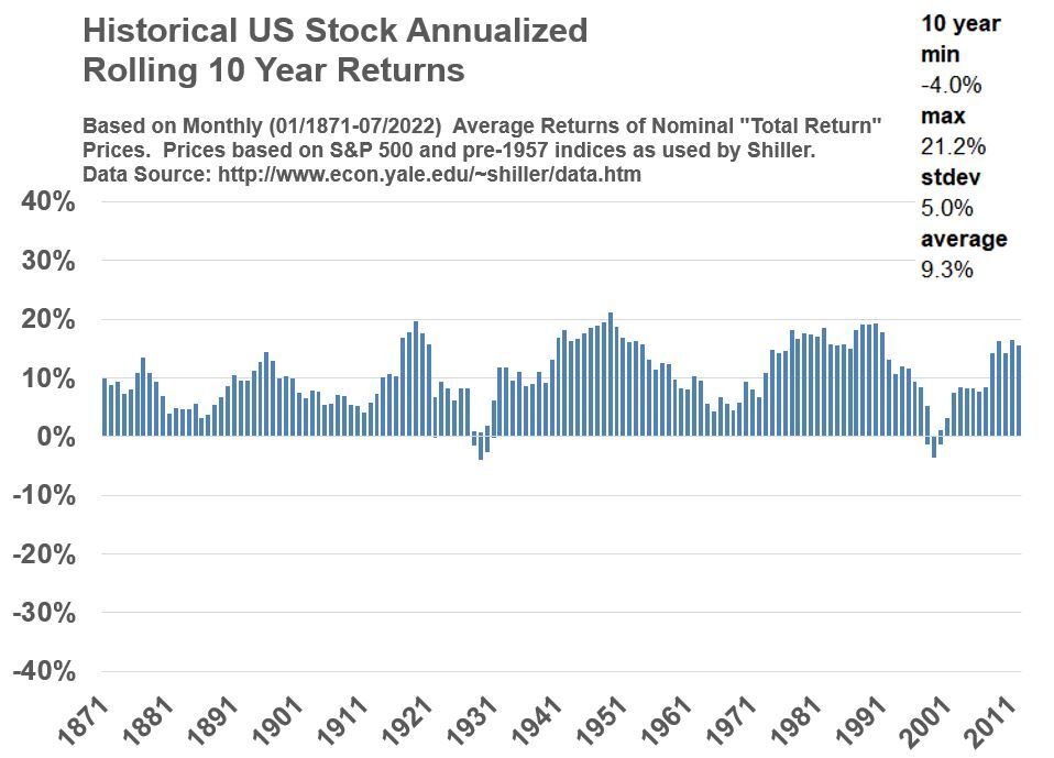
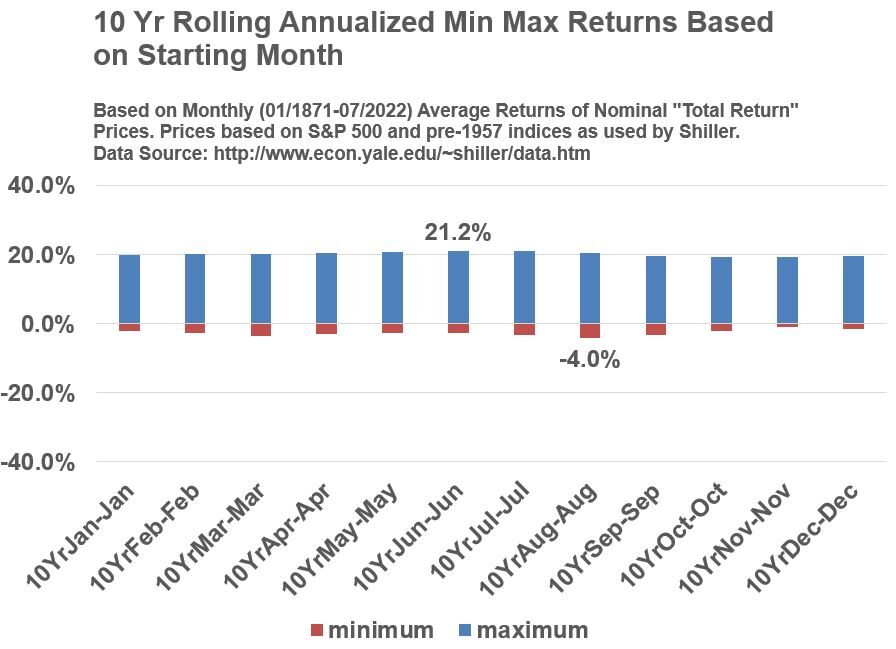
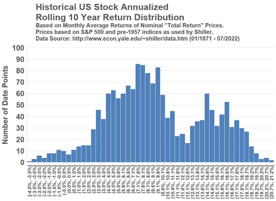
Historical Stock Price Returns (Nominal Annualized Rolling 10 Year Basis)

Graph 13

U.S. Stock S&P 500 10 year rolling annualized Nominal Total Returns (01/1871 - 07/2022) based on monthly data from Shiller.

Graph 14

U.S. S&P 500 Stock 10 Year Rolling Annualized Min Max Returns Based on Starting Month (Based on Monthly Nominal Total Returns 01/1871 to 07/2022)

Graph 15

U.S. Stock S&P 500 10 year rolling annualized Nominal Total Returns Frequency Distribution (01/1871 - 07/2022) based on monthly data from Shiller.

Return to Menu

Return to Discussion Section

Appendix 4

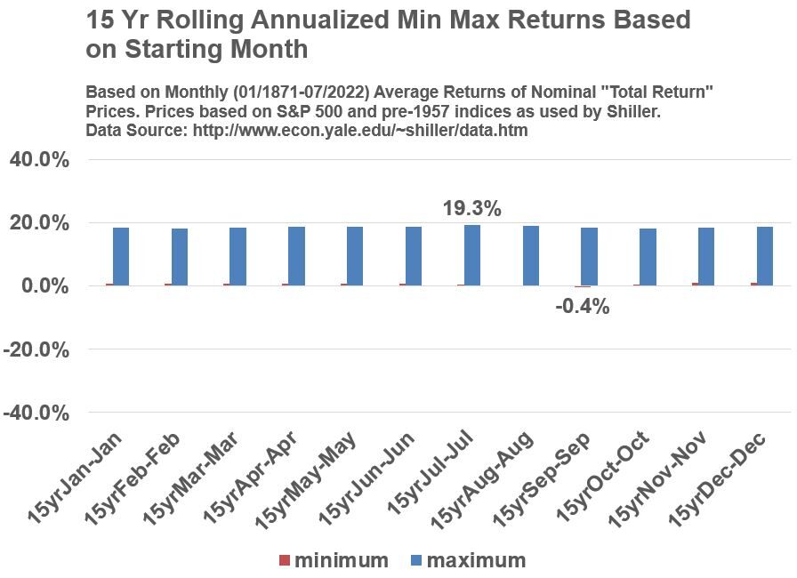
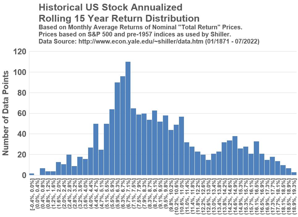
Historical Stock Price Returns (Nominal Annualized Rolling 15 Year Basis)

Graph 16

U.S. Stock S&P 500 15 year rolling annualized Nominal Total Returns (01/1871 - 07/2022) based on monthly data from Shiller.

Graph 17

U.S. S&P 500 Stock 15 Year Rolling Annualized Min Max Returns Based on Starting Month (Based on Monthly Nominal Total Returns 01/1871 to 07/2022)

Graph 18

U.S. Stock S&P 500 15 year rolling annualized Nominal Total Returns Frequency Distribution (01/1871 - 07/2022) based on monthly data from Shiller.

Return to Menu

Return to Discussion Section

Appendix 5

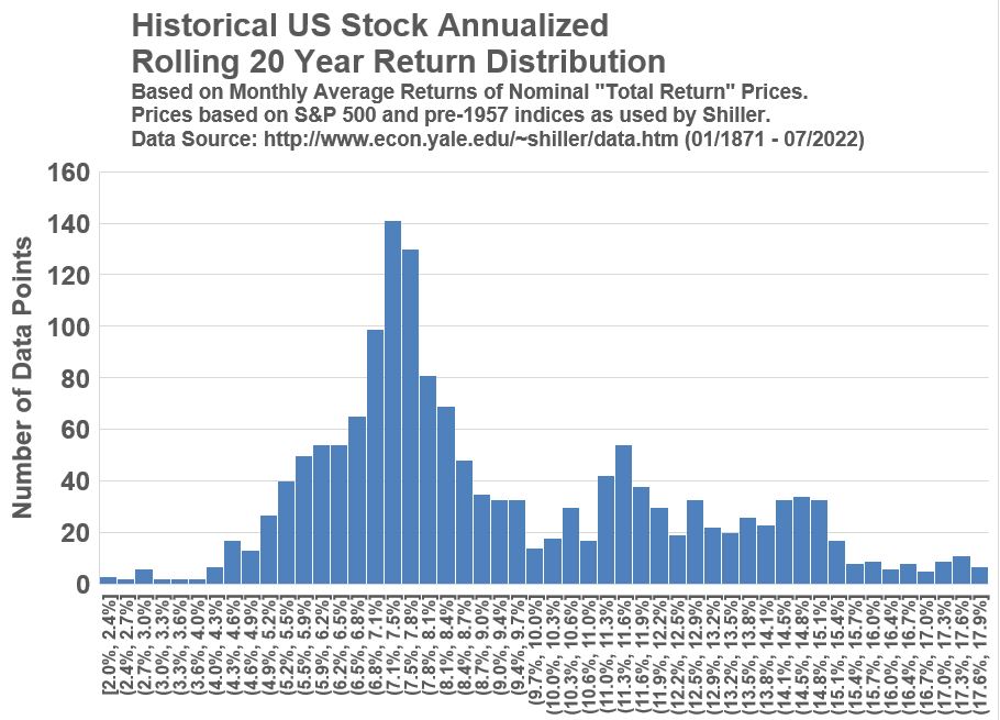
Historical Stock Price Returns (Nominal Annualized Rolling 20 Year Basis)

Graph 19

U.S. Stock S&P 500 20 year rolling annualized Nominal Total Returns (01/1871 - 07/2022) based on monthly data from Shiller.

Graph 20

U.S. S&P 500 Stock 20 Year Rolling Annualized Min Max Returns Based on Starting Month (Based on Monthly Nominal Total Returns 01/1871 to 07/2022)

Graph 21

U.S. Stock S&P 500 20 year rolling annualized Nominal Total Returns Frequency Distribution (01/1871 - 07/2022) based on monthly data from Shiller.

Return to Menu

Return to Discussion Section

Disclaimer: The content of this article is intended for general informational and recreational purposes only and is not a substitute for  professional “advice”. We are not responsible for your decisions and actions. Refer to our Disclaimer Page.

Leave a Comment

Your email address will not be published. Required fields are marked *