Historical Yearly Returns – Example of How to Interpret Graphs
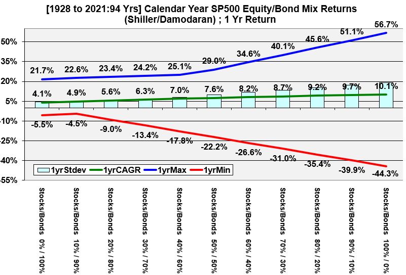
Let’s take a look at a specific example and make sure we are interpreting these graphs correctly. Look at Graph 1 for a 50/50 bond/stock mix):
- The CAGR, Compound Annual Growth Rate, of the full 94 year period, for a 50/50 mix of stocks and bonds is 7.6%.
- Expect that at least 75% of the values will be within 2 standard deviations from the arithmetic average. Note that all the graphs show the CAGR and not the arithmetic average but these values are fairly close and very close as the period duration increases. The point here is, the “likelihood space” between the maximum and minimum values is pretty wide. Refer to the appendix under Chebyshev to understand the basis of this 75% rule.
- The maximum and minimum returns are 29% and -22.2%
Graph 1 (Historical Yearly Returns of Various Stock and Bond Allocations)
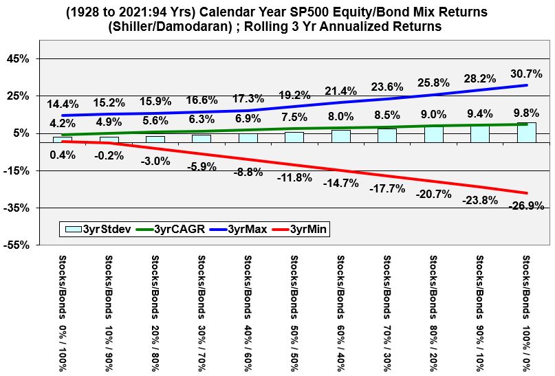
Rolling 3 Year Annualized Historical Returns of Various Stock and Bond Allocations
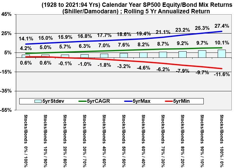
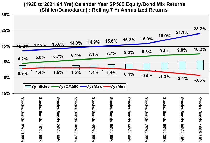
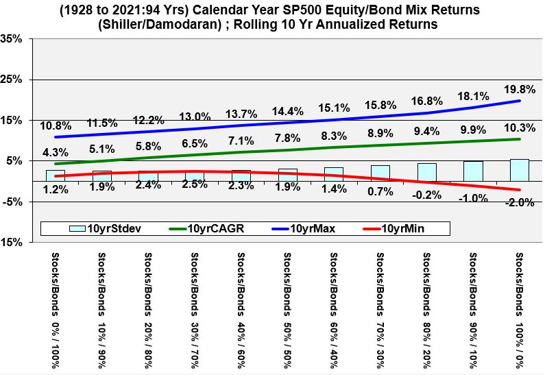
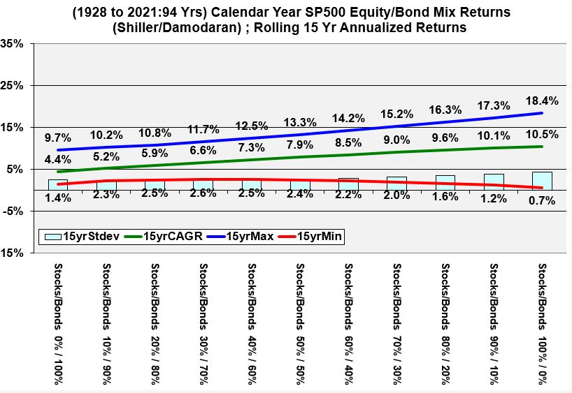
Graphs 2 through 7 below show annualized expected returns of bond and stock allocations for various rolling periods. As you look at the graphs, please notice that the
- riskiness always expands as we go from left to right on each graph (distance between minimum and maximum lines).
- the distances decrease between the maximum and minimum lines with increasing rolling periods.
- the red line eventually has only positive values in the 15 and 20 rolling year periods.
Graph 2 (Rolling 3 Year Annualized Historical Returns of Various Stock and Bond Allocations)
Rolling 5 Year Annualized Historical Returns of Various Stock and Bond Allocations
Graph 3 (Rolling 5 Year Annualized Historical Returns of Various Stock and Bond Allocations)
Rolling 7 Year Annualized Historical Returns of Various Stock and Bond Allocations
Graph 4 (Rolling 7 Year Annualized Historical Returns of Various Stock and Bond Allocations)
Rolling 10 Year Annualized Historical Returns of Various Stock and Bond Allocations
Graph 5 (Rolling 10 Year Annualized Historical Returns of Various Stock and Bond Allocations)
Rolling 15 Year Annualized Historical Returns of Various Stock and Bond Allocations
Graph 6 (Rolling 15 Year Annualized Historical Returns of Various Stock and Bond Allocations)
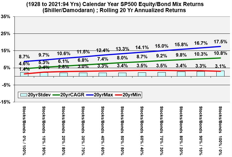
Rolling 20 Year Annualized Historical Returns of Various Stock and Bond Allocations
Graph 7 (Rolling 20 Year Annualized Historical Returns of Various Stock and Bond Allocations)