Inflation
Prices fluctuate over time and over the long term, they rise.
Inflation is the overall price increase of goods and services.
Inflation Indicators
Governments compute composite average prices of key US goods and services as a proxy for inflation. Three key indicators that the US Government computes are the Producer Price Index (PPI) ,the Consumer Price Index (CPI), and the Personal Consumption Expenditures (PCE) Index. The U.S. Bureau of Labor Statistics or BLS releases both the PPI and CPI numbers while the U.S. Bureau of Economic Analysis or BEA releases the PCE Index.
The PPI measures changes in the selling prices of domestic producers (reflecting impact of production costs) whereas the CPI measures changes in prices paid by “urban consumers for a market basket of consumer goods and services.”
The PPI is essentially a leading indicator for the CPI which is a leading indicator for overall inflation.
Government Uses PCE To Track Inflation
The government actually uses the PCE (since 2012) to track inflation. The PCE is a broader version of the CPI and less prone to fluctuation. Some key differences and similarities are listed below (the information below is based on this article by Callan):
- Both the CPI and PCE are based on the pricing of a basket of goods.
- CPI data comes from household surveys while PCE data is based on a report called the “gross domestic product report” and from suppliers.
- CPI only covers urban households while the PCE measures goods and services bought by all U.S. households and nonprofits.
- The CPI excludes expenditures that are not paid for directly (e.g., medical care paid for by employer-provided insurance, Medicare, or Medicaid) while the PCE includes these.
- The PCE calculations smooth out price swings making the numbers less volatile than the CPI.
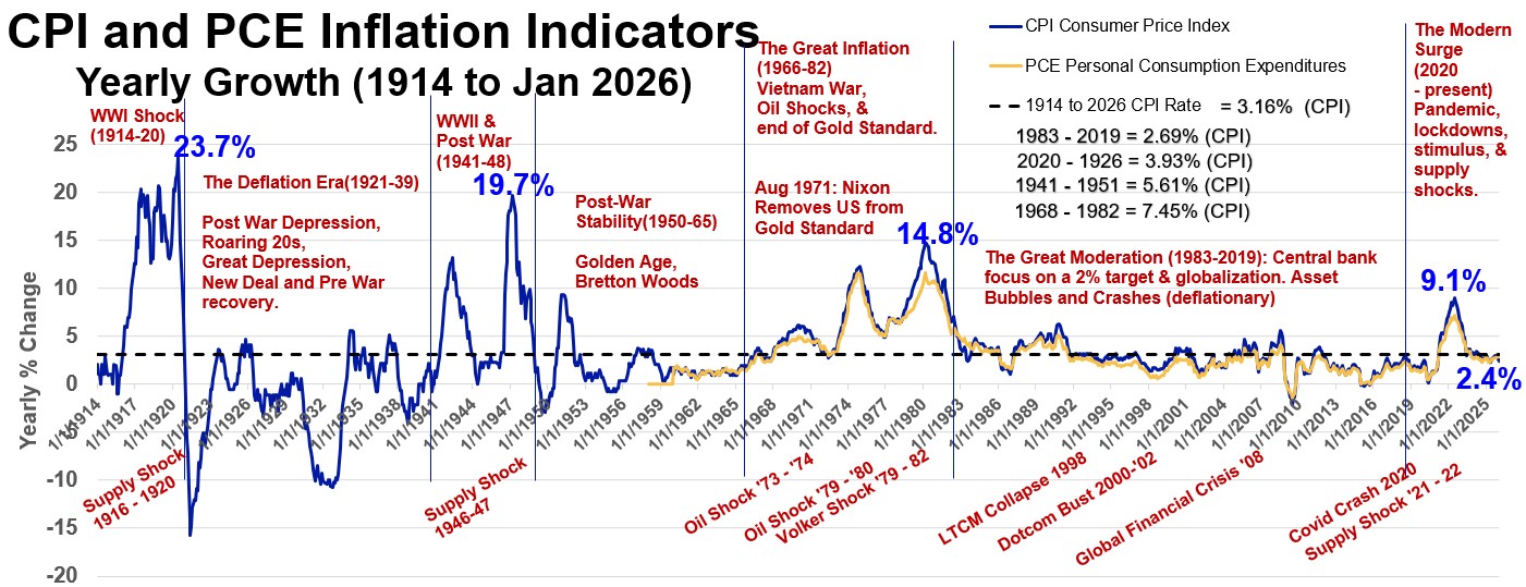
Refer to Graph 1 below to see a historical trend of the CPI and PCE. Notice that the CPI tends to give a larger number than the PCE. Notice the significant spike in inflation in 2021!
Graph 1: US Inflation Indicators CPI and PCE
Purchasing Power
Inflation causes a loss in the Purchasing Power of a currency.
If the currency buys less of the same quantity in the future, we say it has lost Purchasing Power.
We’ve all heard the saying “A dollar in hand today is worth more than a dollar in the future.”
One of the reasons for this time , value relationship for money is due to this loss of Purchasing Power.
Causes of Inflation
Inflation can be cause by supply side as well as demand side issues. Some causes of inflation are:
- Governments Printing Money: Puts more money in circulation, More money chasing same amount of goods i.e. Demand > Supply.
- Demand Pull Inflation: A faster growing economy creates more Demand. This can be explained graphically by using an Aggregate Supply-Aggregate Demand chart (see Appendix 8 and Graph A83).
- Cost Push Inflation: Companies pass on higher prices to consumers because company cost of production has increased. (see Appendix 8 and Graph A84).
References
- CPI – Bureau of Labor Statistics
- PPI – Bureau of Labor Statistics
- CPI vs PCE by Callan
- Investopedia PPI and CPI
- Jacob Clifford Video on Inflation- Cost-push & Demand-pull
- Clevelandfed.org center for inflation research
- Khanacademy Macro-Economics Videos
Intra-Post Links
Interest Rates – Types
Interest is the “fee” for borrowing money (the Principal) and is therefore also the “reward” for saving money.
The borrower takes on this Debt and assumes an obligation to pay back the Principal plus the interest.
Interest can more generally refer to any rate. For example an investment return or a discount rate. In this post we’ll focus on interest as a borrowing or loan rate.
Interest is Used in Many Types of Debt
Interest is employed in several types of debt instruments including:
- Businesses borrowing for investment and expansion via Bonds, Notes, etc.
- Individuals borrowing to purchase homes (mortgages) or cars (auto loans) or other items (personal loans, education loans etc.).
- Banks borrowing money via depositor accounts (e.g. savings, money market, certificates of deposit or CDs).
- Bank lending money to other businesses.
- Banks lending to other banks.
- Government lending to banks.
Depending on the type of Debt, Interest rates
- can be fixed or variable for the duration of the loan (e.g. a fixed versus a variable mortgage rate)
- can take on a range of values (depending on time, creditworthiness of the borrower, tax impacts etc.)
Types of Interest Rates
There are several types of interest rates associated with the debt types described above. Some of the key ones are listed below.
Table 1: United States Indicative Yields as of November 29, 2022
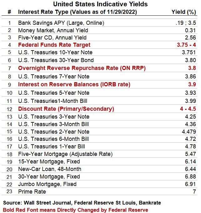
Notice the text in bold red font.
These are important interest rates that the government can manipulate to achieve economic targets (Monetary Policy).
These short term interest rates trickle through and directly or indirectly affect all other rates.
The Federal Reserve’s Administered Rates
The Federal Reserve is the Central Bank of the United States.
It is an independent entity (sort of) that carries out Monetary Policies designed to achieve its congressional mandate of maximum employment and stable prices.
A big part of this effort is adjusting the Federal Funds (interbank) Rate to desired targets.
This is achieved indirectly by the Federal Reserve by adjusting one to three so called “Administered Rates” (the IORB, the ON RRP, and the Discount Rate).
These impact almost all other rates in the economy and so are worth describing below.
This is reviewed in more detail in the government monetary and fiscal policy section as well as Appendix 7 (Ample Reserves).
Federal Funds Rate
The Federal Funds Rate is the interest rate that banks pay to borrow reserve balances overnight from other banks.
This trickles down through the rest of the economy and affects other interest rates. (It directly influences the Prime Rate and indirectly influences longer- term rates such as mortgages, loans, and savings).
The Federal Reserve indirectly changes the Federal Funds rate by adjusting up to three “Administered Rates” (The IORB, the ON RRP, and the Discount Rate).
Interest on Reserve Balances (IORB)
The IORB is the interest rate the Federal Reserve pays on reserve balances of Federal Reserve Banks. It is sometimes called an “Administered Rate” and allows the Federal Reserve to indirectly adjust the Federal Funds Rate (part of the Fed’s Monetary Policy).
Overnight Reverse Repurchase Rate (ON RRP)
A broader group of financial institutions can earn the ON RRP rate on deposits with the Fed.
It is sometimes called an “Administered Rate” and allows the Federal Reserve to set a “floor” on the Federal Funds Rate (part of the Fed’s Monetary Policy). (See the New York Fed’s more detailed description.)
Federal Discount Rate
The Discount Rate is the rate the Federal Reserve charges to member banks (through what is called ‘the discount window’).
It is sometimes called an “Administered Rate” and allows the Federal Reserve to set a “ceiling” on the Federal Funds Rate (part of the Fed’s Monetary Policy).
Prime Rate
The Prime Rate is the interest rate that banks charge their most creditworthy customers. It’s not a legal requirement so banks can charge more if you are less creditworthy for example.
As a rule of thumb, the Prime Rate is about 3 percent higher than the Federal Funds Rate and banks use it to set rates on credit cards, home equity loans and lines of credit, auto loans, personal loans and small business loans.
Savings accounts , interest-bearing checking accounts and CDs are also based on the prime rate as well.
Mortgage Rates
Mortgage rates are influenced by several factors like inflation, GDP growth, and Federal Reserve price and employment stabilization activities (i.e. Monetary Policy).
Yields on Mortgage Backed Securities (MBSs are Bond like mortgage related financial instruments) and Ten year Treasury Bonds are also used as baseline values from which to determine mortgage yields. (see this Investopedia article for more information)
Intra-Post Links
Interest Rates – US Treasuries
https://www.treasurydirect.gov/marketable-securities/
Bonds are essentially IOUs where the lender receives, typically, a fixed interest (returned periodically) and the principal (paid back at maturity).
If the Bond is sold before maturity (in what is called the Bond Secondary Market), then the price and effective interest rate can fluctuate (inversely).
US Treasury Bonds are considered essentially risk-free (backed by the US Government) relative to alternative investments.
In investment portfolios, they serve to reduce volatility as they tend to be non correlated to stocks.
They also set important benchmarks for other products like Corporate Bonds and mortgages.
For example, the 10 year Treasury yield is one of the benchmarks used to set long term mortgage rates.
Treasury Bills
Treasury Bills are short-term securities with five term options, from 4 weeks up to 52 weeks.
Bills are sold at face value or at a discount from the face value. When they mature, you’re paid the face value.
Treasury Bonds
Treasury Bonds (different from U.S. Savings Bonds) pay interest every six months. Historically a 30-year investment, Treasury Bonds are now offered in 20-year terms, as well.
Treasury Notes
Treasury Notes are government securities which are issued with maturities of 2, 3, 5, 7, and 10 years. Notes pay interest every six months.
Yield Curves
Treasury Bills and Notes yields are often charted against maturity (duration) to generate Yield Curve charts like Graph 2 below.
The shapes of the curves are used by economists and others as leading indicators of how the US economy is doing.
The graph shows several snapshots of the yield curve at different times.
The “normal” shape of the yield curve will be sloping upwards from left to right which makes sense since a long maturity Bond should typically demand a higher yield due to time risks.
Expectations are that economic growth will be strong (steeper = stronger) and so people demand higher rates to keep up with expected rising inflation.
Graph 2: United States Treasury Yields as of November 25, 2022
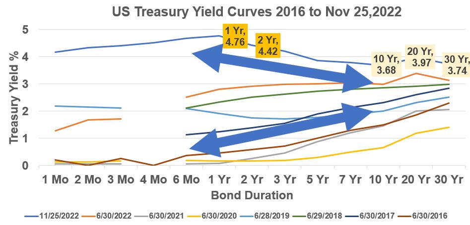
Notice that the Nov 25, 2022 curve (the highest one on the graph) is sloping downwards.
We call this an inverted yield curve where shorter term maturity Bonds have higher yields than long term Bonds.
This can be a leading indicator of an economic slowdown or recession.
A recession is defined as two consecutive quarters of negative growth of the economy as measured by the Gross Domestic Product (See Appendix 2) .
An inverted shape suggests that future interest rates and inflation will drop as economic growth slows down.
Short term rates will also jump when the Federal Reserve intervenes and raises short term rates (Federal Funds Rate is adjusted via the Administered Rates as described in the “Interest Rates – Types” section).
Treasuries and Government Monetary Policies
Starting in 2008 (at the advent of the Great Recession), the US Government, through the Federal Reserve, began purchasing massive quantities of US Treasuries in order to pump cash into the market to revive economic growth.
We’ll cover this in more detail in the Government Monetary and Fiscal Policy section.
You can refer to Appendix 9 as well to see current and historical Federal reserve assets (lots of Treasuries!!).
References
- www.treasurydirect.gov
- Yield Curve Basics (Baruch College)
- Any article on Bonds by PIMCO
Intra-Post Links
Government Monetary and Fiscal Policies
Government Economic Responsibilities
The Legislative and Executive branches of the US Government (i.e. Congress and the President) have the responsibility to keep the US economy healthy and growing. They do this mainly by taxing and spending.
The Federal Reserve was created in 1913 (Federal Reserve Act; Amended in 1977) and is the country’s Central Bank. It exists as an independent government entity (well, kind of, since key staff are nominated by the President and approved by Congress) and wields considerable power as it seeks to control inflation and maximize employment.
The Federal Reserve achieves this through three organizations: (1) the Federal Reserve Board of Governors (7 of them), (2) the Federal Reserve Banks (12 of them), and (3) the Federal Open Market Committee (FOMC). (see The Fed Explained). The FOMC consists of 12 members (Board of Governor members, the president of the Federal Reserve Bank of New York, and four of the remaining eleven Reserve Bank presidents who rotate on a yearly basis).
US Government Goals and Mandates
Congress and the President have goals to keep the economy healthy and growing and to help mitigate boom or bust economic cycles (see Appendix 3 for more on Business Cycles). They achieve this through taxation and spending. These are the Fiscal Policy tools of the US Government.
The Federal Reserve serves as the nation’s Central Bank and implements Monetary Policies to achieve the following congressional mandates:
- Promote high employment. Economic Full Employment is probably equivalent to 4% or less Unemployment (*).
- Ensure price stability (i.e. keep inflation from rising too high). Currently (2022), the government’s inflation target is about 2% (yearly annual increase as indicated by the Personal Consumption Expenditures Index PCE).
- Promote moderate long-term interest rates
(*) Today (as of 2020) the Government doesn’t target a specific maximum employment rate as this shifts and is difficult to measure. That is to say, the government uses various indicators to indirectly conclude that we are at maximum employment. In January 2022, Federal Reserve Chairman Powell stated that ~3.9% unemployment represented a maximum employment situation.
The Federal Reserve is independent in that no other branch of Government has to formally approve its decisions, but I would describe it more as pseudo-independent since the Governors are appointed by the President (and confirmed by Congress).
Technically, the mandates comprise 3 goals (around employment, prices, interest rates) but, because achieving maximum employment and stable prices should result in moderate long-term interest rates, these goals are often described as a Dual Mandate. (see Mishkin’s 2007 Speech).
Limited Bank Reserves vs Ample Bank Reserves
Please read the St. Louis Fed article “The Fed’s New Monetary Policy Tools” for an excellent detailed review of what is described in the sections below (watch this video also). You can also review my more detailed summary of Ample Reserves monetary policy in Appendix 7.
These explain that many of the traditional monetary tools are no longer effective today due to the massive amounts of reserves that banks have today (as of January 2023). The Fed. describes a period of time before the Great Recession (Dec. 2007- June 2009) where bank reserves were scarce or limited (relatively speaking) versus today (since the Great Recession) where bank reserves are much bigger.
The Fed. uses the terms Limited Reserves and Ample Reserves to differentiate between these two periods. Monetary Policy tools were adjusted when the economy transitioned from Limited Reserves to Ample Reserves.
I describe both the old and new ways of implementing Monetary Policy below.
Federal Reserve Monetary Policies
The Federal Reserve can meet their mandate (to maximize employment and control inflation) in a few different ways.
- Setting member bank minimum Reserve Requirements. The idea here is that if banks are required to hold less reserves, they can lend out more and vice versa. Whereas reserves were limited before 2007 (15 Billion USD), they are Ample today (about 3 Trillion USD in Nov 2022!) due to massive government monetary infusions. Reserve Requirements were set to 0 in March 2020, so this is not an effective tool today.
- Open Market Operations (OMO). OMO involves the Fed. buying/selling Treasuries and other types of securities in the open market. This process changes market liquidity by adding/removing dollars from bank reserves by buying/selling securities. Quantitative Easing (QE) is a type of OMO where the Fed. attempts to lower longer term interest rates by purchasing longer term Treasuries or Mortgage Backed Securities (MBS). With banks having Ample Reserves, this is not used today to change interest rates (2022).
- Adjusting the Discount Rate. The Discount Rate is an Administered Rate that the Fed sets on loans to banks to influence the Federal Funds Rate. A constant spread was usually maintained between these two rates. This is still an active tool today.
- The Fed has indicated (2019) that it intends to implement its policies with Ample Reserves going forward. The Fed. does this by manipulation of the Federal Funds Rate (interest rate banks charge each other) by adjusting three related short term Administered Rates.
Ample Reserves Regime Administered Rates
In today’s Ample Reserves world, the rates described below are directly manipulated by the Fed. These directly influence the market driven Federal Funds Rate (FFR).
- Interest on Reserve Balances (IORB) – The IORB is the interest rate the Federal Reserve pays on reserve balances of Federal Reserve Banks. This is the primary handle the Fed. can directly change.
- Overnight Reverse Repurchase Rate (ON RRP) – Non-bank financial institutions don’t have access to the IORB. A broader group of financial institutions can earn the ON RRP rate on deposits with the Fed. It is a secondary tool and allows the Federal Reserve to set a “floor” on the Federal Funds Rate. The ON RRP is a form of Open Market Operation.
- The Federal Discount Rate – The Discount Rate is the rate the Federal Reserve charges to member banks (through what is called ‘the discount window’). It allows the Federal Reserve to set a “ceiling” on the Federal Funds Rate (part of the Fed’s Monetary Policy).
To raise the Federal Funds Rate, the Administrative rates are raised and vice versa. In 2022 the Federal Reserve started raising these Administered Rates to try to reduce high inflation rates. See Appendix 7 for more details.
Government Economic Policies in the Context of the US Business Cycle
The Gross Domestic Product (see Appendix 2), GDP, is a lagging economic indicator that measures US economic output. We can use a GDP versus time Business Cycle plot to explain US Government Economic Policies (See Appendix 3 for more on the Business Cycle). Refer back to this picture as you read the following sections.
Graph 3 – Business Cycle (GDP vs time)
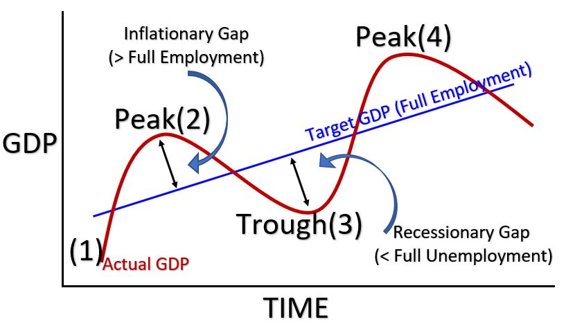
Federal Reserve Monetary Policy During Business Cycle Peaks
Recall that Administered Rates are the short term rates that are adjusted to change the Federal Funds Rate. They are the Discount Rate, Interest on Reserve Balances (IORB), and the Overnight Reverse Repurchase Rate (ON RRP).
At or near Business Cycle Peaks, there is an Inflationary Gap that must be reduced. The Federal Reserve can employ Contractionary Monetary Policy to do this. (note that ↑ = increase and ↓= decrease).
- Tightening: Contractionary Monetary Policy
- Possible Actions: Administered Rates ↑(*); Reserve Requirement ↑; Sell Bonds (**) or other Securities like Mortgage Backed Securities
- Results: Money Supply(***) ↓; Inflation↓
(*)The impact of interest rates on the economy is rather intuitive. If rates rise, businesses and individuals borrow less (and save more) and economic growth slows down. Eventually prices and inflation growth slows as well. Read this on effect of interest rates. Also see Appendix 5 for the relationship between interest rates and Quantity of Money.
(**) The Fed Sells Treasuries (and other securities), by withdrawing dollars (credit) from the reserves of banks (remember Buys = Bigger Money Supply and Sells = Smaller Money Supply).
(***)See Appendix 4 , Appendix 5, and Appendix 6 for more information on Money Supply. Its meaning is fairly intuitive: You can imagine if there is less money flowing through the economy, there is going to be less spending and lower economic growth (and vice versa).
Contractionary Policy can also be graphically explained using an Aggregate Supply-Aggregate Demand Graph (see Appendix 8).
2022 and Onward – Ample Reserve Monetary Policy
The US is probably in a business cycle peak today with inflation spiking up severely in 2022. In 2022 (and 2023) the Federal Reserve has been employing an Ample Reserve Monetary Policy which means they are raising Administered Rates to increase the Federal Funds rate. The Federal Funds Rate directly impacts other short term rates and eventually longer term rates.
Due to Ample Reserves in banks, money supply changes have less of an impact on rates (changing Administrative rates is more effective). This can be explained with fundamental Macro-Economics and the money market diagram showing the relationship of interest rates to bank reserves (read this excellent explanation by the Fed). Also refer to Appendix 7.
Federal Reserve Monetary Policy During Business Cycle Troughs
Recall that Administered Rates are the short term rates that are adjusted to change the Federal Funds Rate. They are the Discount Rate, Interest on Reserve Balances (IORB), and the Overnight Reverse Repurchase Rate (ON RRP).
At or near Business Cycle Troughs (see Graph 3 above), there is a Recessionary Gap that must be reduced. The Federal Reserve can employ Expansionary Monetary Policy to do this.
- Easing: Expansionary Monetary Policy
- Actions: Administered Rates↓(*); Reserve Requirement ↓; Buy Bonds (**) or other Securities like Mortgage Backed Securities)
- Result (Money Supply↑(***); Inflation↑)
(*) Lower Rates = Money Supply increases. More borrowing, more spending, and the economy grows (See Appendix 5).
(**) Buying Bonds or other securities adds money (credit) to bank reserves. Money Supply increases. Economy and GDP and Employment grows.
(***)See Appendix 4 , Appendix 5, and Appendix 6 for more information on Money Supply. Its meaning is fairly intuitive. You can imagine if there is less money flowing through the economy, there is going to be less spending and lower economic growth (and vice versa).
Lower rates mean people and businesses are incentivized to hold cash and spend. Because lending rates are lower, people and businesses will borrow money to expand businesses or buy homes etc.. resulting in increasing economic growth. As the Business Cycle graph shows, increasing economic growth eventually results in higher prices and inflation.
Expansionary Policy can also be graphically explained using an Aggregate Supply-Aggregate Demand Graph (see Appendix 8).
Congressional/Presidential Fiscal Policy
Congress and the President can meet their mandates of maximizing employment and controlling inflation by increasing or decreasing taxes and/or spending.
Congressional/Presidential Fiscal Policy During Business Cycle Peaks
At or near Business Cycle Peaks, there is an Inflationary Gap that must be reduced. The following Contractionary Fiscal Policies can be implemented. (Note that ↑= increasing and ↓= decreasing)
- Contractionary Fiscal Policy
- Actions: Spending↓; Taxes↑
- Results Employment↓ ;Spending↓; Income↓ ; Inflation↓
Congressional/Presidential Policy During Business Cycle Troughs
At or near Business Cycle Troughs, there is a Recessionary Gap that must be reduced. The following Expansionary Fiscal Policies can be implemented.
- Expansionary Fiscal Policy
- Actions: Spending ↑; Taxes ↓
- Results: Employment ↑ ; Income ↑ ; Spending ↑; Inflation↑
References
- Federal Reserve Web Site
- Federal Reserve Monetary Policy
- The Fed’s New Monetary Policy Tools
- The Tools of Monetary Policy Have Changed. Has Your Instruction?
- St. Louis Fed: Teaching the New Tools of Monetary Policy
- Khan Academy – Monetary Policy Tools
- Khan Academy – Open Market Operations
- Jacob Clifford You Tube Macro-Economics Monetary and Fiscal Policy
- St. Louis Fed – Economic Lowdown Video Series
- St. Louis Fed – Economic Lowdown Podcast Series
Intra-Post Links
Appendix 2 : Gross Domestic Product GDP
Gross Domestic Product or GDP is a lagging economic indicator that measures the country’s economic output. It’s the yearly dollar value of all final goods and services produced within a country. The Bureau of Economic Analysis produces this number quarterly.
The 3rd Quarter 2022 Nominal GDP of the US is $25.7 Trillion (equivalent to a rectangular pile of $100 bills the size of an American football field with a height of about 177 feet!). Remember that Nominal means actual prices. Real GDP would be Nominal GDP adjusted for Inflation.
World GDP Data
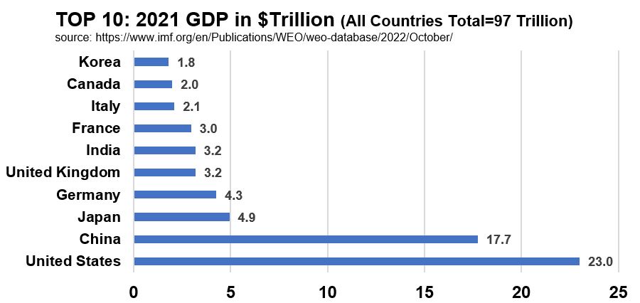
The US produces about 23.7% (using 2021 data from the IMF) of the World’s GDP. Graph A21 shows the top 10 highest GDPs.
Graph A21: 2021 GDP; Top 10 Countries in $Trillions
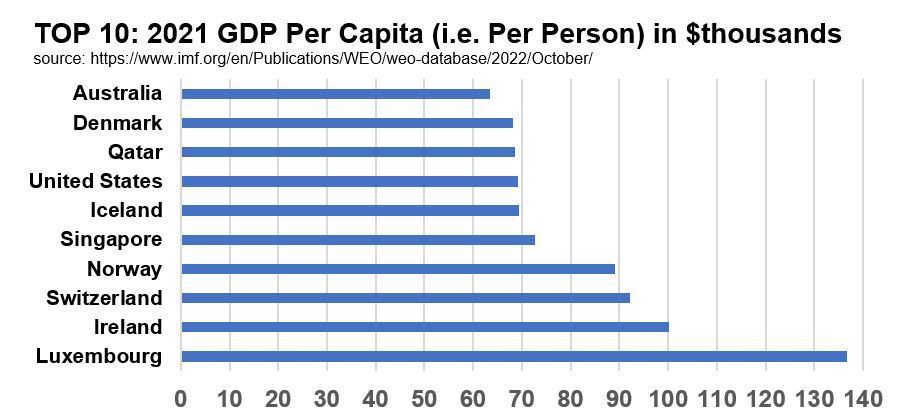
Are you curious about what the most efficient GDP nations are? We can divide each country’s GDP by its population to get this value. Graph A22 ranks the top 10 GDP per Capita countries. The USA makes this top 10 list as well but it’s not number 1 (its 7th and almost equal to Qatar and Denmark).
Graph A22: 2021 GDP per Capita (per person); Top 10 Countries in $Thousands
Let’s define the components of GDP.
GDP Definitions
Since the GDP is the value of all final goods and services of a country it can be expressed in three equivalent ways:
- Value of Production
- Value of Income
- Value of Expenses (Spending)
The GDP is commonly expressed in its Spending form:
GDP = C + I + G + (X – M) where
- C = Consumer Spending (Bar far the biggest contributor at 70% of GDP)
- I = Corporate Spending = Corporate Capital Investments
- G = Government Spending
- X = Exports
- M = Imports (money spend on imports leaves our economy)
- (X-M) = Net Export = Trade Balance
Note that Imports, M, are negative in the equation because money spent on imports leaves our economy versus exports that result in money entering our economy. We do this because we want the GDP to represent the value of the final goods and services produced in the United States (i.e. domestically produced).
Items not included in GDP are intermediate goods, used goods and financial transactions. Government transfers (e.g. Social Security Payments) don’t count as spending either.
An easy way to remember this is with a Mnemonic (courtesy of NPR) like:
Cheese Is Great eXcept for Mozzarella
GDP Relationship to the Business Cycle
The government essentially is tasked, via its Fiscal and Monetary policies to keep the economy growing and stable over the long term. GDP growth over time has cycled between high growth and low growth cycles (Business Cycle) and the task of government is to essentially smooth out these cycles and to avoid economic booms and busts. Graph A23 shows these relationships. Refer to Appendix 3 for more on how GDP relates to the Business Cycle.
Graph A23: Business Cycle on a GDP vs Time Chart
References
- Simple but nice GDP explanation by NPR Planet Money
- Jacob Clifford GDP
- BEA (Bureau of Economic Analysis) GDP
- FRED (St. Louis Fed) Graphical GDP Data
Intra-Post Links
Appendix 3 : Business Cycle
Gross Domestic Product or GDP is a lagging economic indicator that measures the country’s economic output. Plotted against time it becomes a very useful tool for tracking the economy’s Business Cycle.
Graph A31 – Business Cycle Graph
Business cycles are short term fluctuations in the economy. See Appendix 1 for a description of GDP. The government’s job is to try to maximize employment and stabilize prices (i.e. keep inflation from rising too high). Currently (2022) the government’s inflation target is about 2% (yearly annual increase as measured by an indicator called the PCE; see the section on Inflation).
Business Cycle Graph Description
- The Government effectively (*) targets a GDP which represents a Full Employment scenario.
- According to the BLS (Bureau of Labor Statistics), “The Full-Employment assumption links BLS projections to an economy running at full capacity and utilizing all of its resources.”
- Full Employment does not mean 0 (zero) unemployment. Due to Frictional (temporary joblessness) and Structural reasons (mismatch of skills with job requirements).
- Most of the articles I’ve read suggest (as of Dec 2022) any Unemployment Rate of 4% or less is roughly equivalent to Full Employment.
- So the sweet spot is the Full Employment line (blue sloped line in the graph above).
- (1) to (2) in the graph: Expansionary Period (trough to peak). Sometimes called an Economic Boom.
- Leads to an Inflationary Gap where economy is very (too) strong and unemployment is very (too) low. Prices start to rise due to inflation.
- (2) to (3) : Contractionary Period (peak to trough). A Recession is defined as negative GDP growth for 2 consecutive quarters. At some point a trough is reached where we can define a Recessionary Gap. This defines a period of slow growth and high unemployment.
(*) The Government since 2022 has shied away from using specific measures or estimates of Maximum Employment (i.e. NAIRU). The Federal Reserve uses other economic indicators like inflation rates and employment statistics to determine if the US is at maximum or full employment.
References
- Jacob Clifford Business Cycle Video
- Jacob Clifford Business Cycle Video 2
- NPR on Full Employment vs Unemployment Rate
- BLS on Full Employment Definition
- Brookings on Full Employment Definition
Intra-Post Links
Appendix 4 : Money Supply
According to the Federal Reserve (read this), “The money supply is the total amount of money—cash, coins, and balances in bank accounts—in circulation. The money supply is commonly defined to be a group of safe assets that households and businesses can use to make payments or to hold as short-term investments. For example, U.S. currency and balances held in checking accounts and savings accounts are included in many measures of the money supply.”
The Federal Reserve tracks M1 and M2 money supply as defined by the table and picture below. Data is sourced from the FRED website.
Table A41 below breaks down the M0 (or MB), M1, M2 Money Supply components. Notice that Bank Reserves are not considered part of M1 or M2 but Currency is.
Table A41: US MB, M1, M2 Money Supply November 2022 (in $Trillion)
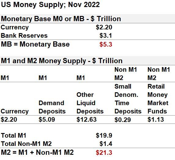
M1 and M2 Variable Descriptions (Excerpted from FRED)
- Other liquid deposits consist of negotiable order of withdrawal and automatic transfer service balances at depository institutions, share draft accounts at credit unions, demand deposits at thrift institutions, and savings deposits, including money market deposit accounts.
- The demand deposits component of M1 is defined as total demand deposits at commercial banks and foreign related institutions other than those due to the U.S. government, U.S. and foreign depository institutions, and foreign official institutions.
- The currency component of M1, sometimes called “money stock currency,” is defined as currency in circulation outside the U.S. Treasury and Federal Reserve Banks.
- The retail money funds component of M2 is constructed from weekly data collected by the Investment Company Institute (ICI), a trade association for the investment company industry. The retail money funds component of M2 excludes IRA and Keogh balances held at MMMFs, which are reported by ICI on a quarterly basis.
- The small-denomination time deposits component of M2 includes time deposits at banks and thrifts with balances less than $100,000. The small-denomination time deposit component of M2 excludes individual retirement account (IRA) and Keogh balances at depository institutions because heavy penalties for pre-retirement withdrawals make them too illiquid to be included in the monetary aggregates.
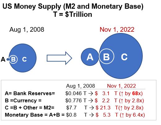
In Graph A41 below, I show how the monetary supply has changed since 2008 showing two snapshots between 2008 and Nov. 2022. The circles are proportional to the quantities. Notice how Bank Reserves (A in the picture) have dramatically increased in this time period. This is primarily due to government liquidity injections (adding cash to bank reserves by buying securities) due to the Great Recession of 2008-2009 and the 2020 Covid Pandemic.
Graph A41: US Money Supply Change (Aug 2008 to Nov 2022)
The following timeline gives you a brief chronology of what has happened since 2008
Timeline for US Government Monetary and Fiscal Actions
- Prior to September 2008 – Very few Open Market Operations conducted by the Fed (buying and selling of mostly Treasuries to influence Bank Reserves and Federal Funds Rate).
- 2008 – Financial Crisis – Beginning of the “Great Recession” (Official duration of the G.R. is December 2007–June 2009, about 18 months).
- 2008 – 2014: Fed lowered Federal Funds Rate to near zero and initiated 3 large scale asset purchasing campaigns (2008,2010,2012; with intent of lowering interest rates and encourage spending). Purchases included longer term Treasury Securities and Mortgage Backed Securities (called Quantitative Easing or QE). The cash for these purchases is mostly added to the reserves of Banks.
- 2020 – 2022 – Covid Pandemic. A large asset purchasing campaign started in March 2020 and was ended in March 2022 (more QE). The amount of reserves in the banking system are now about 68x times higher than what they were before September 2008. Starting in 2020, the government also introduced multiple stimulus packages (part of Fiscal Policy) totaling about 5 Trillion USD!
See Appendix 9 for how Open Market Operations (including Quantitative Easing) have affected the Federal Reserve Balance Sheet (Total Assets were about $ .89 Trillion before the Great Recession (2008). In the 1st quarter of 2022, after the Great Recession and Covid-19, Federal Reserve Assets maxed out at $8.96 Trillion (yes, the government has increased Federal Reserve assets by about 10x over this period of time).
The implications of these massive liquidity injections in our economy is a hot topic today especially since inflation spiked in 2022. Now the government is reversing some of its policies (monetary and fiscal) in order to taper economic growth.
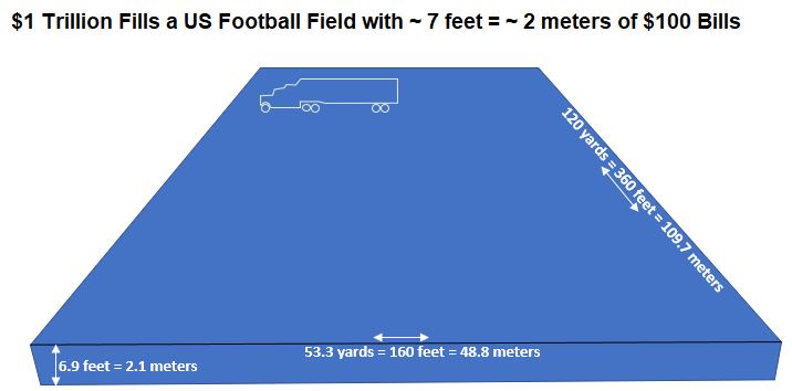
A Trillion is a Shit-Ton of Money
The amount of money we are talking about is sobering.
- Imagine an American football field (See Drawing A41 below). If you were to neatly pile up stacks of $100 dollar bills , how much do you think you would need to get to 1 Trillion dollars? Answer: From edge to edge, you could stack about 7 feet of $100 bills!
- If you spent $100 million a day, it would take you 27.4 years to spend 1 Trillion USD.
Drawing A41: A Trillion dollars worth of $100 Bills on an American Football Field
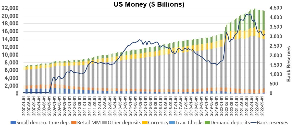
And finally one more graph, Graph A42 below, shows the money supply from 2007 through most of 2022. Notice the spike in bank reserves in 2008 as the Federal Reserve started buying Treasuries and Mortgage Backed Securities to inject cash into the banking system.
Notice the spike in 2020 as the government responded to the Covid 19 Pandemic with massive cash injections into the money supply. M2 money supply was about 21.86 Trillion USD in March 2022!! Another way to see this huge increase is via Assets on the Federal Reserve Balance Sheet (see Appendix 9).
Graph A42: Historical US Money Flows
In Graph A42 the stacked bars are read off the left axis (the total read off the top of each bar is M2 Money Supply). The blue line in Graph A42 is read off the right axis and represents total bank reserves (which are part of the Monetary Base M0 a.k.a. MB but not part of M2).
References
Intra-Post Links
Appendix 5: Money Market Supply/Demand
The graphs shown in this section are idealized. The straight lines will tend to be curved in reality.
The Money Market demand curve explains the relationship between interest rates vs quantity of money demanded (which we can represent as M1 or M2 money- see Appendix 4). Let’s be clear on what each of these variables means:
- The Interest Rate is the rate of return relative to rates on money deposits. It is the opportunity cost (or price) of holding you money as cash (or very liquid assets that can be quickly turned into cash) and not investing it elsewhere (in alternative assets like Bonds for example).
- The Quantity of Money Demanded represents cash in hand or very liquid assets that can be turned into cash in hand (basically, this is M1 money as described in Appendix 4).
Now take a look at Graph A51 below which plots Interest Rate vs Quantity of Money Demanded.
Graph A51: Money Market Demand Graph
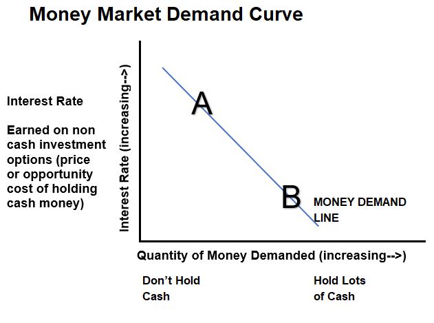
When the Opportunity Cost (interest rates available on Bonds for example) is high (see Point A in Graph A51 above), then we don’t want to hold cash because we can get a decent return elsewhere. The opposite is also true at point B where interest rates are low and there is little incentive to buy Bonds (for example).
This demand curve shows that when interest rates are low, that people and businesses tend to spend (and borrow more) causing the economy to grow (as reflected in the Gross Domestic Product GDP – See the the Business Cycle discussion in Appendix 3).
Let’s add a supply curve on the chart to produce Graph A52. Please note in all of these graphs, that the demand line is really a curve (its not straight) but we are idealizing it as a straight line for the purpose of explaining some key concepts.
Graph A52: Money Market Supply/Demand Graph
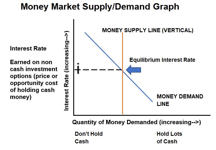
In Graph A52, we’ve added the Money Supply line which is vertical. This is because this does not depend on the interest rate. The Federal Reserve determines the money supply. We know that the intersection of the supply and demand lines is the Equilibrium Interest Rate. What happens when the Money Supply decreases (shifts to the left) ? See Graph A53.
Graph A53: Money Market Supply/Demand Graph – Money Supply Decrease
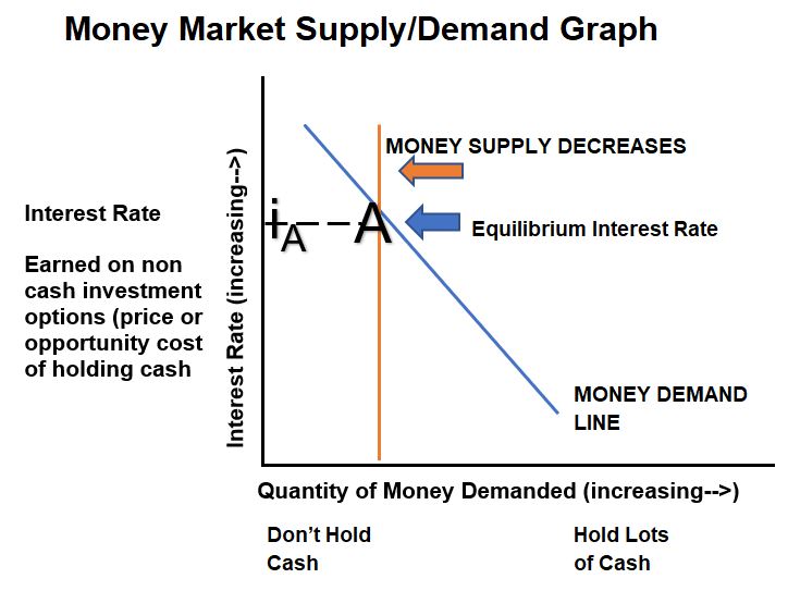
Interest rates increase when the Money Supply decreases (shifts to the left) and vice versa as shown in Graph A53.
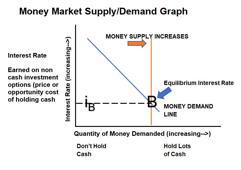
Graph A54:Money Market Supply/Demand Graph – Money Supply Increase
US Bank Ample Reserves Scenario
In reality the demand line in these graphs will flatten out near the max interest rate and bottom out near zero rates. If the Money Supply Line shifts to the right far enough, there would be diminishing effects on the interest rate. If we were to draw a Money Market Diagram today (Jan 2023) for Bank Reserves we would see that the vertical reserves supply line is so far to the right that changes to the supply line do not change the interest rate (Federal Funds Rate).
This so called Ample Bank Reserves regime ,which we are in today, is described further in the following sections of this post: Government Monetary and Fiscal Policies, Huge growth of Bank Reserves since 2008 is described in Appendix 4, and Ample Reserve Monetary Policy in Appendix 7.
References
- Khan Academy – Money Market Demand
- Khan Academy – Money Market Demand/Supply
- Khan Academy – Monetary Policy Tools
- Jacob Clifford – Money Market Demand/Supply
- Jacob Clifford – Monetary Policy Tools
Intra-Post Links
Appendix 6: Quantity Theory of Money
Economist Henry Hazlitt has written that the Quantity Theory of Money is an old concept:
- The idea possibly goes back to French economist Jean Bodin in 1566 or the Italian economist Davanzati in 1588.
- American economist Irving Fisher is given credit for its modern form (in “The Purchasing Power of Money (1911)” and other books)
The Quantity Theory of Money can be stated as,
M x V = Y x P
where,
- M is the Money Supply (See Appendix 4 for how the Government measures Money Supply)
- V is the Velocity of Money which is the number of times money is used in a year (e.g. V would be 3 if you spend a dollar which gets spent two more times as it transfers between buyers and sellers)
- Y represents all goods and services sold (the real GDP)
- P is the price level of all finished goods and services in an economy (Inflation as described by the CPI or PCE would be a price level indicator)
- Since Y is Real GDP then (Y)(P) = Nominal GDP (See Appendix 2 )
The Equation of Exchange
MV=YP is sometimes called the Equation of Exchange and postulates that the actions of Sellers (Y x P) will equal the actions of Buyers (M x V).
Since the growth rate of a product is equal to the sum of the growth rates of each term in the product , the Equation of Exchange can be expressed as a growth equation:
M_growth + V_growth = Real GDP_Growth + P_Growth
One of the leaders of this school of thought was U. of Chicago Professor Milton Friedman (1912 – 2006) who is regarded as the founder of Monetarism. Monetarism postulates that changes in the Money Supply in the short run affects economic activity (GDP) and price level (Inflation) in the long run.
Let’s plot some of these variables over time and try to make some observations. Consider Graph A61 below.
Graph A61: Historical US GDP, M2, CPI, and Velocity of Money
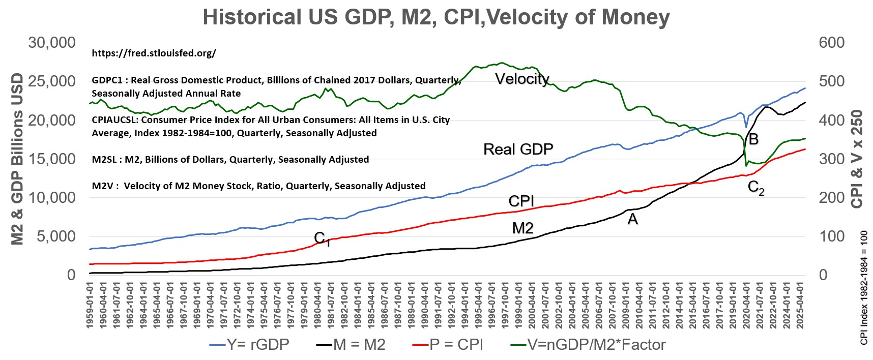
Graph A61 observations (QE1 – QE4 and Fiscal Stimulus):
Refer to Graphs A91 and A92 as well to see the impact of Open Market Operations (Quantitative Easing) on Federal Reserve Assets.
- In response to the Great Recession in 2008,the US Government embarked on a series of cash injections into the economy (Quantitative Easing Open Market Operations) lasting until 2014).
- Three separate campaigns were announced and implemented in this period (QE1, QE2, and QE3).
- In March 2020, in response to the COVID-19 pandemic, the US Government started injecting more money into the economy (I’ll call this QE4).
- About $5 Trillion of Government Stimulus packages were also enacted in 2020 and 2021.
Notice how the M2 slope increases in 2009 (see A on graph A61) and then again in 2020 (See B on graph; almost vertical!) coinciding with the government monetary and fiscal policies.
Graph A61 observations (Inflation):
- In April 2021, the CPI rate of change started increasing.
- The CPI was up 9.1 percent over the year ended June 2022, the largest increase in 40 years .
- The Fed started raising short term interest rates in March 2022 to counteract this.
- From the Equation of Exchange, P = MV/Y = CPI = MV/rGDP.
- The M2 slope increases from points A to B but the slope of the CPI line doesn’t. But after point B, a rapid spike in M2 quickly results in an accelerated CPI (point C2).
- Note that the acceleration in inflation looks like it was faster than it was in the 1970s and 1980s (point C1).
- The Velocity of Money can be greatly affected by consumer psychology and confidence in the future resulting in ,for example, hoarding or saving money, vs spending money.
- Remember that consumer spending is about 70% of GDP.
- After the M2 spike in 2020, its seems V flattened out and M increased more than Y , resulting in an increase in P or CPI.
- My conclusion is that it would be difficult to use the Equation of Exchange as a predictive tool (to estimate CPI based on Money Supply) since V has not been constant for many years.
I think qualitatively its seems intuitive that, at some point, with too much money chasing too few goods , that inflation will tend to go up (time coinciding to points C1 and B on Graph A61).
References
- Scott Walla (St. Louis Fed) on Equation of Exchange, Money Supply and Inflation
- Mru.org Quantity Theory of Money
- FRED (St.Louis Fed) Graphical Data on Money Velocity
Intra-Post Links
Appendix 7: Ample Reserves Monetary Policy
Ample Bank Reserves
You should view this video first before you review this section.
The Federal Reserve’s main goal is to ensure that employment rates are optimal and that inflation is in check (i.e. stable prices).
Traditional Monetary policy ,as we (well some of us) learned in our Macro Economics class, has the Federal Reserve manipulating the Discount Rate, adjusting required bank Reserve Ratios, or buying or selling (mainly) short term Treasury securities (called Open Market Operations OMO) in order to influence short term interest rates (namely the Federal Funds Rate). Basically the Fed goal is to reduce interest rates when the economy is sluggish and needs a boost and do the opposite when the economy heats up.
The Federal Reserve’s traditional Monetary Policy changed after September 2008 , when they started pumping cash into Bank Reserves in response to the Great Recession (Dec 2007 to June 2009). Open Market Operations were expanded and now consisted of buying short and long term Treasuries as well as Mortgage Backed Securities. The purchases of longer term maturity securities is called Quantitative Easing or QE. (Note: reserves started spiking up in Sept even though QE1 start date is formally 11/2008).
See Graph A71 below, and notice how bank reserves ballooned after September 2008. t
Graph A71: Federal Reserve Balance Sheet Liabilities 2002 to Jan 2023.
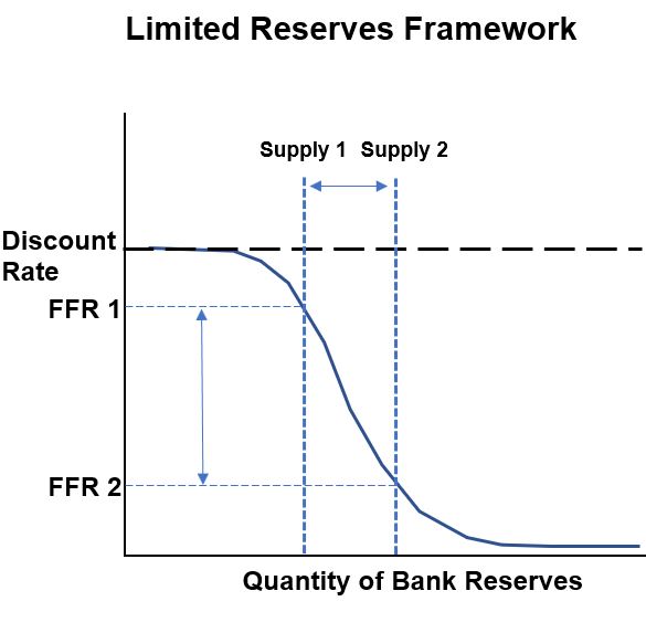
Graph A72 shows an Interest Rate vs Money demand diagram for Bank Reserves (money deposits of banks that are held by the Federal Reserve). See Appendix 5 for a review of these kind of diagrams. In a Limited Reserves Framework (before 9/2008), the Federal Funds Rate (FFR, the interbank lending rate) is controlled by changing the Supply of Money (vertical line). For example, the Fed can conduct Open Market Operations and purchase Treasuries (and therefore inject, actually credit, cash into Bank Reserves).
This would cause, for example, Supply 1 to shift to Supply 2 (in Graph A72) and cause the Federal Funds Rate to drop from FFR1 to FFR2. The top part of the demand curve in Graph A72 is capped by the Discount Rate (Federal Reserve lending rate to banks…they wont pay more than this). In a Limited Reserves world, the Supply Line intersects the downward sloping part of the demand curve, and therefore has a tangible effect on the Federal Funds Rate (FFR).
Notice that at some point the demand curves will flatten out. On the bottom side, the curve flattens out because at some point the banks don’t want any more reserves.
Graph A72: Limited Reserves Framework Demand Curve
After 2008, Bank Reserves became flush with cash as the Fed added liquidity to the market to help resuscitate the economy. Let’s focus our attention on Graph A73 below.
Graph A73: Ample Reserves Framework Demand Curve
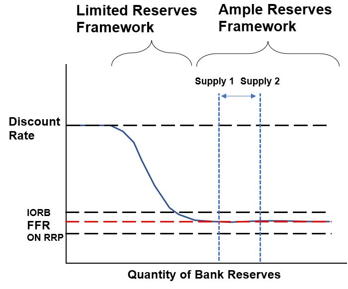
Today the Fed operates under an Ample Reserves (or Super-Abundant Reserves) Framework. This region is depicted as the right, flat part of the demand curve in Graph A73 above. Open Market Operations ,which shift the vertical Supply Line left or right, now have no effect on the FFR because the supply line is now very far to the right of the downward sloping section of the demand curve.
The current Monetary Policy Tool box for an Ample Reserves regime, then, does away with Open Market Operations (ineffectual against the FFR) and bank Reserve Ratios (as of March 2020, there are no required bank reserve ratios). The Federal Funds is still the rate to adjust, but how does the Federal Reserve do it today? Read on.
Administered Rates – IORB
In today’s Ample Reserve regime, the Federal Reserve manipulates three interest rates in order to change the Federal Funds Rate which is a market driven rate. These adjustable interest rates are called Administered Rates because the Fed can directly change them.
IORB – The Interest on Reserve Balances is the primary tool the Fed uses. Effective October 2011, the Fed has been providing interest on reserves that banks hold with the Fed. The current form of the interest rate as the IORB was established later in July 2021. The IORB and FFR stay close together (See Graph A73) due to two phenomena: (1) Reservation Rate and (2) Arbitrage.
The Reservation Rate concept means that the IORB is the lowest rate that banks are likely to accept for lending out their funds.
Arbitrage allows banks to book a profit due to the difference in interest rates between the IORB and The FFR. For example , if the IORB rate is 2.5% and the FFR is 2%, a bank will make a risk free profit of 50 basis points (basis point is 1/100 of a percent) by borrowing money at the FFR and depositing it at the IORB rate.
Over time , demand for the FFR will cause it to increase towards the IORB rate. In this way, through arbitrage, the IORB rate allows a natural self correction of the FFR.
Administered Rates – ON RRP
ON RRP – The Overnight Reverse Repurchase Agreement is a supplementary tool the Fed uses to adjust the FFR. Only banks have deposits with the Fed and earn the IORB rate. The ON RRP rate is offered to non-bank large financial institutions like Money Market Funds. In a reverse repurchase agreement, a counterparty buys securities like Treasuries from the FED and then agrees to sell then back at some future date for a profit (the profit is the ON RRP rate). Reservation Rates and Arbitrage play a role here as well to keep the ON RRP close to the FFR. The ON RRP typically provides a floor on the FFR. (See Graph A73).
Administered Rates – Discount Rate
The Discount Rate provides an upper ceiling for the FFR. Banks are not going to pay more than this rate. In Graph A73, think of the Discount Rate for situations where banks are borrowing from the Fed and think of the lower part of the demand curve as banks placing funds at the Fed.
Open Market Operations
Open Market Operations (buying/selling securities) are still available to the Fed, but now they are used to ensure Ample Reserves are maintained and not to change the FFR.
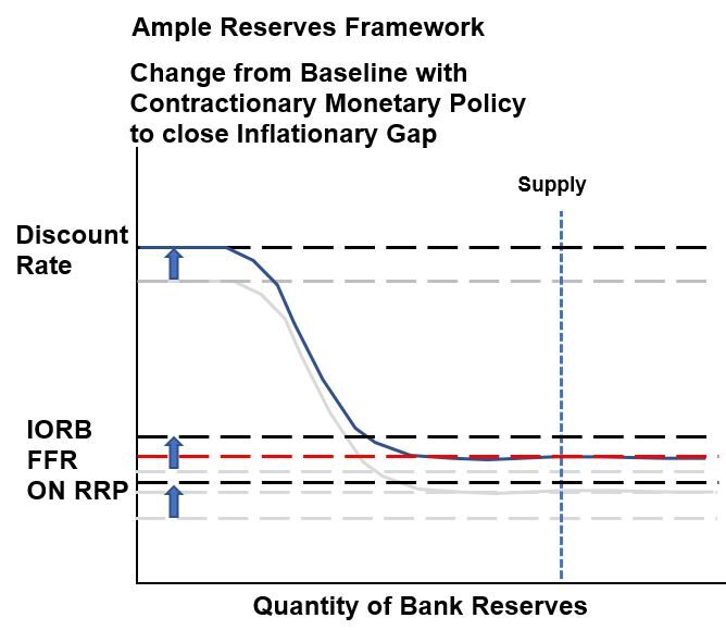
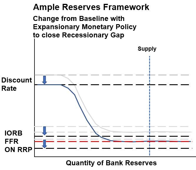
Graphs A74 and A75 show how the market driven FFR changes when changes to the Administered Rates are made.
Graph A74 would reflect a Contractionary Ample Reserves Monetary Policy where the intent is to close an Inflationary Gap (gap between target and actual inflation) i.e. A higher FFR is targeted. The IORB and ON RRP are the primary and supplemental Administrative Rates that are adjusted. The Discount Rate is typically adjusted to maintain a constant spread with the FFR.
Graph A75 would reflect a Expansionary Ample Reserves Monetary Policy where the intent is to close a Recessionary Gap (gap between target and actual GDP or Employment) i.e. A lower FFR is targeted. The IORB and ON RRP are the primary and supplemental Administrative tools that are adjusted. The Discount Rate is typically adjusted to maintain a constant spread with the FFR.
Graph A74: Ample Reserves Framework – Contractionary Monetary Policy
Graph A75: Ample Reserves Framework – Expansionary Monetary Policy
Some Concluding Remarks on Ample Reserves Monetary Policy
- Administrative Rates IORB and ON RRP are the main tools the Fed uses to adjust the market driven FFR.
- Arbitrage and the Reservation Rate concept allow proportional changes in the FFR with changes in the IORB and ON RRP.
- The Fed is communicating these days that it focuses less on impacting the Money Supply. Its focus is now on interest rates, it says, and how interest rates affect the decisions of producers and consumers. This is a very interesting statement given the government has pumped so much money into the economy that the M2 money supply is almost 45% higher than it was before 2020 (See Graph A42 in the Money Supply section)! I would say, not surprisingly, inflation started rising in 2022. To be fair though, it doesn’t seem like money supply has been entirely reliable in predicting when inflation will occur (in the short run).
- Monetary Policy focuses on interest rates (short term interest rates). Changes in the FFR are expected to reverberate throughout the economy and influence spending habits of people and businesses. Remember that consumer spending is something like 70% of GDP or Output. Spending then impacts the Aggregate Demand which impacts Real Output (GDP or Employment) and the Price Level. Refer to the AS-AD diagrams in Appendix 8 for a graphic display of this relationship.
References
- The Tools of Monetary Policy Have Changed. Has Your Instruction? (Ihrig,Wolla)
- The Fed’s New Monetary Policy Tools(Ihrig,Wolla)
- St. Louis Fed: Teaching the New Tools of Monetary Policy
- Implementing monetary policy in an ample reserves regime (Note 1)
- Implementing monetary policy in an ample reserves regime (Note 2)
- Implementing monetary policy in an ample reserves regime (Note 3)
- Ample Reserves – ReviewEcon
- Ample Reserves – Jacob Clifford
- Ample Reserves – Carey LaManna
Intra-Post Links
Appendix 8: Monetary and Fiscal Policy Explained on an AS-AD Diagram
In his 1923 publication “The Tract on Monetary Reform”, the economist John Meynard Keynes wrote, “But this long run is a misleading guide to current affairs. In the long run we are all dead. Economists set themselves too easy, too useless a task, if in tempestuous seasons they can only tell us, that when the storm is long past, the ocean is flat again.” He was suggesting that market disruptions and their return to a natural or equilibrium state would take too long without some kind of government action (a premise of 18th and 19th century Classical Economic thought – think Adam Smith – is that the economy is self regulating).
Macro-Economics, the study of the overall economy and the factors that influence it, was essentially founded by John Maynard Keynes (1883–1946) in the 1930s. In his 1936 book “The General Theory of Employment, Interest and Money”, Keynes argued that gaps between the actual and ideal economic capacity of a country could be closed by government intervention (via Fiscal and/or Monetary Policies).
US Government economic policies through the years have incorporated a mix of Classical (less government intervention) and Keynesian (more government intervention) economics.
The AS-AD (Aggregate Supply-Aggregate Demand) diagram is an idealized graph that can readily explain these Keynesian concepts.
Before we describe the AS-AD diagrams, let’s define some underlying key terms and their characteristics:
AS-AD Lines are Really Curves
The diagrams are idealized with straight AD and AS lines to simplify the concepts being discussed. In reality these lines are going to be curved and often will be described as “curves” even though you will often see them displayed as straight lines.
Ceteris Paribus
Latin for “holding other things constant”. Unless otherwise noted, in Macro-Economics, many of the idealized variable relationships shown in graphs and diagrams assume all other variables are held constant. Keep this in mind when you try to interpret AS-AD diagrams.
Nice Reference: Investopedia on Ceteris Paribus
(PL) Price Level
PL is the Price Level representing the whole economy. It’s essentially an inflation indicator. A Price Level could be the Consumer Price Index CPI (price of a composite of goods) for example or it could be the GDP Deflator (Nominal GDP/Real GDP * 100) or the PCE.
(rGDP) Real Gross Domestic Product
rGDP is the Real (inflation adjusted) Gross Domestic Product. It represent the Real production of goods and services in a country which is equivalent to the total amount spent on final goods and services (less imports). Using the spending-centric definition: GDP = C + I + G + (X – M) where
C = Consumer Spending
I = Corporate Spending = Corporate Capital Investments
G = Government Spending
X = Exports
M = Imports (money spent on imports leaves our economy)
(X-M) = Net Exports = Trade Balance
Note that (Price Level) x (rGDP) = Nominal GDP
rGDP can be expressed using any of the following descriptors or variables: Real GDP = Y = National Income = Real Output = Employment
See Appendix 2 for more.
(Yf) Real GDP at Full Employment
According to the US Bureau of Labor Statistics , Full Employment exists when an economy is “running at full capacity and utilizing all of its resources.” It is often represented using the symbol Yf. We can describe Yf as the maximum sustainable real output. The Full Employment target is often shown on a Business Cycle Diagram whereby the government seeks to dampen (reduce) Inflationary (GDP is Above Full Employment target) and recessionary (GDP is Below Full Employment target) gaps from the Full Employment Target (see Appendix 3 for more on the Business Cycle).
(AD) Aggregate Demand
Aggregate Demand (AD) = All spending within the economy. On the AS-AD chart where Price Level is plotted against Real GDP, AD is represented as a downwardly sloping curve (idealized as a straight line). As the price level increases (Ceteris Paribus), real output decreases and vice versa. The AD line shifts to the right when it increases and shifts to the left when it decreases. Shifters of the AD line are the spending components of real GDP (C, I, G, X- M). Increases in these result in increases in AD.
References: KhanAcademy – Aggregate Demand
(AS) Aggregate Supply
Aggregate Supply (AS) = All production within the economy.
(SRAS) Short Run Aggregate Supply
The SRAS (Short Run Aggregate Supply) slopes upwards on the AS-AD Graph because wages and other resource prices are “sticky” (don’t change). Example: Imagine that a business has to reduce selling prices but the employees have wage contracts so their salaries stay the same. So production costs increase and the company might reduce output to accommodate the rising prices.
As the price level increases (Ceteris Paribus), real output increases and vice versa. The SRAS line shifts to the right when it increases and shifts to the left when it decreases. Some shifters of the SRAS line are : Subsidies for businesses(direct relationship), Productivity(direct), Input prices(inverse), Taxes on businesses(inverse), Expectations about inflation(inverse).
References: Quickonomics.com ; Khanacademy-SRAS
(LRAS) Long Run Aggregate Supply
The LRAS (Long Run Aggregate Supply) is a vertical line on the AS-AD. In the long run, it is assumed that the economy is running at full capacity and utilizing all of its resources. This assumes that wages and other resource costs will change as overall price levels change (aka wages are “flexible”). The LRAS shows that, at any price level, we will have the maximum sustainable real output Yf. In the long run, real GDP does not depend on prices. It represents a natural level of productivity in the economy. Remember that this vertical line is just a snapshot in time with all other variables not changing (Ceteris Paribus).
Any number of variables could shift the LRAS line right (e.g. increase due to population increase or technology improvement) or left (e.g. decrease due to war).
References: Khanacademy-LRAS
Business Cycle Diagram
Keep the Business Cycle Diagram (Appendix 3) below in mind as you read the following sections on the AS-AD diagrams.
Graph A81: Business Cycle Diagram
AS-AD Diagram – Contractionary Fiscal or Monetary Policy
The AS-AD diagram allows us to visualize the effects of economic variables on the economy.
A Contractionary government policy seeks to close an Inflationary Gap. An Inflationary Gap is the distance above the Full Employment line as shown on a Business Cycle Diagram above: Graph A81.
Graph A82: AS-AD Diagram – Contractionary Fiscal or Monetary Policy
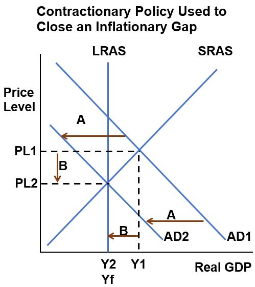
In AS-AD Graph A82 above, the Inflationary Gap is B = Y1 – Yf. Decreasing the Aggregate Demand line from AD1 to AD2 brings down the Price Level (PL1 to PL2) and real GDP (Y1 to Y2) to get back to Full Employment Yf.
Fiscal government policies involve taxation and government spending (G). Higher Taxation would reduce (C) Consumer spending. The government could also decrease (G) Government Spending. These changes would
- Decrease AD (Aggregate Demand). Decreasing AD would
- Decrease PL (Price Level; so inflation decreases ) and
- Decrease Y (real Output or Employment; so Unemployment increases)
We can express the relationships more crisply as follows:
- ↑Taxes ⇒↓C ⇒↓AD ⇒↓PL ;↓Inflation; ↓Y; ↑Unemployment and
- ↓G ⇒↓AD ⇒↓PL ;↓Inflation; ↓Y; ↑Unemployment
The Monetary Policy of increasing short term interest rates would
- Decrease I (Business Investment) and
- Decrease other interest sensitive C (Consumer spending) which would
- Decrease AD (Aggregate Demand) and therefore
- Decrease PL (Price level ,meaning inflation) and
- Decrease Y (real Output or Employment; so Unemployment increases)
We can express the relationships more crisply as follows:
- ↑Short term interest rates ⇒↓I ⇒↓C ⇒↓AD⇒↓PL ;↓Inflation; ↓Y; ↑Unemployment
Graph A83: AS-AD Diagram – Expansionary Fiscal or Monetary Policy
Expansionary Fiscal or Monetary Policy seeks to primarily fight unemployment.
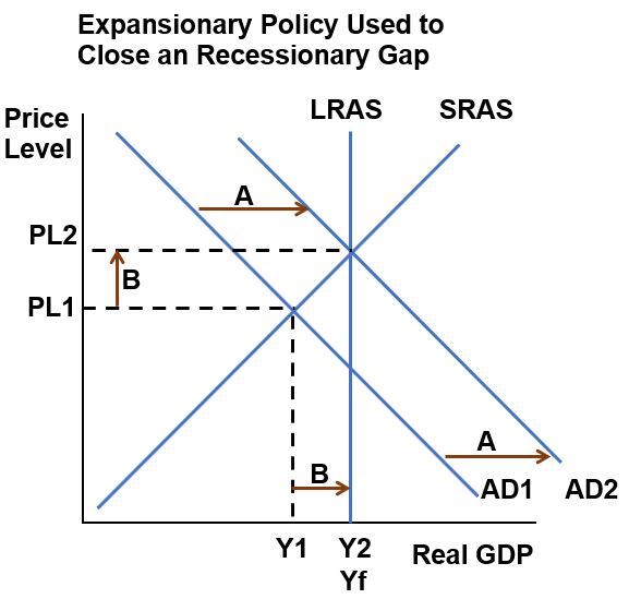
In AS-AD Graph A83 above, the Recessionary Gap is B = Yf-Y1. Increasing the Aggregate Demand line from AD1 to AD2 increases the Price Level (PL1 to PL2) and real GDP (Y1 to Y2) to get back to Full Employment Yf. Increasing price level means increasing inflation. Inflation caused by increasing aggregate demand is described as Demand Pull Inflation.
Fiscal government policies involve taxation and government spending (G). Lower Taxation would increase (C) Consumer spending and business investment (I). The government could also increase (G) Government Spending. These changes would
- Increase AD (Aggregate Demand). Increasing AD would
- Increase PL (Price Level; so inflation increases) and
- Increase Y (real Output or Employment; so Unemployment decreases)
We can express the relationships more crisply as follows:
- ↓Taxes ⇒↑C , ↑I ⇒↑AD ⇒↑PL ;↑Inflation; ↑Y; ↓Unemployment and
- ↑G ⇒↑AD ⇒↑PL ;↑Inflation; ↑Y; ↓Unemployment
The Monetary Policy of reducing short term interest rates would
- Increase I (Business Investment) and
- Increase other interest sensitive C (Consumer spending) which would
- Increase AD (Aggregate Demand) and therefore
- Increase PL (Price level ,meaning inflation) and
- Increase Y (real Output or Employment; so Unemployment decreases)
We can express the relationships more crisply as follows:
- ↓Short term interest rates ⇒↑I ⇒↑C ⇒↑AD⇒↑PL ;↑Inflation; ↑Y; ↓Unemployment
AS-AD Diagram – Cost Push Inflation (Stagflation)
In Graphs A82 and A83 we kept the SRAS line constant (ceteris paribus, all other things equal, i.e. we only shifted the AD line). What could cause the SRAS line to shift?
Short Run Aggregate Supply Shifters:
- Resource Price Shifts (raw prices)
- Wages
- Business Taxes
- Production Costs
What happens if some or all of the factors above increase (ceteris paribus)? The SRAS line decreases and shifts to the left. How does this affect prices and GDP? Prices (Inflation) increase and the GDP (Output, Employment) decreases or stagnates. See Graph A84 below. Inflation caused by a decrease in the Short Run Aggregate Supply is called Cost Push Inflation.
Graph A84: AS-AD Diagram – Cost Push Inflation (Stagflation)
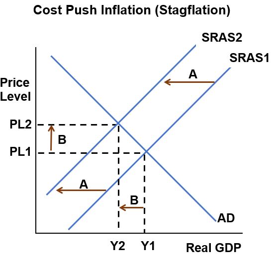
In a speech to the British House of Commons in 1965, Iain Norman Macleod (A British Minister) said: “We now have the worst of both worlds — not just inflation on the one side or stagnation on the other, but both of them together. We have a sort of ‘stagflation‘ situation. And history, in modern terms, is indeed being made”.
America experienced Stagflation in the 1970s and 80s. Some fear we are at the onset of a new Stagflationary period as we enter 2023.
References
Intra-Post Links
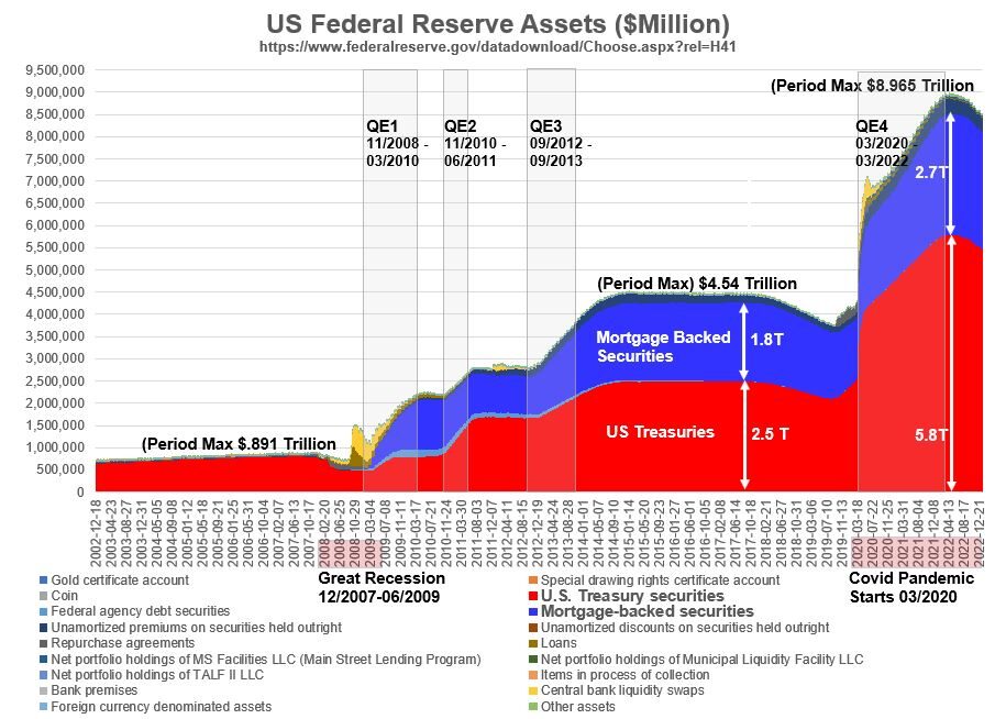
Appendix 9: Federal Reserve Balance Sheet
The purpose of this section is to show how the Federal Reserve Balance Sheet has changed since the Great Recession (Dec 2007 – June 2009).
The Federal Reserve is the United State’s Central Bank. It keeps a balance sheet that meets the definition we’ve discussed in my Accounting Primer (Assets = Liabilities + Equity, except Equity is called Capital here). Go to the Reference section links at the bottom of this section to learn all about the Fed Balance Sheet.
The Federal Reserve updates their balance sheet weekly via statistical release H.4.1. Find Table 5 (Consolidated Statement of Condition of All Federal Reserve Banks) to view a nice summary of Assets and Liabilities.
Quickly scroll down and take a look at Graphs A91 and A92 which show the assets and liabilities on the Fed Balance Sheet since 2002. As you review the graphs recall that
- Mortgage Backed Securities (MBSs) are Bond like mortgage related financial instruments and
- Treasuries are short (Bills) and long term (Notes) government issued Bonds.
- QE = Quantitative Easing (suggesting lowering of borrowing rates) is a synonym for buying longer Treasuries and Mortgage Backed Securities through Open Market Operations.
Timeline for US Government Monetary and Fiscal Actions
- Prior to September 2008 – Very few Open Market Operations conducted by the Fed (buying and selling of Treasuries to influence Bank Reserves and Federal Funds Rate). Total Fed assets peak out at about $.89 Trillion.
- 2008 – Financial Crisis – Beginning of the “Great Recession” (Official duration of the G.R. is December 2007–June 2009, about 18 months).
- 2008 – 2014: The Fed lowered the Federal Funds Rate to near zero and initiated 3 large scale asset purchasing campaigns (Quantitative Easing or QE; 2008,2010,2012; with intent of lowering interest rates and encouraging spending). The cash for these purchases is mostly added to the reserves of Banks. After QE3, total Fed assets peaked out at $4.5 Trillion (increased by 5x from the pre-2008 max!).
- 2020 – 2022 – Covid Pandemic. QE started again in March 2020 and was ended in March 2022. The amount of reserves in the banking system are now about 68x times higher than what they were before September 2008 (see graph A92). As of Jan 11, 2023, the Fed assets were at $8.56 Trillion (about 9.6x the pre-2008 max!!). To give you a visual image, since 2008, Federal Reserve Assets have ballooned from a ~6 foot deep American football field full of $100 bills, to a 59 foot deep field.
- Starting in 2020, the government also introduced multiple stimulus packages (part of Fiscal Policy) totaling about 5 Trillion USD!
Graph A91: US Federal Reserve Historical Assets 2002 to January 2023
Graph A92: US Federal Reserve Liabilities 2002 to January 2023
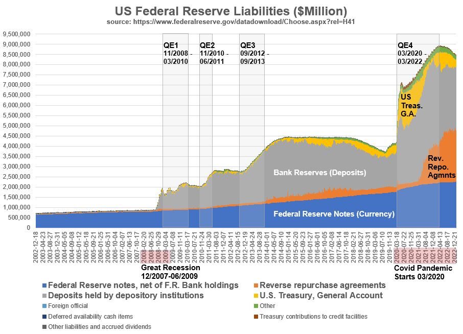
Notice in Graph A92 how Bank Reserves shoot up after QE1. When the Federal Reserve talks about their Ample Reserves Monetary Policy, they are referring to the current Monetary Policy given the situation that bank reserves have massive amounts of cash at this time (Since late 2008 all the way to the present 1/18/2023). See the section on government fiscal and monetary policy for more on this.
References
- Federal Reserve’s Explanation of Balance Sheet Terms
- CRS Description of Fed Balance Sheet
- Investopedia: Understanding the Feds Balance Sheet
- Federal Reserve Balance Sheets (Weekly) H.4.1