
12 Month Moving Range Example
Let’s get clear on the mechanics of a moving or rolling average calculation. A spreadsheet is essentially an electronic calculator that can manipulate columns and rows of numbers. Spread-sheeting tools like Google Sheets or Microsoft Excel facilitate these kinds of calculations. The tables shown in this post are snapshots of spreadsheets.
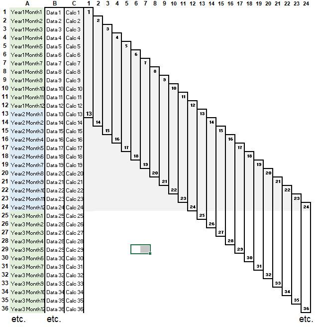
Look at Figure 1 below. The time column A lists the time starting with Year 1, Month 1. Column B contains the list of values coinciding with those times (Data 1, Date 2 etc.), and column C contains the calculation results (for the average for example). An actual spreadsheet would just have these three columns of data (A, B, and C) . The columns 1 through 24 would not actually be part of the spreadsheet. They are just visuals that show the range of data in column B that the calculation in column C is using. In Figure 1, the calculation range is in 12 month periods:
- Calc 1 is performed on Data 1 to Data 13.
- Similarly, Calc 2 is done on Data 2 to Data 14.
- Etc.
The term “rolling” or “moving” indicates that Calc 1 rolls or moves into Calc 2 by dropping Data 1 and adding Data 14.
Figure 1 (Example Picture Showing 12 Month Range Periods )
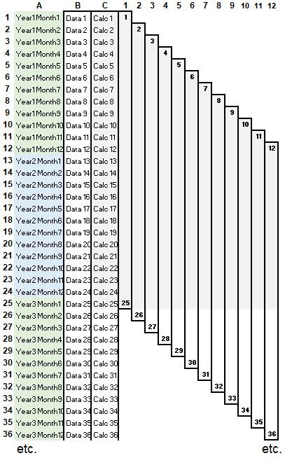
24 Month Moving Range Example
Look at Figure 2 below. This time the computation range is 24 months (versus 12 months in Figure 1):
- Performing the calculation on the range of data from Data 1 to Data 25 results in Calc 1
- Subsequently, Calc 1 rolls or moves into Calc 2 where the data range now is Data 2 to Data 26 etc.
Figure 2 (24 Month Rolling Example)
Hopefully by now you have a good mental picture of how the data ranges update as the calculations update from one period to the next period. Let’s do a moving or rolling CAGR calculation next.
10 Year Moving Average Example – CAGR Review
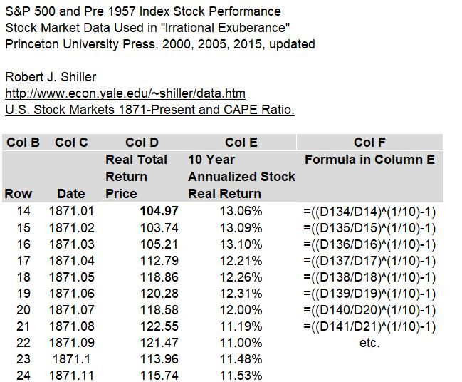
CAGR stands for the Compound Annual Growth Rate and has the formula: CAGR = (Ending Value/Starting Value)^(1/n) – 1 = Geometric Mean – 1 where n is the number of years. Refer to my post on the CAGR and Geometric Mean here. The CAGR tells us what the average annualized return of the investment is.
Refer to Table 1 below where we compute the CAGR for rolling 10 year periods using Robert J. Shiller’s S&P 500 historical data (Real Total Return Price). Column D contains monthly prices and column E is the calculation which updates with each row (which coincides to 1 month). You can access and view the full data set in my spreadsheet (see link in introduction section) as Table 1 only shows the top section of the full table. Column F shows what the calculation formula is in column E (this is the CAGR formula).
Table 1 S&P 500 (and Pre 1957) Index Stock Performance
10 Year Moving Average Example – Table & Graph Description
- In the first row of Table 1 (row 14), the CAGR formula growth ratio in column F is the 120th month’s (10th year’s) value (Cell D134) divided by the row 14 month (Cell D14).
- Subsequently, in the second row (row 15), the CAGR formula growth ratio rolls or moves down one month i.e. (D135/D15)
- Each cell in column E computes an annualized return for that exact 10 year period.
- The annualized return updates as it rolls/moves down the time series, one month at a time.
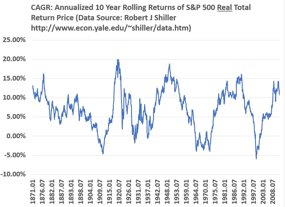
If we graph column E in Table 1, we get Graph 1 below. You can refer to my article on historical S&P 500 returns for more examples of annualized returns for different time periods.
Graph 1 (Annualized 10 Year Rolling Returns of S&P 500 Real Total Return Price)
Daily Moving Average (DMA) Example – Technical Analysis Concept
Many stock investors use technical analysis to help them monitor price trends. This investing methodology uses historical market data to understand potential future events. For example, some people will compare prices against moving averages of those prices and make predictions regarding future price movements. Sometimes a comparison of the averages themselves triggers an action. For example, some people use moving average crossovers as triggers to buy or sell stocks. Lets stick to the basics here and generate some moving averages and see how they look on a graph.
Daily Moving Average (DMA) Example – Table & Graph Description
Consider the example in Table 2 below. Column D is the adjusted daily close of the Russell 2000 index (a small capitalization stock market index). Again, I’m only showing a portion of the full data set (see the link in the Introduction section if you want to download the spreadsheet I used). Columns E, G, and I, calculate the 25, 50, and 200 daily moving averages (DMAs) of the prices , and their formulas are shown in columns F, H, and J. These formulas average the previous 25, 50, and 200 day’s prices starting from the designated day (in each row).
Table 2 (Calculation Table for Moving Average Prices of Russell 2000 Index)
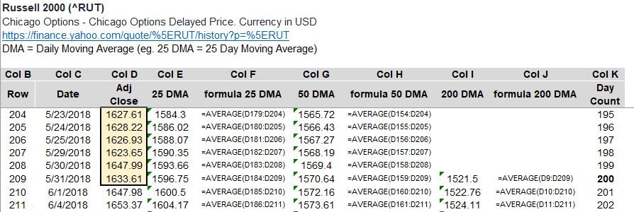
- Download the excel spreadsheet (see introduction section) to properly review the calculations.
- In row 209 of Table 2 for example, the average of the previous 25 days, Excel formula = AVERAGE(D184:D209), produces the 25 DMA.
- In row 209, the averages of the previous 50 (AVERAGE(D159 – D209)) and 200 ((AVERAGE(D9:D209)) days produce the 50 and 200 DMAs respectively.
- Subsequently, as the calculations move or roll down one row (one day), the ranges update by removing the oldest value and adding the next value.
See Graph 2 for a chart of these daily moving averages.
Graph 2 (Moving Averages of Russell Index Prices)
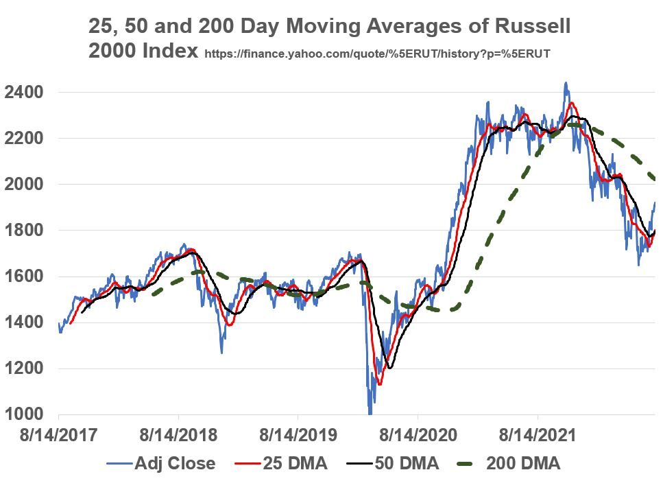
Looking at Graph 2 above, on around 8/14/2020, a rising 50 DMA crossed over the 200 DMA. Investors who use technical analysis to make investment decisions might use this “50/200 DMA crossover” as a buy signal. Likewise, the reverse of this (50 DMA falling through 200 DMA) signals a “sell”. Actual Price crossovers (with the 50 DMA) trigger buy (rising price crossover) and sell (falling price crossover) signals as well. These are just a few examples of how technical analysts might use a chart like this.
ok, lets wrap this up!