What is Color (Colour)?
Light is a form of energy and our eyes and brains “see” a portion of this light energy as color (colour).
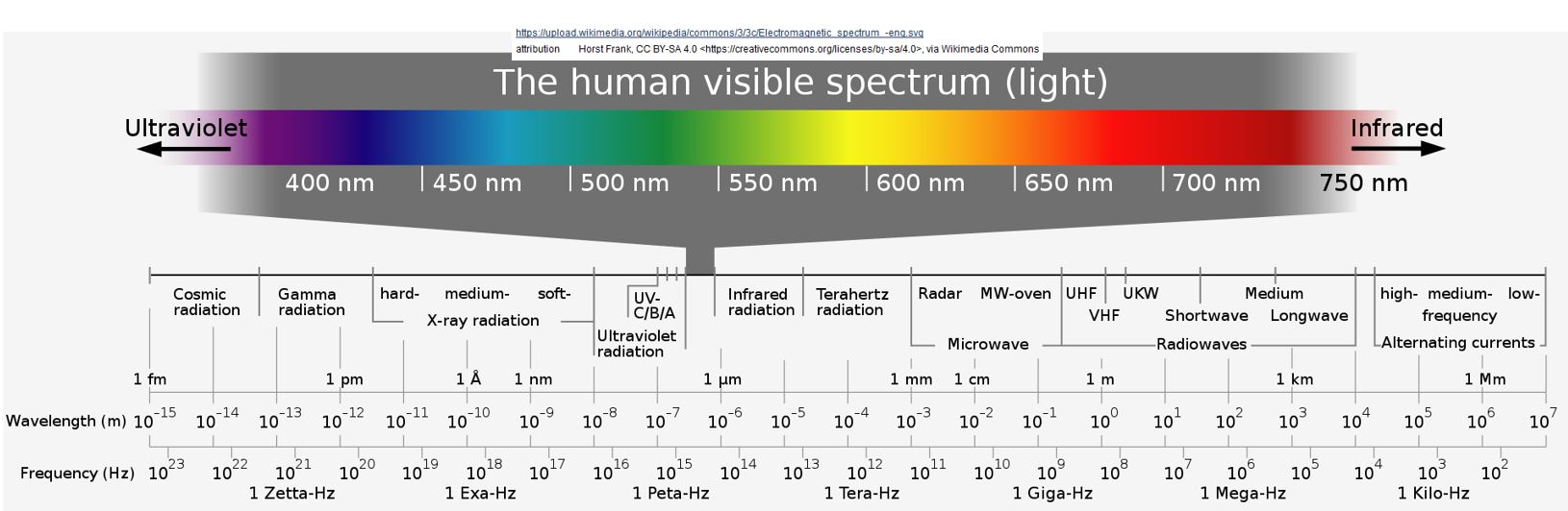
Take a look at Schematic 1 below.
The human visible spectrum of light represents a small section of the full range of light which is called the Electro-Magnetic Spectrum (EMS).
The EMS, in-total, can be described as Electro-Magnetic Radiation (EMR).
Schematic 1: The Human Visible Spectrum
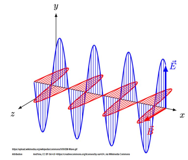
- Electro-Magnetic Radiation, EMR, is radiation energy which travels in the form of electromagnetic waves.
- EMR is (mathematically) both a wave and a particle (a photon, a massless unit of energy).
- Electro-Magnetic Radiation, EMR, has oscillating electric and magnetic fields (See Schematic 2 and videos at end of this section).
- As a wave, EMR has a wavelength (crest to crest or trough to trough distance) and frequency (number of waves passing a point per unit time).
- These waves travel through a vacuum (it doesn’t need a medium like sound would for example).
- EMR moves at the speed of light which is super fast (would go around the earth’s equator almost 7.5 times in one second).
- Nothing goes faster by the way.
- Sunlight is mostly in the Infrared, Visible, and Ultraviolet parts of the electromagnetic spectrum
- In the 1600s, Isaac Newton demonstrated that sunlight “contains” the visible spectrum (**) by bending (refracting) light and then “recombining” light through a series of two prisms.
- By “contains” we mean: possesses the range of electromagnetic wave lengths that we see as the rainbow colors.
- Visible light has wavelengths between 380 and 700 nanometers.
- A nanometer is 1 billionth of a meter.
- In the visible region, Violet light has the shortest wavelength (highest frequency)
- and Red light has the longest wavelength (lowest frequency).
- Color doesn’t exist outside our bodies.
- Electromagnetic Waves are sensed and translated by our eyes and brains into colour.
- The Scot, James Clerk Maxwell (1831 – 1879), and the German, Heinrich Rudolph Hertz (1857 – 1894), did pioneering work in this area.
** Newton probably coined the word Spectrum.
It comes from the Latin for ghost , apparition or specter.
Schematic 2: Electromagnetic Wave
The mention of wave /particle duality is also a little unsettling.
Sometimes the models are just hard to understand and you’ll have to accept that (because they are also hard to comprehend by the smart people who devised them).
That is, the phenomenon is real but ways we describe them are sometimes hard to grasp (i.e. a photon as a particle with no mass is kind of hard to imagine, right?).
Section Summary
- The Electromagnetic Spectrum (EMS) comprises the full range of Electromagnetic Radiation (EMR).
- EMR is radiation energy which travels in the form of electromagnetic waves.
- EMR behaves like a wave and has characteristics of wavelength (crest to crest or trough to trough distance)
- and frequency (number of waves passing a point per unit time).
- Visible light represents a small section of the EMS.
- Visible light has wavelengths between 380 and 700 nanometers.
- A nanometer is 1 billionth of a meter.
- In the visible region, Violet light has the shortest wavelength (highest frequency)
- and Red light has the longest wavelength (lowest frequency).
In the next section, we’ll start exploring how we see colour.
Check out these informative videos for more on Electro Magnetic Radiation:
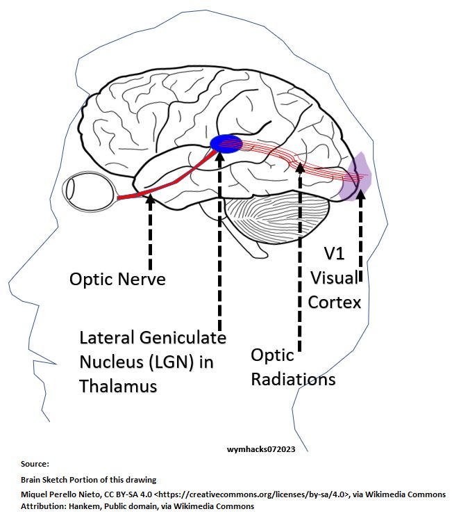
Overall Visual Pathway
Along a Visual Pathway between our eyes and brains, our Nervous System perceives the visible light spectrum as colour.
The color we see is not an inherent property of the light.
Color is a creation of our Nervous System in order to see (sense) light.
Ponder this for a moment.
Refer to Schematics 3 and 4.
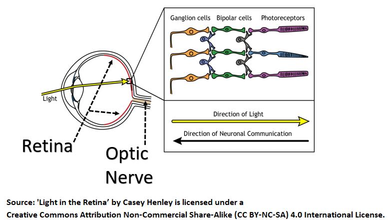
- The back of your eyeballs (Retinas) consist of a layer of nerve cells which receive and process light.
- These Retinal Cells convert light to electrochemical signals (the language of our Nervous System).
- Electrical signals travel along the Nervous System via nerve cells called Neurons.
- Electrical signals travel from the eye, via the Optic Nerve, to relay stations in the middle of your brain called LGNs (Lateral Geniculate Nucleus located in the brain Thalamus).
- The LGNs route the signals to the Visual Cortex in the back of your brain where complex processing occurs.
Schematic 3 – Overall Visual Pathway – Side View
A horizontal cutaway of your brain in Schematic 4 shows you another perspective of the Visual Pathway.
Notice that the Thalamus and LGN are actually paired organs.
Schematic 4 – Overall Visual Pathway – Horizontal View
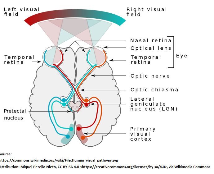
The pictures show clearly that the Retina is really a part of the Brain, connected via the Optic Nerve.
Section Summary
- The human Visual Pathway includes the eyes, Optic Nerve, Lateral Geniculate Nucleus, and Primary Visual Cortex (and ultimately other sections of the brain).
- Colour perception starts when light energy is converted into electrochemical signals in our eyes’ Retinas.
- Along the Visual Pathway from the eyes to the brain’s Primary Visual Cortex, the electrochemical signals are ultimately converted and processed into the colours we see.
Now, let’s take a closer look at the Retina of the Eye.
Retinal Cells (Light Energy to Electrical Energy)
The back of the eye, the Retina, contains layers of cells that are organized as shown in Schematic 5.
Schematic 5 – Light to Energy Pathway in the Eye
According to aao.org, the Retina contains approximately 126 million Photoreceptors (in each eye) and about 1 million Ganglion Cells (in each eye).
A very high level description of the visual pathway goes like this:
- Light, seemingly non-intuitively, travels to the back of your Retinas (perhaps to regenerate pigment producing layers in this area).
- Photoreceptor Cells (called Rod and Cone Cells) receive the light and convert it into electrical signals using a process called Phototransduction.
- These electrical signals enable our Nervous System to sense light and colour.
Phototransduction describes the process of light energy changing the chemical structure of photopigment molecules called Retinal.
This causes an electrical cascade that moves “up” the Retinal cell layer, ultimately reaching (or converging to) the Retinal Ganglion Cells (RGCs).
The RGCs send their electrical signals further down the Visual Pathway via the Optic Nerve.
Nerve cells, that enable the movement of electrical signals (from Retina – to Thalamus – to Visual Cortex and beyond), are collectively called Neurons.
Neurons are the signal carriers in our Nervous system.
Let’s learn more about them in the next section.
From Light to Action Potentials
In the previous section, we learned that light travels in one direction to the back of the Retinal cells, then changes direction at the photoreceptors where it is converted to electrical energy.
Electrical energy is the language of the Nervous System and Neurons are the carriers of this electrical energy.
Let’s learn more about these electrical signals.
Our Nervous System Communicates Electro-Chemically
The Nervous System communicates (senses, instructs, acts, etc.) via electric signals caused by charged elements and compounds (ions).
Differences in charges (or electric potentials) cause these ions to flow throughout our Nervous System, and specialized chemicals called Neurotransmitters enable this to happen.
Neurons
Schematic 6 shows what a typical Neuron might look like.
The Dendrite areas receive information and the Axon Terminals transmit signals to the next Neuron.
Schematic 6 – Typical Structure of a Neuron
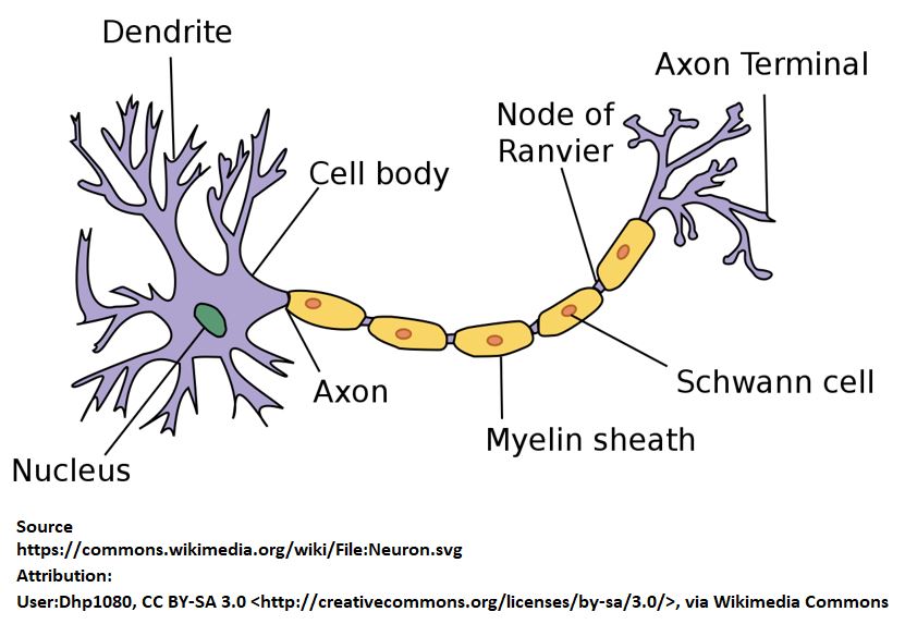
So, Neurons transmit electrochemical signals across your body (body to brain and brain to body) and the brain contains over 80 billion of them.
Neurons contain ionic elements and molecules that cause them to exhibit a net charge, and the environment surrounding Neurons are also charged.
The charged state of a Neuron is measured as Voltage (electrical potential) and, at rest, a Neuron exhibits a negative charge.
Electrical signals occur due to Voltage changes across Neuron membranes.
Signal Flow
Neuron Voltages exist across their membranes (i.e. inside cell vs outside cell).
So, imagine a horizontally situated Neuron.
Then the voltage we are referring to occurs longitudinally (up/down) across the membrane.
- Neuron Voltages can become more positive (excited or de-polarized) or become more negative (inhibited or polarized or hyper-polarized).
- If a Neuron is sufficiently excited (becomes more positively charged) , it starts a chain reaction that ultimately results in electrical signals propagating from Neuron to Neuron.
- This horizontal propagation occurs because more positive charges will be attracted to the surrounding more negative charges.
- This “excitation” inside the Neuron along with specialized physical characteristics of the Neuron itself (Axon-Myelin Sheath-Nodes of Ranvier structure), causes the signal to propagate in one direction (along the Neuron’s axon).
- Neurotransmitter chemicals trigger these changes in Voltage.
- They control the transfer of signals from Neuron to Neuron and activate proteins (called receptors) that influence the flow of charged ions in and out of the Neurons.
- Depending on the Neuron type, size, and proximity to other cells, either smaller (Graded) or larger (Action) Potentials (Voltage changes) trigger the signal.
Signals Leaving The Retina to the Brain
Due to the smaller sizes and close proximity of the Retinal Cells, Graded Potentials (Voltage changes) are sufficient to move electrical signals from the Rods and Cones to the RGC cells.
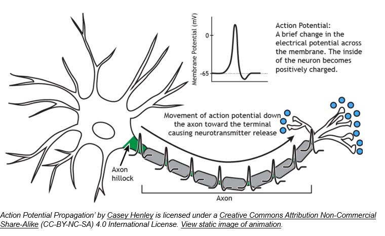
But, electrical signals from RGC cells to the Brain are generated via Neuron Action Potentials.
- A Voltage change only becomes an Action Potential once it has exceeded a certain threshold amount.
- A Neuron Action Potential has a fixed magnitude i.e., it operates in a binary fashion i.e., it’s transmitting signals or it’s not. i.e., it’s “on” or it’s “off”.
- Although this Neuron Signal has a fixed magnitude, its rate of occurrence will differ depending on the strength of the light sensation.
- The Rate of the Neuron Signal is impacted by the net result (summation) of excitatory ( increasing in positive charge) and inhibitory (increasing in negative charge) events.
- This Rate of Action Potentials is a kind of Nervous System Morse Code.
- The Rate of Action Potentials is the code that allows the brain systems downstream of the Retina to do the required color sensing.
Check out this Neuron action potential Video
Schematic 7 – Action Potential Propagation
Check out this great video on Phototransduction and Action Potentials by Julia Strand.
She explains Trichromatic Theory as well which we’ll review in the next section.
Section Summary
- Light energy is converted to electrical energy in the Retina.
- Neurotransmitter induced Voltage changes called Action Potentials (and the special structure of the Neurons themselves) enable electrical signals to travel from the Retinal Ganglion Cells (RGCs) to the Visual Cortex.
We’ve learned that the mind and body decodes light as electrical energy.
But how do we actually see colour?
Read on.
Trichromatic Theory of Color
Trichromatic Color Theory was proposed in the early 1800s (by Thomas Young) , further developed in the mid 1850s (by Hermann Von Helmholtz and James Maxwell…some controversy here as to who was first) and basically proven by measurement in the 1950s.
The Trichromatic Theory states that humans see color through three types of eye receptors or Cones.
In addition, we are able to have night vision (in Greys) via Rod photoreceptors .
You’ve already seen the schematic below.
Schematic 8 – Rod and Cone Photoreceptors in the Retina
The retinal region of our eyes contains four types of photoreceptor cells:
- S or Blue Cones (S = short wavelength light i.e. most sensitive to Blue Light)
- M or Green Cones (M = medium wavelength light i.e. most sensitive Green Light)
- L or Red Cones (L = long wavelength light i.e. most sensitive to Red Light)
- Rods – Rods operate at low levels of illumination (scotopic environment) and helps us see at night in shades of Grey. As illumination increases (photopic environment) , Rods are no longer in play and the Cones now take over.
According to aao.org, the Retina contains approximately 120 million Rods and 6 million Cones (in each eye).
- (L) Red Cones represent 60% of the Cones.
- (M) Green Cones represent 30% of the Cones.
- (S) Blue Cones represent 10% of the Cones.
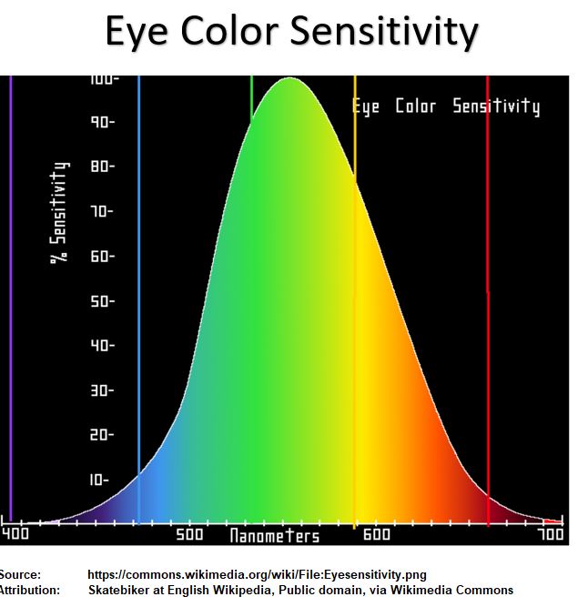
Schematic 9 below shows the relative sensitivities of the Cones (and Rods) to different spectral wavelengths.
You can see that the Cones actually cover wide ranges and don’t just detect a pure color.
So, a Red or L Cone for example, can detect a wide range of spectral colors and not just Red.
The names are obviously a little misleading but are intended to identify the color that the Cone is most sensitive too and not the narrow wavelength range that that specific color resides in.
Schematic 9 – Relative Sensitivities of Rods and Cones
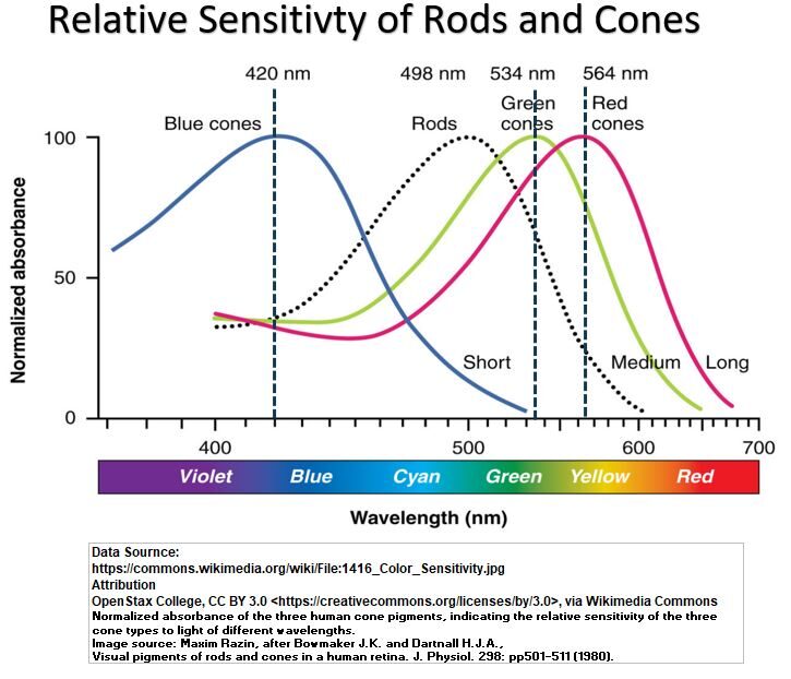
Notice the example vertical dashed Black lines in Schematic 9.
These represent the Cone maximum detection sensitivity spectral wavelengths 420, 534, and 564 nanometers (nm).
The intersection of the vertical lines with the Cone curves tells you that it is the combined and simultaneous detection of wavelengths that results in us perceiving colour.
The amount of detection by each Cone type will vary along the spectral range.
For example, we see at 564 nm that it’s almost all M and L cones that respond, whereas at 420 nm, all three Cones are detecting the wavelength.
Remember the Following:
- We sense colour via simultaneous detection via our S, M, and L Retinal Photoreceptor Cones.
- Each Cone type senses a wide range of wavelengths (color). i.e. A Blue or S Cone actually senses more than just Blue although it is most sensitive to Blue.
- Each Cone has a maximum sensitivity shown at its peak. (S peak at 420 nm, M peak at 534 nm, and L peak at 564 nm **see note)
- With just three Cone types we are able to sense the full visible light spectrum.
- We cannot “see” the shorter (e.g. Ultraviolet) wavelengths to the left, or the longer Infrared wavelengths to the right.
- The S,M,L lines show normalized relative sensitivities (relative sensitivity being defined as actual sensitivity as a % of max sensitivity).
- We are actually much more sensitive to Green range light since L and M Cones are more numerous than S Cones. (see Schematic 10 Below)
Schematic 10 – Eye Color Sensitivity
** note: There are various data sets that list different peak wavelengths.
This is due to varying test conditions like amount of luminance and dimensions of viewing space.
Check out this great video on the Trichromatic Theory of Colour by Julia Strand.
Summary
- Trichromatic Theory states (and it has been proven) that the visible electromagnetic spectrum is detected by our Retinal Photoreceptors as colour.
- Three types of photoreceptors called S, M, and L Cones work simultaneously across the full visible spectrum to detect colour.
- Rod photoreceptors operate at low levels of illumination (scotopic environment) and helps us see at night in shades of Grey.
We need a bit more theory to get full closure on how we see colour.
Next we’ll discuss the Opponent Process Color Theory.
Opponent Process (Color) Theory
There are some aspects of color perception that can’t be explained by the Trichromatic Theory alone.
After-Images
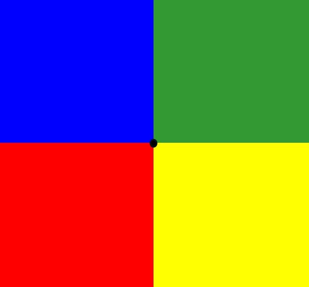
Check out the following image of four blocks of color.
Stare at the center of the image at the Black dot for about 20 to 30 seconds and then look away at a blank sheet of paper and blink a few times.
What do you see?
Schematic 11 After-Image: RYGB Colors
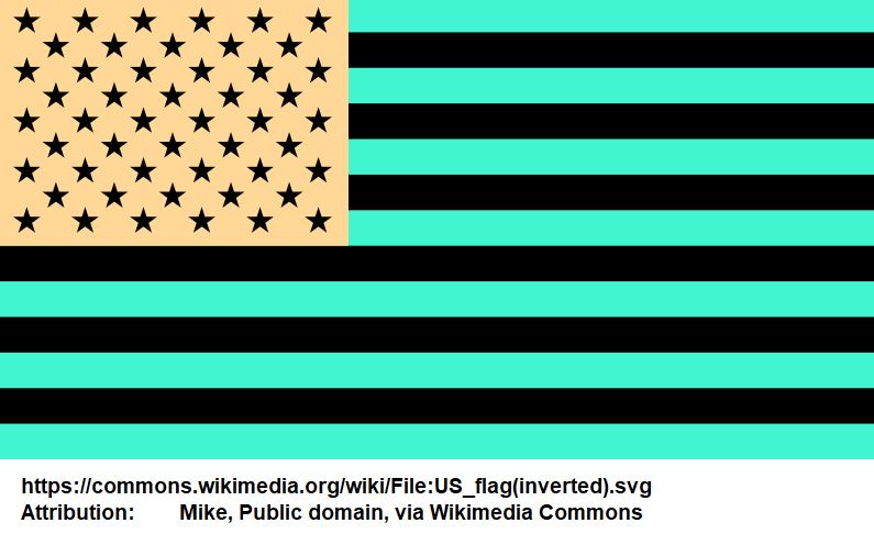
Check out the picture below of the weirdly colored American flag.
Stare at the middle for about 20 to 30 seconds and then look away at a blank sheet of paper and blink a few times.
What do you see?
Schematic 12 After-Image: American Flag
You should have seen after-image colors where staring at
- Red produced a Green (is it Green? See **) after-image and vice versa,
- Blue produced a Yellow after-image and vice versa,
- Black produced a White after-image and vice versa.
** A lot of web sites and text books will describe the after-image colours as R/G, but, is the Red after-image really Green?
It looks more Bluish-Green (or Cyan) to me.
We’ll come back to after-images later.
Let’s talk about Ewald Hering’s idea first.
Ewald Hering
Ewald Hering proposed the Opponent Process (Color) Theory in 1892.
He based it on observations that certain color mixtures are not perceived as combinations of those colors.
Blue and Yellow when combined don’t produce grades of Bluish-Yellow.
When Red and Green colored lights are mixed, they produce Yellow, but Yellow is not perceived as Greenish-Red.
Hering postulated that
- there were four unique primary colors (Red, Green, Blue and Yellow) , and any other color can be described as a mixture of them.
- He called these “Urfarben” colors meaning primordial in nature.
- Red and Green oppose each other and so do Blue and Yellow.
- By this he meant , in combination they are never perceived as Red-Green or Blue-Yellow.
It took many years later to prove out what Hering proposed. (by von Kries, Schrödinger, Svaetichin, and Hurvich and Jameson (in the 1950s!) ).
Today we know that both the Trichromatic Theory and Opponent Process Color Theory explain how we perceive color.
How we See Colour
Let’s go back to the Retina.
Schematic 13.1 shows the back of an eyeball with light penetrating to the Retinal Cones and then being processed through the various Retinal cells.
Retinal Ganglion Cells (RGCs) ultimately send out signals (as electric Action Potentials) down the Optic Nerve to the brain.
The Action Potentials differ in rate and not in magnitude (so size or amount per signal is the same but the repetition of the signal changes).
The signals are the result of processing by three different channels:
(1) a Luminance or Achromatic channel or Black/White channel
(2) a Yellow/Blue channel and a
(3) Red / Green channel.
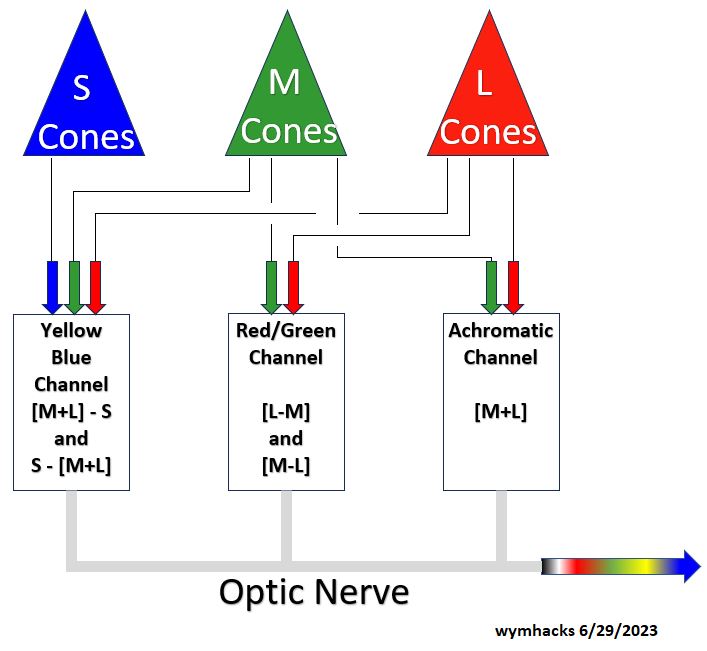
Schematic 13.1 – Retinal Cells And Achromatic, RG, YB Channels
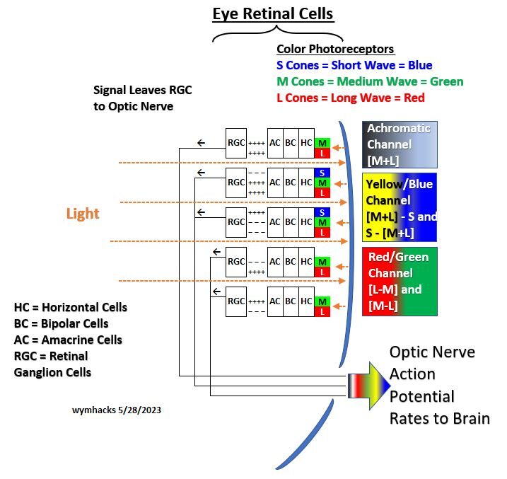
Observations regarding Schematic 13.1:
- There are three Opponent Colour channels in the Retina.
- Combinations of S, M , L Cone cells combine with other cells to send excitatory (+) or inhibitory (-) signals to the RGCs.
- (+) and (-) signals cause increases or decreases in the Rates of Action Potential in the Optic Nerve.
- An Achromatic or Luminance or Black/White Channel receives input from M and L Cones.
- Notice there are no Rod cones involved.
- There are four arrangements of Cones and RGCs.
- In most areas of the Retina, collections of Cones called Receptive Fields feed into a single RGC.
- Cones in the receptive fields tend to arrange themselves in a circular fashion with one type collected in the annulus (Surround) and the opposing type in the center (Center).
- The RGC can receive inhibitory or excitatory signals from either the Center or Surround.
- There are therefore two arrangements for each circuit (On-Center/Off-Surround and Off-Center/On Surround).
- A Yellow/Blue Channel receives signals from S, M and L Cones (Actually two Channels that respond in opposite ways).
- Note that the M and L combine to produce Yellow.
- A Red/Green Channel receives signals from M and L Cones (Actually two Channels that respond in opposite ways).
- “two Channels that respond in opposite ways” means they are different signals from the same stimulus.
- For example, for a Green signal, there is a high firing rate from the +M-L circuit and a low firing rate from the +L-M circuit.
- In the Red /Green channels, some suggest that Short (Blue) Cones exists as well. (they are not shown)
Schematic_13.1 above shows that there are actually four types of color Cone/Retinal Ganglion Cell arrangements.
The fifth channel is a Luminance or Black/White channel.
Schematic_13.2 shows a more generalized version of this Cone/Channel relationship.
Schematic 13.2 – High Level Cone , Opposing Channel Relationships
Colour vision in the Retina is explained today as a two part process:
- Trichromatic Theory explains how photoreceptor cell types are excited by visible light wavelengths in a simultaneous fashion.
- The Opponent Process Color Theory explains how the RGCs integrate (do a net summation) of all the excitatory(+) and inhibitory (-) signals coming in from the photoreceptors and associated cells.
- These are the codes sent by the optic nerve to be processed in the LGN and Visual Cortex, ultimately leading to the colours we see.
Look at Schematic 13.3 below for a graphical analogy of what is going on.
Assume we are sensing the color C.
The coordinate of C in this 3 dimensional space would be the color code being fed to the brain from the Retinal Ganglion Cells via the Optic Nerve.
This color code (as an Action Potential Rate) would contain information on
- illumination in terms of Whiteness or Blackness,
- its Blueness or Yellowness and
- its Greenness or Redness.
note: I am using the same description and similar drawing to that provided by Craig Blackwell in this video.
Schematic 13.3 – Colour Channels 3 Dimensional View
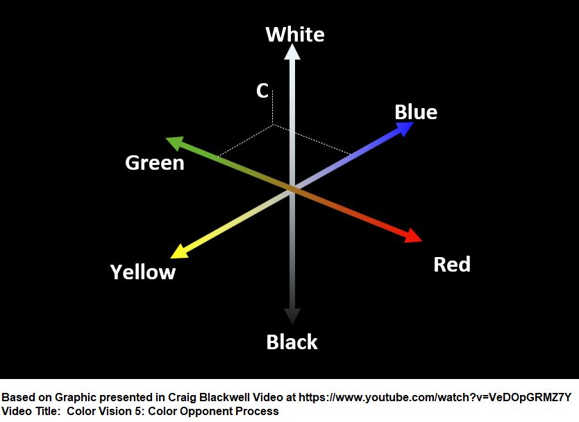
The code is routed via the Optic Nerve to the Thalamus (where the Lateral Geniculate Nucleus is located) and ultimately the Visual Cortex where the color perception is further processed into the colours we ultimately see.
Please see the following two videos which are excellent descriptions of the above:
Why aren’t Rod cells involved in the Black/White Channel?
So why aren’t the Retinal Rod cells part of this Black/White channel?
- Rods operate at low levels of illumination (scotopic environment) and helps us see at night in shades of Grey.
- As illumination increases (photopic environment) the Rods are no longer in play.
- The Retinal Cones now take over.
- The Retinal Cones help us discern colors and are part of the three channel system (B/W or perhaps more correctly Luminance, R/G, and B/Y).
- Rods and Cones allow the visual system to cope with “high dynamic range” scenes where the ratio of light to dark is high.
Thanks Julia Strand and Steve Westland for giving me feedback on my questions regarding Rod cells.
Hue Cancellation Experiments Confirm The Opponent Process Color Theory
Hurvich and Jameson in the 1950s provided further evidence that our color vision mechanism consists of Red-Green Channels and Blue-Yellow channels.
Take a look at Schematic 14.
There is a lot going on here, but it’s worth understanding.
In the Hue Light Cancellation Experiments of Hurvich and Jameson, spectral colors are presented to an observer.
The observer then adds the Opponent Color light to it until the resultant color hits an “equilibrium”.
The amount of Opponent Color needed to effectively “cancel” the original spectral color is documented and this process is repeated across the full visible spectrum.
For example, the observer is given a Red-ish color as the sample wavelength (e.g. a long wavelength color).
The observer is also given a Green light that he will shine on the sample wavelength unit the color changes to a “neither Red nor Green color” i.e. an equilibrium color or the cancellation color (in this case it will be a Yellow color).
This is recorded, and then the experiment is repeated for a slightly shorter sample wavelength.
The “C Red Line” in Schematic 14 represents the Redness of the sample wavelengths as quantified by the amount of Green added (in order to cancel the Redness).
Schematic 14 – Hue Cancellation Experiment Chart (1957; Hurvich & Jameson)
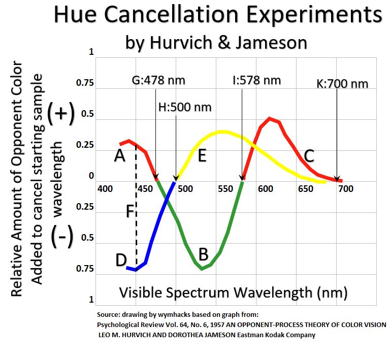
Eventually at lower wavelengths the spectral sample color changes from Red-ish to Green-ish.
At this point the observer is given a Red light to add to the sample spectral light until the light reaches “equilibrium”.
So, the “B Green Line” represents the Greenness of the sample wavelengths as measured by the amount of Red that is being added to reach “equilibrium”.
The “A Red Line” of the ABC line is plotted using the same procedure.
This “A Red Line” section of the ABC Red-Green line shows the Redness of the sample wavelength as quantified by the amount of Green color that has to be added to reach equilibrium.
The DE Blue Yellow Line is plotted using the same process.
Starting with a Bluish Light (short wavelength), Yellow is added until the color reaches equilibrium and this point is plotted.
A slightly higher wavelength is used to plot the next point.
Eventually the sample spectral wavelength will start to turn Yellowish, and now Blue is added for the remaining increasing wavelengths.
The Blue D Line represents Blueness as quantified by the amount of Yellow light used to cancel the color (i.e. reach equilibrium), and the Yellow E Line represents Yellowness as quantified by the amount of Blue light used to cancel the color.
Schematic 14 Observations
- All amounts on the y axis are actually positive.
- The (-) values are just a plot configuration so the lines are better contrasted against each other.
- Each color is perceived as a mix of the two channels (The Blue-Yellow Channel and the Red-Green Channel).
- Going left to right (shorter to higher wavelengths) the spectral colors are represented by Hues of Red + Green, Green + Blue, Yellow + Green, and Red + Yellow.
- The Blue Channel dominates at wavelengths less than 500 nm and the Yellow Channel dominates at wavelengths greater than 500 nm.
- In the Red Green Channel, Red dominates at low and high wavelengths, with Green dominating in the middle.
- The fact that wavelengths on both ends of the spectrum are Redish gives some scientific credence to why color Hues are typically represented via circles. More on this when we discuss Chromaticity.
- As an example, Line F would represent 450 wavelength Blue which consists of a Red Channel Input (A Red Line) and a Blue Channel Input (D Blue Line).
- The 0 (zero) crossover points on the graph at G , H, I represent the Unique Hues of Blue, Green, Yellow.
- Unique Red at K doesn’t exist (there is a bit of Yellow in it).
Can We Explain the After Image Illusions Now?
The Hue Cancellation experiments definitely provide evidence for the Opponent Process Theory.
What about those after image illusions?
At the beginning of this section you saw after-image colors when you looked away from the the color block and the American Flag. (Schematics 11 and 12).
Some claim this is proof of Opponent Process Color Theory at work.
For example, in the American Flag you stared at Green stripes ,Black stars and stripes, and Yellow.
When you looked away you saw the Red (did you?), White and Blue flag.
Recall from Schematic 13.1 and 13.2 how the different Photoreceptor Cone cells are situated. Many (all?) scientists explain the after image phenomenon as being the fatigue (or depletion of photopigments) of the sensing Cones.
For example, the “fatigue-ing” M Cones when you stare at Green, results in the opposite Cones (the L Cones) showing the Opponent Color, Red.
Ok, nice and tidy with a bow, right? Not exactly.
What about that Green after-image color? The After image of Green is definitely Cyan and not Red.
In a later chapter we will learn more about it, but for now, accept that the Complementary Colors of Red, Blue and Green are Cyan, Yellow and Magenta (respectively).
So, the after-images we see are Complementary Colors and not Opponent Colors (also note that Blue/Yellow are both Opponent Colors and Complementary Colours).
Perhaps the Trichromatic Theory alone is sufficient to explain after-images. Lets try to explain after images with Schematic 15.
Schematic 15 – After Images Caused by Depleted Cones

In Schematic 15, the top color block represents the Retinal Cone responses when looking at a blank sheet of paper.
You see all the wavelengths of light so you see White.
- If you now stare continuously for 30 seconds at a Blue colored paper and then switch over to a White sheet of paper, you will see a Yellow after-image.
- The Cone responses shown in the second row of Schematic 15 show that the Blue Cone responses have been depleted, so our brains decipher mostly Green and Red with a little Blue, even though we are staring at a White sheet of paper.
- Stare at Green, you get Magenta which is a mix of Blue and Red.
- Stare at Red, you get Cyan which is a mix of Blue and Green.
- The after-images in this experiment are the Complementary Colors.
At this point I might have confidently said that Trichromatic Theory alone is sufficient to explain after-images and we don’t need opponent theory to explain it.
But, Wait a Minute!
There is some evidence out there that says the Red/Green opponent circuits might really be Red/Cyan opponent circuits in biological systems.
There is a fellow named Pridmore who states that there is no biological proof for Red/Green opponent circuits and that THERE IS evidence for Red/Cyan opponent circuits.
Ok, what implications does this have on all the material we covered in this chapter?
Can the Hue cancellation experiments of Jameson and Hurvich and Schematic 14 be re-interpreted using Cyan versus Green as the opposing color?
After all, Cyan is a Bluish Green.
There is some level of vagueness when applying a color description to the visible spectrum.
Maybe that Green line in Schematic 14 could well be called a Cyan line.
Perhaps in Opponent Process Theory, Opponent Color and Complementary Color mean the same thing.
Maybe scientists will work out these “kinks” in the coming years.
Check out these nice Video demonstrations and Explanations of the After Image Phenomenon (Just keep in mind this Opponent Color vs Complementary Color issue):
- Julia Strand Opponent Process Theory – Start at 8:12 The Lilac Chaser (rotating colored dot) Illusion is especially freaky!
- Craig Blackwell Color Vision Video 4 – Start at 14.25
- Kristen Anderson – Perception 5.3 – Start at time 2:45
Summary
Scientists today believe (backed by a lot of research and evidence) that humans perceive colour as follows.
- Our eye Retinas convert light energy to electrical energy via Photoreceptor neuron cells.
- Three types of Cone Photoreceptor cells (Short, Medium, Long) detect various wavelength ranges of color.
- If we describe these Cones as Blue (Short), Green (Medium), and Red (Long) we have to remember we are describing the peak sensitivity and not the color range that is detectible.
- Colours are first perceived as simultaneous detections from these S, M, and L cells (Trichromatic Theory).
- Signals from these photoreceptors are further processed by “downstream” Retinal Ganglion Cells which appear to integrate them (sum them up).
- Integrated signals from the RGCs are perceived as combinations of a Yellow-Blue color channel , a Green-Red color channel and a Black-White color channel (Opponent Process Color Theory).
- Hue cancellation experiments provide strong evidence for Opponent Process Theory.
- After image phenomena can be explained by the Trichromatic Theory and the concept of Cone cell photopigment depletion (fatigue).
- Some evidence shows that in biological systems Red/Cyan Opponent circuit exists and not Red/Green circuits (a reminder that ideas and concepts in this field are not 100% understood).
- Signals (as voltage spikes aka Action Potentials) travel from the RGCs to the brain (to LGN and then to Visual Cortex) for further processing to produce the colors we “see”.
In the next section we’ll cover colored light matching experiments and the Chromaticity diagram.
These topics will help us gain a deeper understand of Complementary Colors as well as other color concepts.
Chromaticity Diagram
Colour Matching Experiments
Schematic 16 – CIE 1931 RGB Color Matching Functions Chart
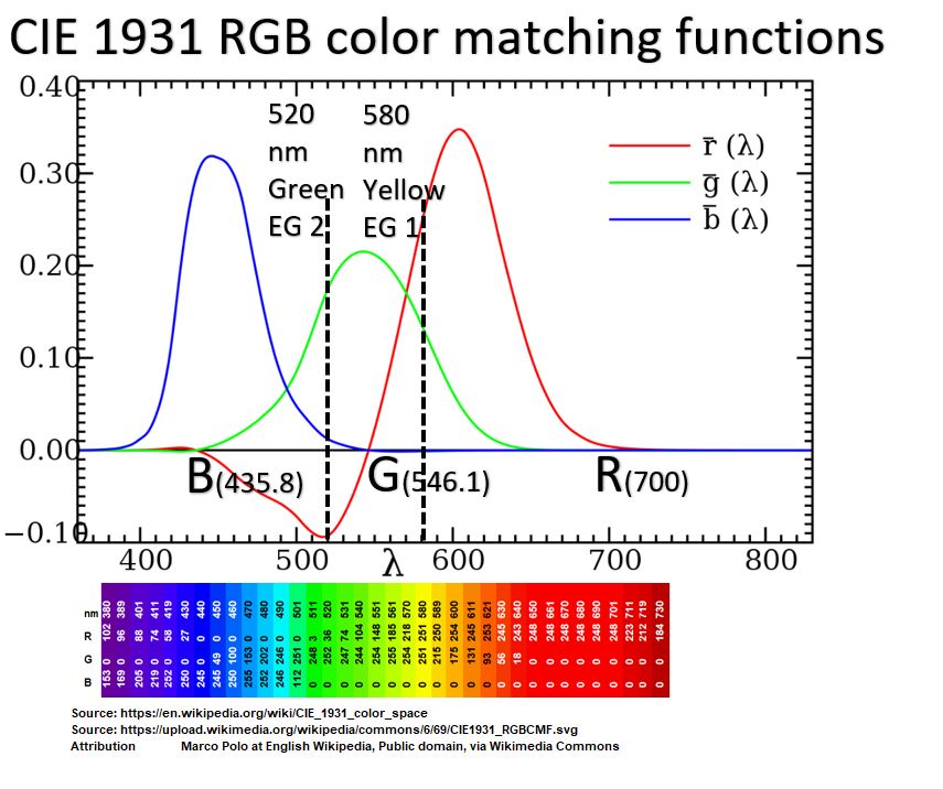
Schematic 16 Observations:
- If you draw a vertical line representing any specific visible spectrum wavelength, the intersections with the Red, Green, or Blue curves represent the quantities of those lights required.
- Blue, Green, and Red Mixing lights were chosen at 435.8 , 546.1, and 700 nanometers respectively.
- The vertical line of Example 1 shows that 580 nm light colour is matched with certain Red and Green and very small Blue light quantities.
- The vertical line of Example 2 shows 520 nm light color being matched with Green, Blue, and Red but the Red amount is negative. How can that be?
What the experiment revealed is that NOT ALL VISIBLE LIGHT FREQUENCIES can be mapped with these three particular primary colours (or any 3 colours for that matter).
- The negative numbers in Schematic 16 represent the amount of Red light added to the Sample Frequency Color such that the other two colours could be used to match the new Sample Colour.
- So, in the negative Red region of the chart, the Sample Color is not a Spectral Colour (single wavelength) anymore.
- The Sample Color is a mixture of Red and a Spectral wavelength and the quantities of Blue and Green light required to match this new colour are shown. We’ll come back to this later.
(note: at about 13.46 in the video, there is a statement that equal mixing between two points on a chromaticity diagram is the middle of the line between these two points. This is not precisely correct because these maps are not perceptually uniform. See this for more information).
CIE Chromaticity Diagram
Schematic_17 uses an x and y coordinate to identify each color.
So, for example, point .3,.3 represents a “Whit-ish” color and .1,.3 is a “Cyan-ish” color.
Please note that the Luminosity or Brightness of the colour is another dimension that is fixed in this chart (another axes coming out of the plane would show varying Luminosity).
Schematic 17 – CIE Chromaticity Diagram
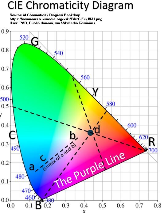
Chromaticity Schematic 17 Description
- The single wavelength spectral colours wrap around from 380 nm to 700 nm in a horse shoe or shark fin shape (RYGCB).
- Colours on the boundary RYGCB are unique colours (represented by a single wavelength).
- The Base of the Horse Shoe shape, called the Purple Line, represent non spectral colours (meaning, they consist of a mixture of wavelengths)
- All possible colours are represented inside the diagram
- The Purple Line consists of mixtures of Red Light and Blue/Violet Light.
- Although the light spectrum is open (i.e. goes from invisible UV to visible spectrum to invisible Infrared), we perceive colour in a closed fashion (i.e. we perceive R to Y to G to C to B and then right back to R through various Hues of Violet and Red.
- The diagram allows us to standardize certain colours (for example, traffic light specifications as a function of x,y coordinates).
- A straight line through any two colour points shows all the colors that can made by mixing those two colours. For example , mixture c on line ab.
- Consider drawing various lines between any two points but crossing through d.
- The colours inside the diagram are not unique colours and so point d, for example, can be formed from mixtures of various colours (different mixtures that produce the same colors are called Metamers).
Let’s continue with the Chromaticity Diagram and describe a few more things.
Schematic 18 – CIE Chromaticity Diagram (Continued)
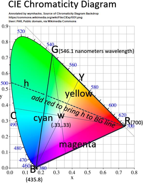
Chromaticity Schematic 18 Description
- Draw a line from any point on the boundary, through White, to the other side.
- The two colours on the boundary are Complements of each other.
- So, the Complement of Cyan is Red, the Complement of Blue is Yellow , and the Complement of Green is Magenta etc.
- These are described as Additive Complements as opposed to Subtractive Complements which we will review in a later section.
- Drawing a straight line from w to a boundary of the horse shoe shape gives you the most saturated version at the boundary (dominant wavelength).
- If we plot the Primaries that were used in the CIE colour matches, we get points R, G, and B.
- The only colours that can be made from these colours lie in triangle RGB (called a colour Gamut).
- Notice that all Hues can be made in the Gamut but not all colors.
- The RGB colour gamut is much larger than an RYB colour gamut for example.
- Computer colours are limited by the colour gamut contained by its primary colours (RGB model based gamuts are used in computer screens, TVs, and mobile phones ).
- Red , Green, and Blue are considered the Primary Colours of Additive Mixing (light mixing).
- Equal mixing of any two of these colours gives the Secondary Colours (Cyan, Magenta, Yellow respectively).
- Mixing of Complementary Colors produces White (w in our diagram).
- Magenta is not a spectral colour (it does not consist of a single wavelength).
- Magenta is a mix of Blue/Violet and Red wavelengths.
What About Those Points Outside the Chosen Colour Gamut?
- A large region of Greenish, Bluish light is outside the RGB triangle.
- These colours cannot be matched by combinations of R,G and B.
- Look back at the Schematic 16 colour matching graph at spectral wavelength 500 nm.
- It is outside the triangle RGB so it cannot be created as a mixture of RGB.
- In the colour matching experiments, the observers added Red to the Green (noted as a negative number).
- They added sufficient Red such that a mixture of Green and Blue would match the resultant mixture (noted as line h in Schematic 18 ; going from the pure spectral colour at 500 nm to a non spectral colour at the intersection with line BG!
Summary
- In the 1920s, scientists conducted a series of color matching experiments where observers matched sample spectral light colors with combinations of Red , Green, and Blue colours.
- Using sample light colours representing the full visible spectrum, a large data set of R, G, B colour combinations were collected.
- In 1931, the CIE (Commission Internationale de l’Eclairage) created a Chromaticity Diagram based on this data.
- The Chromaticity Diagram represents all light colors in a horseshoe or shark fin shape where lines on the curved section represent the pure spectral colors.
- Any point in the diagram or on the base line (the Purple Line) are mixtures of colors.
- The straight line joining any two colors defines all colors that can be obtained by combinations of those two colors.
- A line drawn from the White point to the spectral locus is a Saturation line going from fully unsaturated (at w) to fully saturated at the boundary.
- A triangle formed by choosing any 3 colors shows the Gamut of colors available by combining those three colors.
- The Gamut will contain all Hues but not all colours.
- RGB colour Gamuts are standards used for computer monitors, TVs, and similar devices.
- Red, Green, and Blue are considered the Primary Colors in Modern Color Theory for light. (note we are talking about light and not colorants like paint or ink).
Excellent References on Color Matching Experiments and Chromaticity:
- Andrew Hanson Video – Start at 21:58 (or just watch the whole thing, it’s great).
I love the videos below as well, although in all of them it is stated (or suggested) that equal mixing between two points on a Chromaticity Diagram is the middle of the line between these two points.
This is not precisely correct because these maps are not perceptually uniform. See more on this here.
- Blackwell Color Vision 2 Video – Color Matching
- Blackwell Color Vision 3 Video – Chromaticity Diagram
- SMC468 – Video – The Chromaticity Diagram
Some other great ones:
Physical and Perceptual Colour Attributes
We want to familiarize ourselves with ways in which we can describe colors.
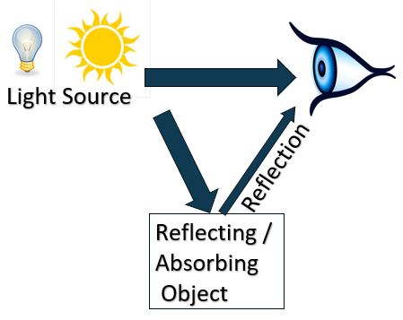
We See Light and Colour Directly and Indirectly
Light can be produced in several ways (see the color production section of this web source).
We’ll focus on emitted and reflected light.
Light sources emit to our eyes directly or transmit to object surfaces which reflect certain wavelengths and absorb others.
The object colors we see represent reflected wavelengths.
Schematic 19 – Eyes Receive Light Directly and Indirectly
Physical Color Attributes: Spectral Power Distribution
We can characterize emitted light using Spectral Power Distribution (SPD) curves.
SPD curves plot the intensity (energy) of light versus the wavelengths of the visible spectrum.
Schematic_20 shows SPDs for different types of light.
Schematic 20 – Spectral Power Distributions for Various Light Sources
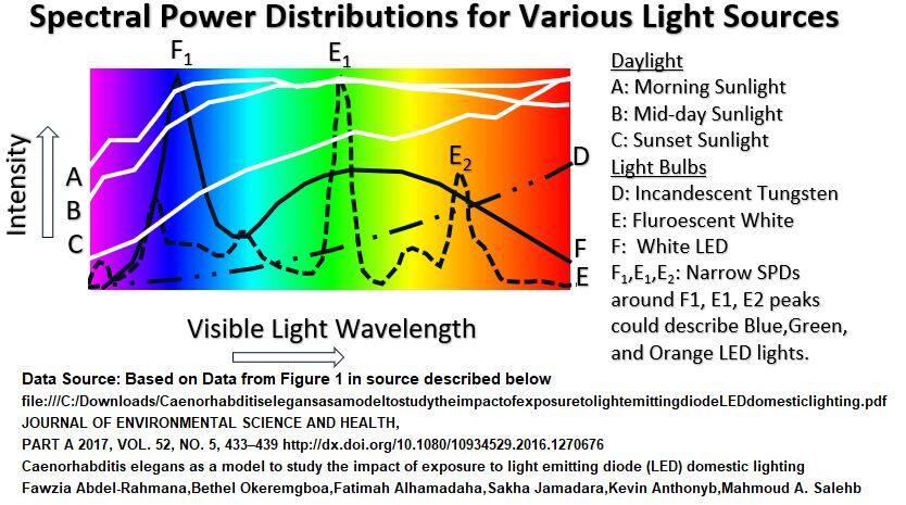
Schematic 20 Observations
- SPD curves show wavelength distributions of different illuminating sources.
- Lines A, B, C are SPDS of daylight at different times of the day. “A” will appear clear (Whitish) to us but “C” will appear Reddish.
- The other lights (D, E, and F) are emitted from different types of bulbs.
- Although their spectral distributions vary across the spectrum, the color of light we see from all of them is White.
- This is because we perceive the color as a composite balance of all the wavelengths.
- The SPDs of other emitters could be narrower.
- For example, Blue, Green, and Orange light emitting LED bulbs might produce symmetrical and narrow distributions with peaks around F1, E1, and E2 respectively.
- Laser diode light emitters might even display narrower (steeper sloping) distribution curves.
Physical Color Attributes: Object Reflectance Curves
Object surfaces display colors to our eyes by reflection. That banana you are looking at is reflecting light wavelengths that your eyes/brain interpret as having a Yellow color.
An Object’s Reflectance is the % of the emitted light (going to object) that is being reflected (to your eyes).
Schematic_21 compares the Reflectance curves for various objects and pigments.
Schematic 21 – Object Reflectance Curves
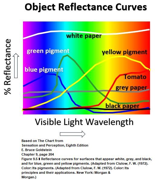
Schematic 21 Observations
- Object Reflectance curves show the percent of incident light reflected.
- The Absorbed light will be 100 minus the reflectance value (assuming an opaque surface).
- White, Grey, and Black Paper have roughly constant reflectances (at different levels).
- White would be a big reflector and small absorber of light and vice versa for Black (with Grey closer to Black characteristics).
- The Blue, Green, Yellow pigments and the Red tomato show dominant reflectance occurring in the Blue, Green, Yellow, and Red wavelength sections.
- Trivia: The reflectance of a surface is sometimes referred to as the Albedo of the surface (from the Latin for White).
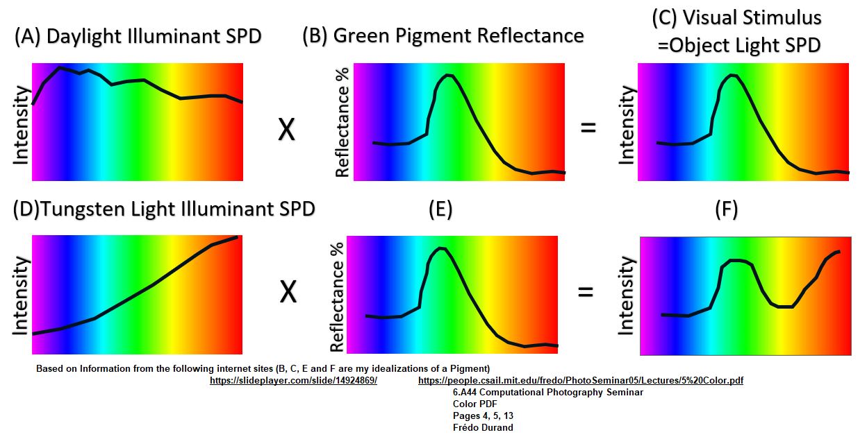
Physical Color Attributes: Visual Signal from Object Light Reflection
The physical attributes of reflected color are a product of the intensity of the illuminant (SPD) and the % of light reflected.
This makes sense.
If we just have direct light from an emitter going into our eyeballs, we are sensing the power distribution of the various wavelengths.
If we are sensing light and color from an object’s reflection, we will sense the reflection’s Spectral Power Distribution which is the product of the emitter SPD and the object’s Reflectance curve.
For a relatively constant SPD, the shape of the reflected light SPD wont change markedly from its Reflectance curve, but it could if the SPD of the emitter varies markedly through the visible spectrum (like the tungsten light curve D in Schematic 20).
The examples in Schematic 22 show how the Spectral Power Distribution of a Green Colored Pigment could change quite a bit depending on the type of illuminant (daylight vs a tungsten light).
Schematic 22 – Visual Stimulus from Object to Eye
Perceptual Color Attributes
So, we know we can physically characterize light entering our eyeballs using the light’s Spectral Power Distribution (SPD).
The SPD of reflected light off of objects can also be derived by multiplying the object’s % Reflectance by the incident light SPD.
We can adequately describe colours using three attributes: Hue, Lightness/Brightness (Value), and Saturation.
More accurately, we should say these are the Chromatic Color Attributes. (versus Achromatic meaning the colors Black, White , and Grey).
Hue
Hue is an attribute of color which describes the average or dominant wavelength of a light in the visible spectrum.
It refers to what the average person would simply call the main color perceived.
So, for example, Light Red or Dark Red are both describing the same Hue of Red.
Hues would be the Primary or Secondary or Tertiary colors of a Color Model.
Saturation
Saturation describes the strength or purity of the colour. Similar terms are Chroma, Color Strength, Color Purity and Colourfullness.
Brightness
Brightness indicates the light or dark of a colour. Value or Lightness are similar terms.
Black, Grey, White Are Colors
Black, Grey and White are also colors but only have attributes of Value (Brightness).
These colors do not have Saturation or Hue.
They are referred to as Achromatic or Neutral colors.
Perceptual Attributes of Color Described Using Their Physical Attributes
We can use the Spectral Power Distribution of direct or reflected light to describe the perceptual attributes of color.
Consider Schematic 23 below.
Here I’ve plotted a generic SPD diagram showing various curves.
Schematic 23 – Color Attributes Explained with SPD Curve (see Note)
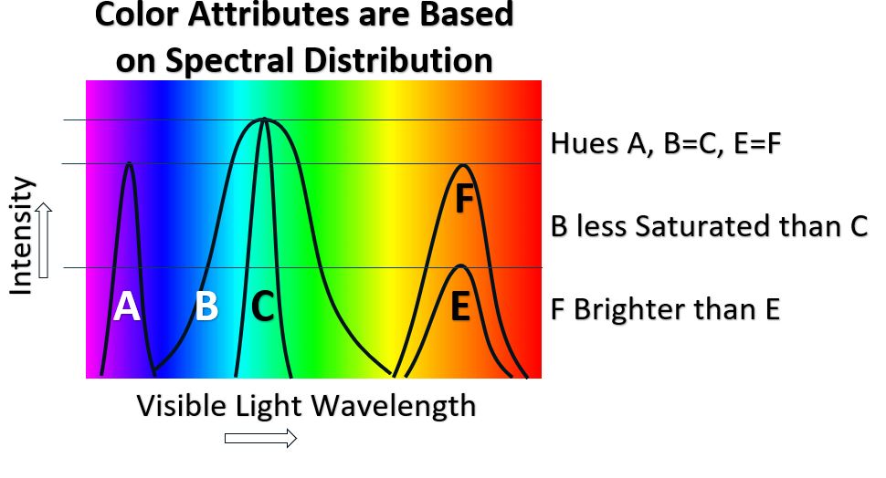
Note: In Schematic 23, Hue , Saturation, and Brightness are being defined using the Intensity (SPD) curves.
They can also be defined using the %Reflectance curves.
Remember that SPD and Reflectance curves are related: Intensity of Reflected Light = % Reflectance x Intensity of Incident Light.
If a % Reflectance curve is used, in order to make the definitions below, the incident light must remain constant between the comparative examples.
Hue Is the average or Dominant Wavelength of the Spectral Power Distribution of light entering the eyes.
It is going to be defined by the x axis of the SPD curve.
In Schematic 23, Curve A would have a Hue in the Blue color region of the visible spectrum, whereas, both B and C have the same Hue in the Green region.
Both E and F have the same Hue in the Orange-Red region of the spectrum.
The Saturation of a color will be a function of the slope of the SPD curve.
The higher the Saturation the more pure the color.
The lower the Saturation the murkier and paler the colors will get.
For example, in Schematic 23, B and C have the same Hue but B is less saturated than C.
The Saturations of curves E and F are roughly the same.
What Saturation do you think a White or Grey or Black light would have? (answer: 100% unsaturated).
Saturation is a measure of freedom from White, Black and Grey.
The Brightness of a color will be a function of the amplitude of the SPD curve.
Hues F and E are the same but Hue F is brighter than Hue E.
Perceptual Attributes of Color Described Using The Chromaticity Diagram
Recall from a previous section (see Schematic 18) that light color matching experiments in the late 1920s were eventually manipulated into what is called the 1931 CIE Chromaticity Diagram. There have been other modified versions of the Chromaticity Diagram but the 1931 version is often referenced.
Schematic 24 – Color Attributes from a Chromaticity Diagram
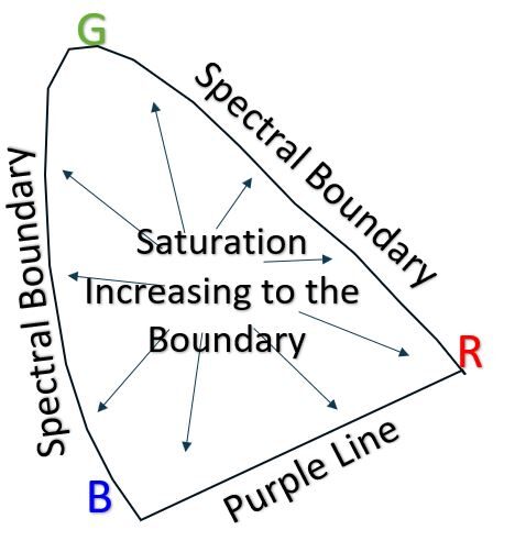
Refer to Schematic 24 above.
The Spectral Locus of the CIE Chromaticity diagram resides at the curved sections of this closed shape.
These represent all the single wavelength colors of the visible spectrum.
The bottom straight section between Blue/Violet and Red is called the Purple line.
None of the Purple Line colours exist as a single wavelength and are mixtures of Blue and Red.
Chromaticity Diagrams show two of the three colour attributes, Hue and Saturation (or Chroma).
The Spectral Locus and Purple Line represent color Hues in their purest or most saturated forms.
A straight line drawn from any color point to the boundary would represent a line of progressively higher Saturation (as the line moves to the boundary).
There is a point at about x=.33,y=.33 in which all the colors equally mix and we get White light.
If we draw a line from this White point to the boundary we are going from a 100% unsaturated color (White light) to a 100% saturated Hue.
Tint, Tone, and Shade
Remember that color can be described using the three attributes of Hue, Saturation, and Brightness/Lightness (or Value).
There are three additional ways we can describe colors by the amounts of Black, White , or Grey (equal amounts of Black and White) we add to a Hue or Hues.
- A Hue with Tint means we have added White to it.
- Shade means we’ve added Black to the Hue.
- A Hue with Tone means we’ve added Grey to it.
We will review Color Schemes or Harmonies in a later section.
One popular Color Scheme is called the Monochromatic Color Scheme where a single Hue along with various Tints, Shades, Tones of it are used.
In Schematic 24.1 below, I used an on-line color picker (Dopely) to Tint, Shade, and Tone a Cyan-ish color named Cerulean.
Schematic 24.1 Tints, Tones, Shades
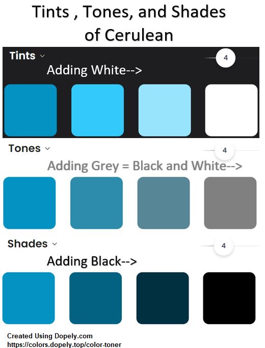
Notice that increasing:
- Shade, Decreases Hue Brightness (Value) and Decreases Hue Saturation.
- Tint, Increases Hue Brightness (Value) and Decreases Hue Saturation.
- Tone, Decreases Hue Brightness (Value) and Decreases Hue Saturation
One way to think of the colors going to White or Grey or Black is how the color’s spectral power distribution (SPDs) changes.
The starting Hue might have a distinct steep sloped SPD curve but as more and more White or Black or Grey is added, the SPD ultimately gets stretched out across the whole spectrum (a characteristic of the Achromatic colors White, Black, and Grey).
Summary
- Light energy enters our eyes directly from a source or by reflection off of an object.
- This light energy entering our eyes an be characterized using Spectral Power Distribution (SPD) curves by plotting intensity (energy) against wavelengths across the visible spectrum.
- Light energy entering our eyes from reflected objects can be determined by multiplying the incident light SPD by the % Reflectance of the object at each wavelength in the visible spectrum (i.e. SPD reflected light = SPD incident light x % Reflectance).
- Perceptual attributes of color include Hue, Saturation, and Lightness/Brightness/Value (several related terms are used as well ).
- Hue is the dominant color we see. A Yellow Hue can be describe as a Bright Yellow or a Pastel Yellow for example.
- Saturation is the purity or strength of color (its freedom from Black, White, or Grey).
- Brightness describes the lightness or darkness of a colour (similar to Lightness or Value)
- Adding White, Black, or Grey to a Hue means we are Tinting, Shading or Toning the Hue respectively. This changes both the Hue, Saturation, and Brightness.
- SPD (or reflectance curves) can be used to describe the Perceptual Attributes.
- Hue is the peak or average wavelength, Saturation is proportional to the steepness or slope of the curve, and Brightness is proportional to the height or amplitude of the curve.
- A Chromaticity Diagram shows the Hue and Saturation of colours.
- A line from any point in the diagram to the boundary represents a Hue of increasing Saturation.
- The boundary of the Chromaticity Diagram , including the Purple Line, represent the dominant wavelength/s of each Hue. e.g. a Magenta Hue will be a mix of wavelengths.
Very nice.
We’ve learned some things about the physical and perceptual attributes of color.
Onwards for a description of color models!
Resources
Perceptual Attributes, up to 9 of them, are described in lots of detail by two well known color experts: Bruce MacEvoy, David Briggs and others:
- See David Brigg’s listing of various Color Attribute resources here.
You need to see the videos below as well:
- For a review of these colour attributes, check out this simple , informative, short video by Stephen Westland: How We Describe Colour.
- Check this one out too: Julia Strand – Describing Color
Color Models
Color models numerically define a primary set of colours from which a wide array of colors can be produced (called a Color Space).
Recall the colour matching experiments we discussed in the Chromaticity Diagram section.
The Chromaticity Diagram** (see Schematic 25 below) represents all colors based on these color matching tests.
For Additive light colors, a colour space is defined by the location of any three points on this diagram.
By just choosing three colors in the Red, Green, Blue regions , very wide color spaces are produced.
Notice that not all colors are captured (but all Hues are!!) and notice that some of the color spaces spill out of the diagram meaning no real colors exist there.
** There have been various improvements done to the original 1931 CIE Chromaticity diagram so several “versions” exist.
Color spaces can be determined off of each of these versions as well.
Once an RGB triangle is chosen, a mathematical model is devised to represent the color space that the triangle occupies.
This can then be adapted to the various devices it is applied to (for example a TV or computer monitor or iPhone screen).
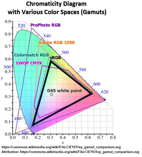
The standard sRGB model (the thick triangle space in Schematic 25) is widely used.
Schematic 25 – Chromaticity Diagram With Various Color Spaces
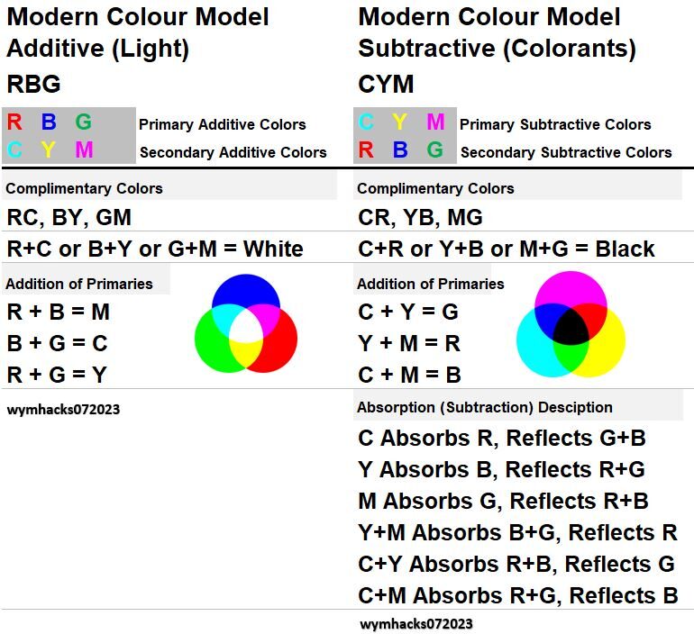
The RGB Color Model is an Additive color model.
That is, when colors are mixed, they combine to produce progressively lighter color (and if mixed equally will produce White).
Computer monitors and TVs work this way.
Other models like the CYM (Cyan, Yellow, Magenta) or the RYB Color (Red, Yellow, Blue) Model, are called Subtractive color models.
Subtractive color models are used in the application of colorants (paints and inks for example).
As each color is mixed, it absorbs (subtracts) some light and reflects other light.
The more colors that are added the darker the result will be (i.e. all or most of light has been subtracted).
See this useful video on additive and subtractive colors.
We will mention these many times in the following sections.
Summary
- Color models numerically define a primary set of colours from which a wide array of colors can be produced.
- Color models produce a Color Space on a Chromaticity Diagram.
- RGB is an Additive color model (applies to color of light).
- Adding colors progressively Whitens the composite color.
- The CYM Color Model is a Subtractive color model (applies to colorants like paint or ink).
- Adding colors progressively darkens the composite color.
We’ll dig deeper into color models in the following sections.
RGB and Related Color Models
RGB Color Model
As we described in the previous section, the RGB Color Model is a standardized model which produces a large Gamut or Color Space (i.e. can make just about any color of interest).
It is based on color matching data as represented in the CIE Chromaticity Diagram.
The RGB model is used in devices that display digital images like computers ,TVs, and mobile phones.
Red , Green and Blue (RGB) are often identified as the Additive Primary Colors when mixing colored lights.
They are Primary in that they provide a wide array of colors. Your computer and TV work this way as light is transmitted to a Black viewing screen. As you add light, the color becomes brighter and if equal amounts of Red , Green, and Blue are added, the result will be a White light.
The color matching experiments discussed in previous sections also involve additive color mixing of light.
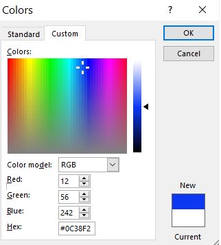
Typically if a computer is using the RGB Color Model, a color is computed as the composite of Red, Green, and Blue lights of various intensity.
Each light color’s intensity is coded with a number between 0 and 255 (maximum intensity).
So, each RGB color is represented as Red at 0 to 255, Blue at 0 to 255, and Green at 0 to 255.
Why 255? Where does that come from? With an 8 bit image, 256 patterns of 0 and 1 are possible (e.g. 2 bits has 00, 01,10,11 or four patterns).
Each color is a 24 bit image so the total number of color possibilities is quite large: 256 x 256 x 256 = 16,777,216 combinations (almost 17 million!).
See Schematic 26 for the RGB coordinates of a dark Blue color in Microsoft Excel.
Schematic 26 – Example RGB Color Box In Microsoft Excel
RGB Color Wheel and Color Mixing
Assume we are referencing the various colors as R (Red), G (Green), B (Blue), C (Cyan), Y (Yellow), and M (Magenta).
Remember that the RGB Color Model applies to the Additive color mixing of light (not colorants like ink or paint).
For Additive mixing, the Primary Colors are Red, Green, and Blue (RGB).
Primary colors in modern color theory have only two requirements:
- Their mixtures need to represent a wide array of colors (a Gamut or Color Space).
- No Primary can be created from the other Primaries.
The RGB Color Model can be represented by three overlapping circles or a color wheel (see Schematic 27).
Schematic 27 – RGB Color Wheel
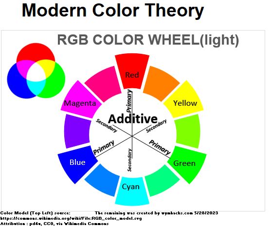
The intersections of the R, G, B color circles reveal some symmetrical patterns :
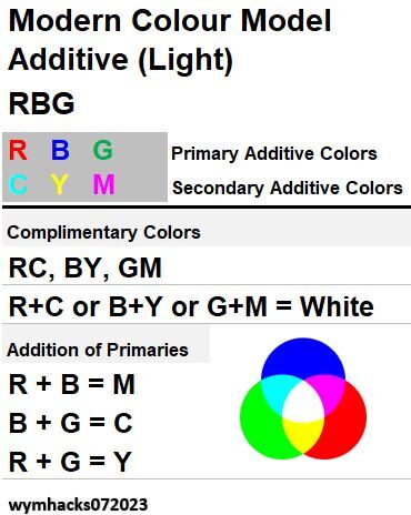
- Complementary Colors are situated opposite each other (R and C, G and M, B and Y).
- Equal Additions of Complementary colors produce White. (R+C, G+M, B+Y = White).
- Addition of any two Primary colors produce Secondary Colors (R+G = Y, G+B = C, B+R=M)
See Schematic 28 for a tabulated summary of the RGB Additive Color mixing rules.
Schematic 28 – RGB Additive Color Mixing Rules
HSB and HSL – More Intuitive Versions of RGB
Recall in a previous section we introduced the colour attributes Hue, Saturation, and Brightness /Lightness /Value.
Using these perceptual attributes to describe colour is more intuitive for a lot of people.
There are free tools available on the internet called color pickers (or color wheels) which display RGB colours in a 3 dimensional way using Hue, Saturation and Lightness / Brightness/ Value .
These are also found in a lot of commercial software like the Microsoft Office Suite programs or Adobe programs etc.
These tools are typically using the HSB or HSL Color Models.
Schematic 29 – HSB and HSL Colour Models
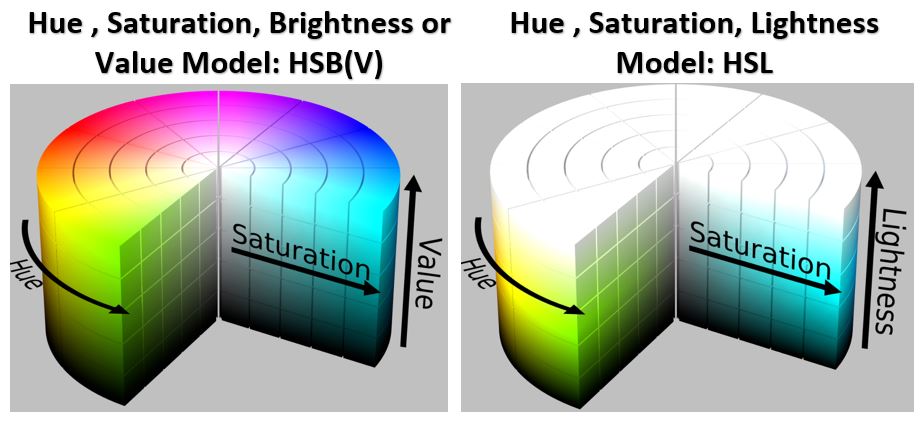
The HSB or HSL Color Models have the following characteristics:
- A Hue dimension appears, in its most pure form, on the circumference of an RGB circle.
- A Saturation or color purity dimension appears as a radial point on each “horizontal” circle in the 3 dimensional space.
- A lightness or darkness measure called Brightness (Value) or Lightness appears on a vertical axis.
- Hue is represented the same way in each model.
- HSB shows Saturation on a scale from White to Fully Saturated and Brightness from Black to Fully Bright.
- HSL shows Saturation on a scale from Grey to Fully Saturated and Lightness from Black through the Hue Color to White.
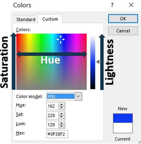
Microsoft Excel ,for example, ( see Schematic 30) employs an HSL /RGB based color picker.
Schematic 30 – Color Picker in Microsoft Excel Using RGB and HSL Color Models
Summary
- Red , Green and Blue (RGB) are the Additive Primary Colors when mixing colored lights.
- Cyan, Magenta, and Yellow (CMY) are the Additive Secondary Colors when mixing colored lights.
- Equal mixtures of RGB produce White. Addition of any two Primary Colors produces a Secondary Color.
- HSB and HSL models are useful 3 dimensional models that interpret RGB using the perceptual attributes of Hue, Saturation, and Brightness /Lightness.
- Two very nice on line color picker tools that use RGB , HSL and HSB are: Dopely: RGB and HSL (find color wheel under Tools) and Sessions College: RGB and HSB
So CY and M are the Additive Secondary Colors, but they are also the Subtractive Primary Colors.
What?
We need to dedicate another section to understand this so keep reading!
CMY Subtractive Color Model
In Modern Color Theory, Cyan , Yellow , and Magenta are called the three Subtractive Primary Colors.
The CYM Color Model applies to colorants like ink or paint and is called Subtractive because ink , for example, absorbs (or subtracts) some wavelengths and reflects others.
Your color printer is more than likely using CYMK cartridges. The K stands for Key referring to an industrial printing Key Plate.
In printing (like newspaper printing) , the key plate is the plate that prints the details of an image and it’s usually Black (see this Medium article for more info on this).
A K cartridge carries Black ink. Because its hard to get a clean Black when mixing C, Y, and M (costly also), it makes more sense to just add Black as an additional color (cheaper and you get a more pure Black color).
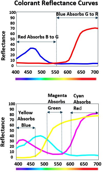
Why are C, M and Y the Optimal Subtractants?
Consider the Red and Blue pigment Reflectance Curves in the first graph of Schematic 31a below.
Red absorbs in the Blue to Green range of visible light and Blue absorbs in the Green to Red Range.
Using both these colors as pigments leads to “duller, muddier” colors (they are subtracting a wider range of wavelengths from the visible spectrum).
The CYM reflectance curves in the second graph of Schematic 31a shows that each of C, Y, and M absorb in a narrower wavelength range.
Roughly speaking…Cyan absorbs Red, Magenta absorbs Green, and Yellow absorbs Blue.
Please be mindful that these reflectances and absorbances are not perfect in any particular region of the visible spectrum.
We can still say in general that the CYM colors are the Optimal Subtractive Primary Colors and typically produce more vibrant and less dull, colors than RYB for example.
There is some controversy though about wither vibrant or dull can even be compared since either might be the effect an artist is trying to produce.
Certainly the CYM Color Model is optimal with respect to the wide array of colors it can produce.
Schematic 31a – R and B versus C, Y and M as Subtractants
We can idealize the actual absorption characteristics of various pigments in Schematic 31a with Schematic 31b below, where the visible spectrum is divided into three color zones.
Schematic 31b – Idealized Colorant Absorption Zones
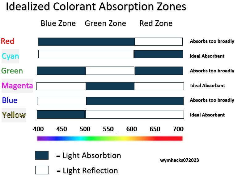
A few useful observations from Schematic 31b are:
- Red, Blue and Green colorants each absorb roughly 2/3 of the visible spectrum.
- These broad absorption characteristics make R, B, and G less than ideal Subtractant Colors.
- Cyan, Magenta, and Yellow each absorb only 1/3 of the visible spectrum and thus are the Optimal Subtractive Primary Colors.
Check out these videos on subtractive colors:
- Colourware.org Colourchat Video: Subtractive Color Mixing
- Colourware.org Colourchat Video: Optimal Subtractive Primaries
- Stephen Westland – Understanding Color Primaries
- UCSC CSE 160 Subtractive Mixing
Just like with the RGB Color Model, we can describe the subtractive CYM Color Model with the color wheel in Schematic_32.
Schematic 32 – CYM Subtractive Color Wheel (Colorants)
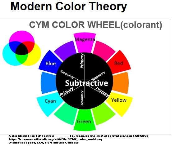
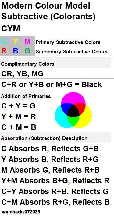
The intersecting CYM circles lead to some symmetrical observations:
- Complementary Colors are situated opposite each other (M and G, Y and B, C and R).
- Equal Additions of Complementary Colors produce Black (ideally). (M+G, Y+B, and C+R = Black ideally).
- The addition of any two Subtractive Primary Colours produce Subtractive Secondary Colors (M+Y=R, Y+C=G,C+M=B).
- Subtractive Secondary Colors, RGB, are the same as the Additive Primary Colours.
- The Subtractive Primary Colors, CYM, are the same as the Additive Secondary Colours.
- C absorbs R and reflects G and B (roughly correct since the reflectance/absorbance curves are not perfect in any wavelength range).
- Y absorbs B and reflects R and G (same caveat as in the previous sentence)
- M absorbs G and reflects R and B (same caveat as in the previous sentence)
These bullets are summarized in the Schematic 33 table below.
Please note that the actual mixture of C,Y and M paints will not produce a Black color because the absorption and reflection curves are actually absorbing and reflecting over a broad range.
If the CYM reflectance curves were actually singular vertical lines (they are not) we would get 100% absorption and a resultant Black color (absence of light reflection).
The mixture is more of a dark Brown or Grey. Review Stephen Westland’s excellent short tutorial on this topic.
Schematic 33 – CYM Subtractive Color Mixing Rules
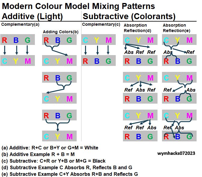
Schematic_34 below compares the RGB Color Model “rules” against the CYM Color Model “rules”.
Can you appreciate the symmetry between the two?
Schematic 34 – RBG vs CYM Comparison
In Modern Color Theory, the Additive Primary Colors are Red, Green, and Blue (RGB) and the Additive Secondary Colors are Cyan , Magenta and Yellow (CMY).
Not coincidentally, the Subtractive Primary Colors are CMY and the Subtractive Secondary Colors are RGB.
If you plot RGB or CMY on a Chromaticity diagram you will see that they offer the widest range of color mixes as well.
Now, for those of you who want an easy way to remember a lot of these mixing rules in Modern Color Theory, you might find the following helpful.
- An easy Mnemonic to remember RBG and CYM in pairs of Complementary Colors is: BuY RC cola and GM cars.
- Adding any two Additive (light) colors gives you the secondary color that is not one of the Complementary Colors.
- Subtractive Primary Colors absorb the Complementary Color and reflect the other two Secondary colours.
Check out Schematic 35 below for a tabulated summary of these mixing patterns for the RGB and CYM models.
Schematic 35 – RBG and CYM Mixing Patterns
Section Summary
- Cyan, Yellow, and Magenta (CYM) are the Optimal Subtractive Primary Colors for colorants (pigments, paints, ink, etc.).
- The narrow visible light absorption ranges of CYM make them the best subtractant colors.
- Red and Blue and Green are not ideal subtractant colours.
- Only in an ideal world would a mixture of CYM and their Complements produce Black. Because of imperfect absorption / reflection characteristics, the resultant color is more of a dark Brown or Grey colour.
- The Optimal Subtractive Secondary Colors are equivalent to the Optimal Additive Primary Colours (Red, Green, and Blue or RGB)
- Optimal is an important word here to remind you that any color combination of paints could serve as the basis for a colour model.
- The Gamut (or range of color mixture possibilities) as well as the appearance of the colours (dull and muddy and unsaturated vs rich and vibrant for example) are the major determinants of what would be considered optimal.
In the next section we’ll wrap up our color model discussion by reviewing the traditional subtractive RYB Color Model.
We already know that Red and Blue are not ideal Subtractive colors, so why bother discussing a Subtractive RYB Color Model?
Well, as noted, the RYB Color Model is sometimes described by Traditional Color Theory as THE Primary Color Model.
Most of us were probably taught in grade school that Red, Yellow, and Blue were the Primary colors of painting.
Many artists still claim this and many teachers still teach this.
So, lets take a closer look at this in the next section.
RYB Subtractant Color Model of Traditional Color Theory
Chances are, if you peruse the web today, you will find many sites that describe Red, Yellow, and Blue as being THE Primary Colors of paint mixing (i.e. Subtractive process).
It’s what you were probably taught back in grade school i.e. RYB are the Primary Colors and GPO or Green, Purple , and Orange are the Secondary Colors.
Often the distinction (which is really important) of RYB being a Subtractive color model is left out and this leads to meaningless non-contextual discussions.
Some people will describe the RYB Color Model as being the basis of Traditional Colour Theory.
This rose to prominence in the 17th century with Newton’s light/color discoveries and creation of the first color wheel (see more in Wikipedia or in David Briggs’s excellent web site).
Recap of Modern Color Theory
Let’s recap Modern Color Theory which we have covered in more detail in previous sections.
Trichromatic and Opponent Process (Color) Theories
Modern Color Theory was established in the late 19th century.
Among the pioneers in this field were Thomas Young, Hermann Von Helmholtz and James Maxwell who all contributed to the establishment of the Trichromatic Theory of color.
This theory states that there are three types of color receptors in our eyes that sense colors in Blue, Green, and Red wavelength ranges of light.
Each covers a wide range of wavelengths, but each is most sensitive to , roughly, Blue, Green, and Red colours (wavelengths).
Perception of color is based on the simultaneous sensing of all three receptor types (S, M, L Cones).
This Trichromatic Theory is coupled with the Opponent Process (Color) Theory (concept pioneered by Ewald Hering) to explain how we actually see colours.
The Opponent Process Color theory explains how we perceive via a Blue/Yellow sensing channel ,a Green/Red sensing channel, and a Luminance sensing channel.
See previous sections for more details.
Chromaticity Diagram
In the early 1920s in England, William David Wright and John Guild conducted light color matching experiments (using Red, Green, and Blue mixing colours to match specific wavelength colors of the visible spectrum).
This ultimately led to a rigorous 2 dimensional color map called the 1931 CIE Chromaticity Diagram.
From this diagram, an exact and standardized RGB Color Space or Gamut can be created. Red , Green, and Blue (RGB) were established as the Additive Primary Colours because they produce a very wide Gamut of colours. The RGB Color Model chosen by three coordinates on a Chromaticity Diagram allows us to define the Additive Primary Colours (RGB), the Additive Secondary Colours (CMY) and Additive Complimentary Colors (BY, GM, RC).
The Additive CMY Secondary Colors are also the Subtractive Primary Colors. Refer to the sections with Schematics 16,17,18,24,25 for more information.
RYB Color Model
The Red, Yellow, and Blue (RYB) Color Model, like the CYM Color Model, pertains to colourants like paints and inks.
These are described as Subtractive colours where added colours absorb (subtract) certain wavelengths of light and reflect others (see the previous CYM section).
In older days ,I am guessing (and I have read), colors like Cyan and Magenta were not readily available as paint.
So, given the available paints of the day, RYB perhaps were chosen as the optimal colourants.
Let’s not forget that artists are probably working with more than three colours anyway so some desired color deficiencies could probably be compensated for by the use of other colours.
In the end, let’s remember that there are any number of colors one could use (Subtractive or Additive) to create a color model.
Modern Color Theory basically says that the advent of advanced measuring techniques (e.g. Spectral Power Distributions and Reflectance Curves) and newer paints (e.g. synthetic paints) support the statements that:
- CYM (compared to RYB) covers a wider Gamut of colors.
- Due to their more selective color absorption ranges compared to Red and Blue (Schematics 31a and 31b), CYM are the Optimal Subtractive Colours (CYM mixtures tend to more vibrant than RYB mixtures because of this).
Why Use RYB Today?
Are the above two reasons enough for people to completely abandon RYB?
The answer is a resounding No.
Red , Yellow, and Blue as Primary Colors are still frequently taught today (grade school especially) and supported and taught that way by many artists and painters.
Why is that? Here are some possible reasons:
- I already mentioned that artists seldom work with just three colours so some deficiencies can be compensated for with other colours.
- In a way artists are following the adage, “If it’s not broke , don’t fix it).
- Art is subjective. Certain effects of RYB (compared to CYM) mixing might be just what the artist is looking for.
- Lack of understanding of the science behind color.
- I don’t know how pervasive this is, but I sense there is a bit of an “Art vs Science” vibe happening.
- Culturally, the colors Magenta and Cyan have not made it into our lexicon as naturally as the colours Blue and Red.
- There is this feeling that M and C are not “pure” colors the way Blue or Red are.
Stephen Westland articulates pretty nicely why RYB are not the best Subtractive Primary Colours:
- Stephen Westland article on RYB as Subtractive Primaries . See his nice little presentation also.
David Briggs has a polite and kind of funny bone to pick with Traditional color theorist.
Check out his articles and videos.
RYB Color Wheel
Ok, I’m a baby boomer.
Chances are most of you baby boomers out there were taught that the Primary paint colors were Red, Yellow, and Blue.
I think this is commonly taught today as well.
You’ve probably seen and used some version of the color wheel in Schematic_36 below.
Schematic 36 – RYB Color Wheel
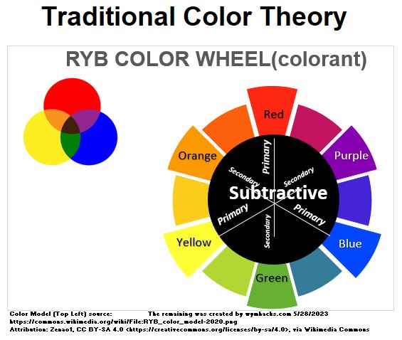
Schematic 36 above shows that for the RYB Color Model, Red, Yellow, and Blue are the Subtractive Primary Colours and Green, Purple, and Orange are the Subtractive Secondary Colors.
Notice from the intersecting color circles that the combination of Red, Yellow and Blue is a Brownish/Greyish color.
Remember Schematics 31a and 31b showing the reflectance/absorption characteristics of colorants?
I show Schematics 31a and 31b below in Schematic 37.
Recall how Blue and Red (and Green) absorb over a wider wavelength range than Cyan, Magenta, and Yellow.
Schematic 37 – Actual and Idealized Colorant Absorption Zones
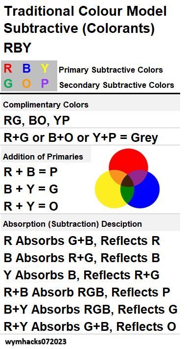
We can see from Schematics 36 and 37 that
- Complementary Colors are situated opposite each other (R and G, B and O, Y and P).
- Equal additions of any two Complementary Colors produce a dark Brownish/Greyish color. (R+G, B+O,Y+P = Brown/Grey).
- The reason why the color is not Black is due to the imperfect absorption characteristics of each color in each color zone.
- The addition of any two Subtractive Primary Colours produce Subtractive Secondary Colors (R+Y=O,R+B=P,Y+B=G).
- R absorbs Cyan (Green and Blue) and reflects Red.
- B absorbs Green and Red and reflects Blue.
- Y absorbs B and reflects G and R.
- R+B absorbs RGB, reflects P**.
- B+Y absorbs RGB, reflects G**.
- R+Y absorbs G+B, reflects O**.
* Remember that we don’t get perfect absorption and reflection coverage in each color zone (see the graphs in Schematic 37).
In Schematic 38 below you can see a tabulation of these RYB mixing rules.
Schematic 38 – RBY Color Model Mixing Rules
To compare more easily, I’ve placed the CYM mixing/subtraction rules side by side against the RYB rules in Schematic 39 below.
Schematic 39 – Mixing Rules – CYM compared to RBY
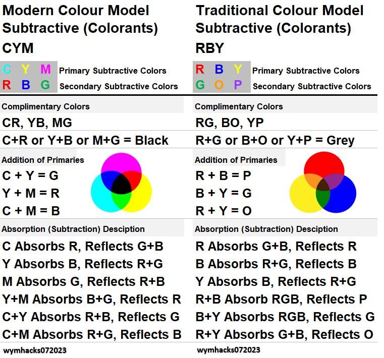
Summary
- The RYB Color Model is a Subtractive color model for colorants.
- Traditional Color Theory teaches that RY and B are the Subtractive Primary Colors.
- Modern Color Theory has shown that the CYM Subtractive Color Model is the Optimal model because it produces a larger Gamut than RYB.
- Darker color mixtures are also produced using RYB vs CYM but I am not sure we can judge this as better or worse (when it comes to painting at least).
- The superiority per se of one Subtractive color model over the other is probably more important for some activities (like printers) than others (colors a painter uses).
- Printers use CMYK cartridges because these provide the broadest Gamut.
- Painters in general probably use more than three colours anyway so the issue becomes less relevant.
Color Schemes
From his book “Colour Harmony“, Arthur Allen writes , “When two, or more than two, colours are used together in a picture or in a design and the combination of those colours produces a pleasing effect to the eye, then we say we have created a colour harmony”.
So basically if groupings of colors appear aesthetically pleasing to us , we can say they are Harmonious.
Why some colours look better together than others is something that is a bit harder to answer.
There is obviously some subjectivity here as well.
Even a very nice article like this one does not answer this question.
So we’ll just say that through the years people in art and design have found certain color configurations that “work” for most viewers.
Many of these Harmonies can be identified via geometric configurations on a color wheel.
I’ve recently been tinkering with a free on-line web site called Dopelycolors AKA Dopely.
Its color wheel tool can be used to create a color palette (collection) using various Harmony configurations.
Let’s describe the color wheel first (see Schematic 40 below).
Schematic 40 – Color Wheel Color Schemes (Harmonies)
Color Wheel Basic Description
Refer to my annotated Dopely’s color wheel in Schematic 40.
It has the following features:
- It uses the Hue, Saturation, Lightness, HSL, 3D model (using an RGB Color Model basis).
- Hues , in their most intense and saturated form, sit on the circumference of the circle
- A line drawn from a Hue on the circumference to the center defines 100% to 0% Saturation (Grey at center) of that Hue (e.g. Point 1 to Center)
- For our purposes Lightness, Brightness, and Value are the same thing (its how dark or light something is).
- The Value / Brightness adjuster changes the Brightness from Black through a Hue color range and then eventually to White.
The user can choose the Custom mode to locate as many colors as desired anywhere on the circle.
Geometric Harmonies from the Color Wheel
Keep referring to Schematic 40 as we define some Color Schemes (Harmonies) below.
As you read the following, note that
(1) each scheme shape can represent may sets of colors since the shapes can be rotated around the wheel.
(2) In the schematic, the scheme colors reside on the circumference (100% saturated).
But, the shapes can be reduced so the color points are inside the circle and therefore possess some degree of unsaturation.
- Monochromatic schemes use a single Hue and various Tints (White), Shades (Black) , and Tones (Grey) of that Hue.
- Complimentary schemes use two Hues, situated opposite each other on the wheel (e.g. line 1-to-19).
- Split Complimentary schemes use three Hues, splitting one of the complementaries into two close-by colors. (e.g. line 1-to-center-to-16-and-22)
- Triadic schemes use three Hues in an equilateral triangle shape: e.g. triangle with corners at colors 1, 13, and 25.
- Square scheme: e.g. square with corners at colors 6,14,24, and 32.
- Tetradic scheme (or Double Split Complimentary): e.g. rectangle with corners at colors 4,16,22, and 34.
- Double Complimentary scheme: e.g. rectangle with corners at colors 2.5,18.5,20.5 and 35.5
- An Analogous scheme has adjacent colors. e.g. Green, Yellow, Orange = colors points 1 to 7.
- Cool colors reside in (roughly) the left half of the schematic (e.g. Green – Blue – Purple range)
- Warm colors reside in (roughly) the right half of the schematic (e.g. Yellow-Orange-Red range)
Now that you have some definitions, check out this excellent video on how these schemes manifest themselves in paintings and photographs: Understanding Color by Blender Guru
Summary
This section reviewed some well known color groupings (Schemes or Harmonies) that are often used effectively in art work.
Most of the groupings exhibit symmetry around the color wheel.
Ok, next we want to discuss Color Vision Deficiencies which affect hundreds of millions of people across the world.
It’s good to know a little about this so you can select colors that are accessible to people with this affliction.
Color Vision Deficiencies and Color-Blindness
You should try to make the colors you use accessible to people who can’t see colors or see them differently than a normal person would.
In this section, I review the types of color viewing disabilities.
I’ve paraphrased heavily from part 1 of Lisa Charlotte Muth’s Color-Blindness articles.
You should read anything on color by her ,in my opinion.
General
- Some Retinal S, M, and L Cone Cells have deficiencies detecting colors (We’ll call this Color-Weakness).
- I have read Color-Weakness described as Color Vision Deficiency or CVD also.
- Sometimes the Cones are just missing and so cannot detect colors at all (We’ll call this Color-Blindness).
- Some form of Red-Green Color-Weakness is the most common type.
- Color-Weakness /Color-Blindness afflicts men (vastly) more than women.
- Refer to Schematic 41 for some statistics on color deficiencies.
- Please be aware that the numbers are kind of old (2006) and I believe apply to a sample population of Northern European people.
- So my population estimates in the table are just rough order-of-magnitude guesses.
- I would interpret all the percentages provided in the table and in this section as rough order-of -magnitude estimates.
Schematic 41 – Color-Weakness and Color-Blindness Statistics (2006)
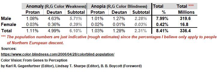
Color-Weakness
- With Color-Weakness, one can still tell the colours apart even though they don’t look the same compared to normal vision.
- About 6% (I rounded 5.71%) of men have some form of Color-Weakness.
- The suffix “anomaly” means weakness.
- The prefixes Prot, Deut, and Trit refer to the 1st, 2nd , or 3rd of the colours Red, Green, Blue (RGB)
- Protanomaly (pronounced: pro-tanomoly): Refers to Red (L Cone) Weakness i.e. defective L Cones. This makes Red look more like a less bright Green
- Deuteranomaly (pronounced: dooter-anomoly): Refers to Green (M Cone) Weakness i.e. defective M Cones. This is the most prevalent type and it makes Green look more Red.
- Tritanomaly (pronounced: try-tanomly): Refers to Blue (S Cone) Weakness i.e. defective S Cones. Cannot differentiate between Blue and Green, and between Yellow and Red.
Color-Blindness
- Around 2% (I rounded 2.28%) of men are Color-Blind.
- Color-Blind people cannot see Red, Green, or Blue.
- The suffix “-anopia” means no vision.
- Protanopia (pronounced: pro-tanopia): Dichromatic vision. Cannot see Red (L Cones not there).
- Deuteranopia (pronounced: dooter-anopia) : Dichromatic vision. Cannot see Green (M Cones not there).
- Tritanopia (pronounced: try-tanopia): Dichromatic vision. Very rare. Cannot see Blue (S Cones not there).
- Colors look “less bright”. Cannot differentiate between Blue and Green, Purple and Red, and Yellow and Pink.
- Monochromacy: Cannot see colors at all. Very uncommon.
- A specific type of Monochromacy is called Rod Monochromatism (or Achromatopsia).
Lisa Charlotte Muth’s Advice on Safe Colors
Ok, I want to summarize some of the advice that Lisa Muth provides regarding using colors that are accessible to people with color viewing disabilities.
Again, if it’s a topic of interest to you, read her three part series on Color-Blindness.
The following bullets are based on her second article in the series.
- In these bullets, “safe” means accessible to people with color seeing disabilities.
- If you vary the Value /Lightness /Brightness, you can make many colors work together.
- “Get it right in Black and White”. View the colors in Black and White (print or use on-line tool like Viz Palette).
- If you can tell a difference than so will a person with color disability.
- If they are the same Lightness / Brightness, don’t use Green with Orange/Red
- If they are the same Lightness / Brightness, don’t use Green with Blue
- Blue is very popular in data visualization.
- It is safe for Red and Green blind readers.
- According to Google Bard, Blue is calming and gives a sense of “order and structure”.
- Blue combined with Orange/Red is going to be safe.
- Yellow can be safe as well.
Summary
Try to use colors that are safe for Color Week and Color-Blind people.
Using Blue combined with Orange/Red will work.
How to Pick a Color Palette for Data Visualization
We are now armed with a lot of knowledge regarding color and its interpretation and application.
As suggested by my comments in the introduction, I am mainly interested in data visualization (i.e. charting and graphing).
So, let’s review some color application rules and then run through an example of how to create a color palette.
Color Usage Rules
The following bullets are a summary of Lisa Charlotte Muth’s advice on effective color combinations for data visualization
(See her article “How to pick more beautiful colors for your data visualizations”)
- Try to use colors that are accessible to people who have color seeing disabilities (see the previous section).
- Don’t use Hues from all over the color wheel.
- Muth writes that using a few Hues and nearby Hues will make the colors look more professional and trustworthy.
- Avoid pure Hues on the color wheel that are located at 60 Degree Intervals (0, 60, 120 etc.).
- Avoid highly saturated light colors (try to avoid 100% on Saturation and maximum Value / Brightness/ Lightness).
- Don’t choose all your colors at 100% Saturation (Hues at the circumference of the color wheel).
- They will be too bright and will clash.
- Use Complementary Colors or sets of Complementary Colors.
- Don’t scatter too widely around the color wheel.
- Try to keep your Hues close on the color wheel but adjust Value / Brightness/ Lightness and/or Saturation to produce a variety of colors.
- Blue is probably the most versatile color for data visualization.
- Muth writes that Blue colors look “pleasing, calming, and professional”.
- Warm colors (Yellow, Orange, Red) and Blue go well together.
- As we noted in the previous section, they are accessible to people with color disabilities as well.
- Green can work but you should probably lighten and desaturate it quite a bit.
- Muth says make Green “a bit Yellow or Blue”.
As noted in the previous section, use colors that have different Value / Brightness/ Lightness.
You can check by ensuring you can differentiate a Black and White printout of the colors (or use an on-line Grey scale checker like Viz Palette).
Example of How to Choose a Color Palette
Here is an example of how I recently created some color palettes to be used mainly in Microsoft Excel charting (and possibly other Microsoft Office software).
First, I needed to find a good on-line color wheel using the HSL or HSV model we discussed in a previous section.
After some tinkering, I decided Dopely was a good option (I looked at Adobe Color also but they use an RYB Color Model and I wanted to use an RGB model).
The Dopely color wheel uses the HSL (RGB) Color Model and allows the user to choose color points in custom mode (not constrained by the various Harmony configurations available).
You can see the basic configuration for the Dopely color wheel in Schematic 42 below.
Schematic 42 – Dopely HSL Color Wheel
The Dopely Color Wheel has a Value (Brightness / Lightness) adjustment that moves around the Hue circle.
The 100% saturated Hues are located at the circumference of the color wheel.
Saturation can be adjusted from 0% saturated (center) to 100% saturated at the circumference boundary.
The six colors I ultimately chose (the White circles in Schematic 42) were selected by trial and error to meet the following aesthetics, style and accessibility criteria:
- Create 3 pairs of roughly Complimentary colors (my requirement, not really a rule).
- Avoid scattering the colors too widely around the wheel.
- Vary the Saturation and Lightness of the Colors.
- Balance Blue-ish colors against Red-ish colors.
I used a very useful tool called Viz Palette to help me do this.
Basically I chose colors on the wheel , then used Viz Palette to check out how the colors looked together and whether they were “Color-Weak and Color-Blind” safe.
I continued adjusting until the two criteria were satisfied.
Check out the Viz Palette layout in Schematic 43 for the colors chosen in Schematic 42.
Schematic 43 – Viz Palette Tool Checks the Look and Accessibility of Colors
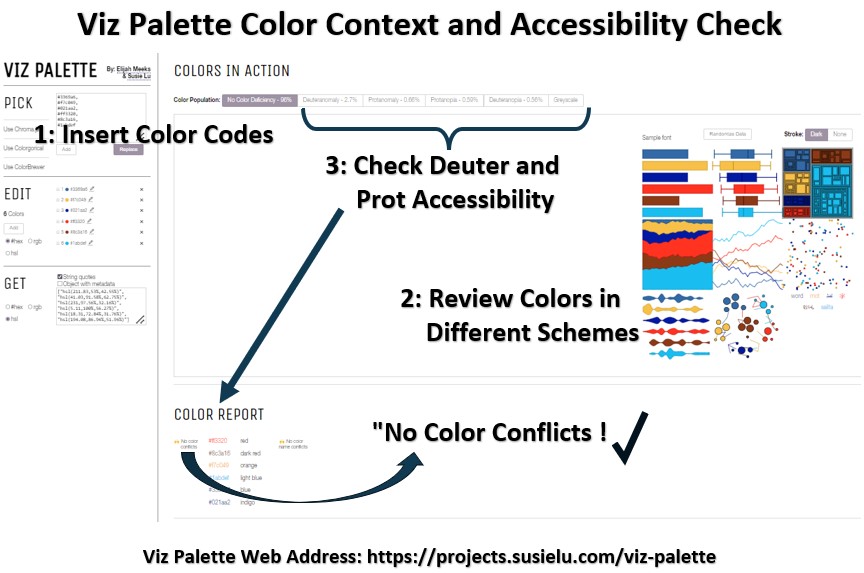
I took the color codes from the Color Wheel (i.e. Schematic 42) and entered them into Viz Palette (see 1. in Schematic 43).
Then, I reviewed the colors in various visualizations (see 2. in Schematic 43).
I also checked the colors for Accessibility to people with Red and Green Weakness and Blindness.
By clicking on the tabs (see 3. in Schematic 43) for each color viewing disability, I checked to ensure the color report showed no conflicts.
Viz Palette also shows the colors in Grayscale.
By ensuring we can differentiate the colors in Grayscale (“Make it right in Black and White”), we know we have enough variability in Lightness and Saturation , which will also allow Color-Weak and Color-Blind people to differentiate them.
Pretty cool, I think.
So check out Schematic 44 below for a summary of the final colors chosen for the example I just described.
Schematic 44 – Example 1: Color Palette
Just for fun I also produced a slightly lighter palette that met all the criteria.
You can see those colors in Schematic 45 below.
Schematic 45 – Example 2: Color Palette
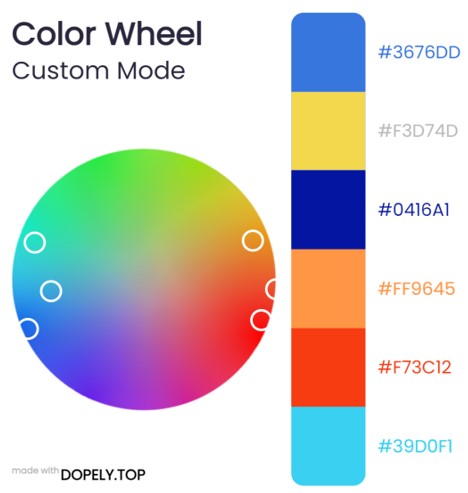
Summary
Follow these rules for using colors in data visualization:
- Avoid scattering the colors too widely around the wheel.
- Vary the Saturation and Lightness of the Colors.
- Blue color combinations with warm colors (Yellow, Red, Orange) work.
- Use Color-Weakness and Color-Blindness safe colors.
- Analyze your colors in Black and White to ensure you can tell a difference.
- Use on line tools (color pickers or palette generators or color wheels) to generate effective colors.
- For example, you could use a color wheel application like Dopely along with a color quality checker like Viz Palette to ensure your color selections will be effective and accessible to all.
Tools and References
Conclusion
Congratulations!
You and I now know a little more about a lot of color (colour) related topics.
Let’s finish with a high level overview of this essay.
Light Energy
Light, emitted by the sun and other “artificial” emitters (e.g. light bulbs etc.) is radiation energy that can be quantified by wavelength and frequency.
The visible portion of the light spectrum spans roughly between 380 and 700 nanometers ( billionths of a meter).
Visual Pathway
Our brains interpret visible light wavelengths as colors.
Visible light doesn’t contain colors.
Our imagination does.
The Spectral Colors (the Rainbow continuum) are identified by a single wavelength but there are others like Magenta which only exists as a mix of wavelengths (of Blue and Red).
Don’t believe that one type of color is less real than the other!
They are all created by our eyes and brains (our eyes are really a brain extension).
Our understanding of our biological light and color sensing mechanisms and pathways is still developing and growing.
Light and color sensation is an electrochemical process.
Two integrated theories explain colour vision today: The Trichromatic Theory (TCT) and the Opponent Process (Color) Theory (OPT). TCT explains how 3 types of photoreceptors operate simultaneously to sense color.
OPT explains how inhibitory and excitatory signals from the photoreceptors are integrated via opposing color “circuits”: Blue/Yellow, Red/Green, and Black / White (Luminance).
Hue cancellation experiments provide compelling proof for the OPT.
After images can be explained by TCT and OPT although there are some inconsistences.
This is because after image colours are Complementary and so the after-image of Red is Cyan and not Green (the Opponent Color to Red).
There is some evidence that Red-Green might more accurately be described as Red-Cyan in OPT.
This would reconcile the inconsistency.
Light Matching Experiments
Additive light mixing experiments in the 1920s in England resulted in the creation of a standard Chromaticity Diagram (CD) in the 1930s.
The CD (it has taken on a few different versions) plots all possible colors on an x,y diagram.
The range of possible colors is contained in a horseshoe shape (shark fin shape) bounded by spectral colors on the curved side and color mixtures on the flat side (Purple Line, where Magenta and other Blue/Red colors reside).
Colors on the Spectral Line or Purple Line are considered 100% saturated.
All color points inside these boundaries will be less saturated.
Color models defined mathematically off the CD could now be created (with a standardized basis).
Three point “triangular” color models defined from the CD enabled a standardization of colors for electronic technologies (TVs, computer monitors and phones for example).
The Red, Blue, and Green (RBG) Color Model represents the Optimal Additive Primary Colors because the possible colors produced (Gamut) is large.
Complementary colors can be derived from the CD diagram by drawing a line from the R or B or G spectral points through the White point of the diagram to the other border.
The Complementary Colors of RBG are thus Cyan, Yellow, and Magenta (CYM) respectively.
Physical and Perceptual Color Attributes
Spectral Power Distributions (SPD) and Reflectance Curves (RC) allow us to characterize colours by plotting energy vs wavelength.
We sense a direct colored light via its SPD curve.
The energy vs wavelength of reflected light color coming to our eyes is equal to the emitted light (to the reflecting object) power (SPD) x the RC of the reflected light.
SPD and RC curves allow us to understand how colorants (ink or paint) operate subtractively when reflecting light e.g. Yellow paint absorbs Blue but reflects Red and Green.
Perceptual attributes of Chromatic Color, Hue (the dominant color), Saturation (the purity), and Value/Lightness/Brightness (how dark or light), can be described using SPD and RC curves.
From an SPD or RC curve, Hue is the central, average wavelength of color.
Saturation increases with the slope of the curves and Value is proportional to the amplitude of the curves.
The Achromatic (Neutral) Colors, Black , White , and Grey have Value / Lightness/ Brightness attributes only (no Saturation and no Hue).
Neutral colors can be added to Hues to produce Tints (adding White), Shades (adding Black), and Tones (adding Grey ).
Color Models
Color models are mathematical models that typically comprise three colors.
The models can generate an array of colors based on mixtures of the three colors.
A model that can produce the widest Gamut (range of colors) is described as an Optimal Model.
Before describing primary colors, we must always declare whether we are talking about Additive mixing of light or Subtractive mixing of colorants (e.g. paints and pigments).
From the Chromaticity Diagram we know that the Optimal Additive Primary Colors are Red, Blue, Green (RBG).
Cyan, Yellow, and Magenta (CYM) are the Optimal Additive Secondary Colors.
Mixing Additive Complementary Colors produces White.
The Optimal Subtractive Primary Colors (i.e. colorants like paint and ink) are CYM. The Optimal Subtractive Secondary Colors are RGB.
The Subtractive color model you are most likely familiar with (and mostly likely taught in school) is the Red, Yellow and Blue or RYB Color Model.
Since the CYM Color Model offers a wider Gamut than RYB, it is understood that CY and M are the Optimal Subtractive Primary Colors.
If we assume we can divide the visible spectrum into Blue, Green, and Red zones, Schematic 46 shows which colors are absorbed (subtracted) or reflected by various colored paints.
Mixing Subtractive Complementary Colors produces Black (ideally; more like dark Brown or Grey in reality).
We can glean from the last two paragraphs that mixing Complementary Colors will produce Achromatic or Neutral colors (White for additive light mixing and Black /Grey /Brown for subtractive colorant mixing.
Schematic 46 – Colorant Absorption/Reflection Color Zones
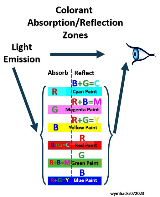
Each of the color models can be represented by a color wheel which displays the complementary relationships of color pairs.
A 3 dimensional color model like the HSL Color Model (an RGB model showing Hue, Saturation, Lightness) is very useful in selecting color palettes.
There are many color wheels (color pickers) that utilize the HSL Color Model.
Color Selection
Various harmonious color combinations (Harmonies or Schemes) can be derived from color circles.
The combinations that are traditionally taught in painting and design classes assume symmetrical geometric configurations around the wheel (see Schematic 47).
Schematic 47 – Color Schemes
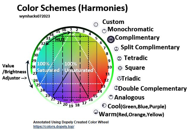
When selecting optimal colors for data visualization try not to get too complicated with your color schemes.
Try closely grouped Complementary Colors.
Adjust the Saturation and Value/Brightness/Lightness of the colors to give sufficient contrast and to avoid having oversaturated and overly bright colors.
Choose Blue in combination with warm colors like Yellow or Red or Orange.
We are Done!
My original intent was to provide a short article describing how to use a color picker tool to choose a decent color palette for graphics data visualizations.
What ended up happening was this essay!
Writing this has expanded my knowledge and appreciation for what color is and how it can be applied.
I hope you experience the same after you’ve read it!